Inhabitat
Great for ideas on recycling art and green designs
Marvellous Art Musings
Marvellous Art Musings interactively muses on twentieth century and contemporary South African art and showcases the vibrant South African art scene
The act or art of expressing by means of types or symbols; emblematical or hieroglyphic representation.
The art and craft of designing typefaces is called type design. Designers of typefaces are called type designers. In digital typography, type designers are sometimes also called font developers or font designers. (Ref)
Every typeface is a collection of glyphs, each of which represents an individual letter, number, punctuation mark, or other symbol.
The term typeface is frequently confused with the term font.
the physical embodiment of a collection of letters, numbers, symbols, etc. (whether it’s a case of metal pieces or a computer file) is a font. When referring to the design of the collection (the way it looks) you call it a typeface. (Ref)
Fonts don’t just display letters as words and sentences. They convey emotion, attitude and tone. They call out what information is most important and help you navigate through a site.
The mood of a typeface is an important part of how it should be used. Different typefaces have strikingly different moods. Commonly used moods include formal vs. informal, modern vs classic/traditional, and light vs dramatic. Some typefaces have very distinct moods. For example, Times New Roman is pretty much always going to be a traditional font, which is why it’s so commonly used for business correspondence. Verdana, on the other hand, has a more modern mood.
Some typefaces are more transcendent, and can convey almost any mood based on the content and the other typefaces they’re combined with. Helvetica is often considered one such font.
The following animation Type High is an introduction to the principles of typography through letterpress, to serve as a typography primer for novice students and for classroom instruction. It was a self-initiated project under the guidance of Raphael Attias in his class, Interactive Text, Sound and Image, at RISD. Type High was part of a larger toolkit that allowed students to interact with type anatomy, composition and type in the real world. Produced in stop-motion animation, it explains the grammar of typography in the RISD letterpress shop. The video was made by Lynn Kiang.
A great GIF showing the history of the alphabet fromReddit
History of the Alphabet
The infographic below presents a history of typefaces, incorporating fun tidbits from tech, pop culture and the web. Do you know what font the Google logo is?
The readymades of Marcel Duchamp – By simply choosing the object (or objects) and repositioning or joining, titling and signing it, the object became art. (Ref)
Marcel Duchamp – Bicycle Wheel Dada 1913
It now seems that even well before our archaic ancestors started to produce works of art, they too used readymades. At least 2 million years ago our Hominid ancestors collected rocks that resembled for example faces or animals. These objects have been found across the world in early hominid sites and has been called Manuports.
According to Australian archaeologist and rock art scholar Robert G. Bednarik : “Manuports are unmodified objects transported and deposited by hominids, and they are distinguished by being of a usually striking material clearly foreign to the sediment containing the occupation deposit they occur in.” (Ref)
One such example is the Makapansgat pebble. It is a 260-gram jasperite cobble with natural chipping and wear patterns that make it look like a human face. The pebble, found some distance from any possible natural source, was in the possession of a female Australopithecus africanus. The pebble was not a manufactured object, but it was possibly recognized it as a symbolic face, and treasured as such. This would make it the oldest known sculpture, or manuport. (Bradshaw Foundation)
Makapansgat pebble – earliest known manuport
Australopithecus africanus was an early hominid, living between 3 and 2 million years ago – in the late Pliocene and early Pleistocene, thought to be a direct ancestor of modern humans.
Artists Impression of Australopithecus africanus
But is it Art?
Who among us haven’t at some stage carried home a rock, a stick or something because we saw in it a face, or an animal; looked at clouds and saw a dragon?
My personal Manuport – I have carried it along because to me it resembles a veiled woman
This ability is called Pareidolia and is what happens when we see images in the famous psychological inkblot test. Interestingly, this ability is something we share with other animals. Research has found that it does not depend on the size of the brain. For example;
“Just as frogs are prone to see moving dots on a screen as flies, and sea urchins will avoid any dark shadow as if it were an enemy fish, humans too tend to interpret their environment with the “models generated by their most pressing interests” Steward Guthrie
Rorschach test. or Inkblot Test
It doesn’t take much of a stretch of imagination to see how this may have been how we started to create art, invent technology, and attach spiritual significance to to certain mountains, events or places, or a mechanism to understand the cosmos.
Mechanism of exploration and understanding of the Cosmos
This also connects to the theory that rock art is a depiction of what shamans saw in their trances or how entoptic motifs, turns into iconic images.
If you watch the documentary How Art Made the World Part 2 – The Day Pictures were Born , you can see more about that.
To this day before we can create anything, something else must first spark our imagination.
Pareidolia (psychological phenomenon): involving a vague and random stimulus (often an image or sound) being perceived as significant. Psychological phenomenon related to the Rorschach test.
Apophenia (psychological phenomenon): that describe the experience of seeing patterns or connections in random or meaningless data. The term was coined by Klaus Conrad (1958).
Hierophany (psychological phenomenon): the perception of a manifestation of the sacred.
PAH Triad (psychological phenomenona): Pareidolia-Apophenia-Hierophany working simultaneously, is changeable among diverse individuals. The PAH triad is part of the unconscious mechanisms inherent to every human being, present in the primary stages of the early development of the human conscience.
Mimetolith (M):1.a.a natural topographic feature or rock which natural shape resembles something else – human, animal, plant, manufactured item, or part(s) thereof. (Dietrich 1989).
Mimetomorph (Mm): Any kind of material (bones, wood, mud and others) with natural shapes that resembled animals, human beings or other objects. Many of these material don’t survive passage of the time.
Mimetolith Modified (M-m): Natural shape altered by human beings.
Mimetomorph Modified (Mm-m): Natural shape altered by human beings.
Prehistory of Art – Lascaux – great documentary to give insight into Lascaux caves and paintings.
Prehistoric Europeans. People Who Invented Art
Prehistoric Art: Part 1 of 2
The cave drawings were found by archaeologist Marc Azema and French artist Florent Rivere, who suggest that Paleolithic artists who lived as long as 30,000 years ago used animation effects on cave walls, which explains the multiple heads and limbs on animals in the drawings. The images look superimposed until flickering torch-light is passed over them, giving them movement and creating a brief animation.
“Lascaux is the cave with the greatest number of cases of split-action movement by superimposition of successive images. Some 20 animals, principally horses, have the head, legs or tail multiplied,” Azéma said.
Great BBC Documentary series on the origins of Art and the importance of our ability to see and recognize images. How art shaped our world – It is a great overview of the History of Art.
Part 1 – More Human than Human –
The Human body in art – body image, Venus of Willendorf, Egypt, Greece
Part 2 – The Day Pictures were Born
Origins of Art, how did we first think of making images?
The purpose of a visual analysis is to recognize and understand the visual choices the artist made in creating the artwork. By observing and writing about separate parts of the art object, you will come to a better understanding of the art object as a whole.
The simplest definition for visual rhetoric is how/why visual images communicate meaning. Visual literacy is also about how culture and meaning are reflected, communicated, and altered by images. Visual literacy involves all the processes of knowing and responding to a visual image, as well as all the thought that might go into constructing or manipulating an image.
A visual analysis addresses an artwork’s formal elements—visual attributes such as colour, line, texture, and size. It also includes historical context or interpretations of meaning.
Read the assignment or questions carefully to decide which elements of visual analysis needs to be included, as not all the aspects are suitable to comment on for every painting. Select the aspects that seem most appropriate. Some questions or assignments will require that you either do a comparative analysis – (comparing artworks, or artists from a different social, or historical context) or will expect you to frame your formal description in terms of historical or social context. information.
All observations must be justified e.g “Paul Cézanne‟s Mont Sainte-Victoire is composed of a number of repeated shapes and lines that serve to unify the composition. So, if you make an observation about a formal element, also state what visual effect it has in your opinion.
Paul Cézanne, Mont Sainte-Victoire (1885-7)
1. Recording the painting details (your notes should always state painter, title and date) Note; for exams each section has two questions, in the first question, you will be given the images and these details, you can then refer to the works as they are numbered in the paper e.g fig 1b.
Name of Painter: (e.g. Monet)
Title of the Work: (e.g. Rouen Cathedral in Full Sunlight)
Dateit was painted: (e.g. 1874)
It’s more than just dating the piece — once you have the date down, you can take a look at what was going on during that time period that would make the artist want to depict his subject the way he has.
Size : (e.g. 84 x 63 cm)
Medium : (e.g. oil on canvas)
Stylistic Period: (e.g. Impressionism) Note – If your assignment or question asks you to identify the style or movement associated with the artwork, compare the artwork’s formal elements to the stylistic characteristics of the style/or movement. For example: “Robert Adam‟s library at Kenwood is quite classical, not just because of the Corinthian columns and barrel vaults, but also because it is symmetrical, geometric, and carefully balanced .”
2. Subject and Theme
Describe the subject: (e.g. the artist Courbet meets his patron Monsieur )
and/or Describe the content: (e.g. the stone facade of a Gothic Cathedral)
and/or Explain any ideas that the painting is expressing (political, social, personal) : (e.g.Courbet depicts himself as of equal status to his wealthy patron)
Identify underlying themes: (e.g. self-sacrifice, loyalty to nation in David’s Brutus receiving the Bodies of his Sons)
Explain any background known about the work (using research to find out): (e.g. the format derives from a popular print called The Wandering Jew)
“What’s the mood like?” In other words: what overall feeling do you get from the piece? Do the colour choices the artist used make you feel a certain way? Does the composition give you a mood?
3. Composition (means the organization of objects and/orfigures within the painting) (select only the most relevant of these), how does the artist piece together the different parts of the canvas? How does the artist make your eye move around the canvas? Is there one place where your eye always ends up? What does this movement and organization make you think about the figures or objects depicted?
Focal Point:
Geometrical shapes:
Symmetry?/Asymmetry?:
Methods used to lead the eye around the work:
Effects created by compositional devices: (e.g. stability, order, randomness, effect of drawing attention to particular parts of the work)
4. Space/Depth (how is the illusion of depth created?)
Camille Pissarro, Hyde Park, London 1890
Linear perspective: (e.g. Pissarro uses a row of trees which recede and lead the eye into the distance. The trees vanish at a point on the horizon)
Aerial perspective: (the gradual lightening, haziness and bluish tinge that appears towards the horizon)
Overlapping of objects:
Distance from the picture plane : (sense of distance from the actual surface of the painting)
5. Colour
Main Colours used :
Cool and Warm Colours:
Range of the palette : (means the number of colours used – a wide range or a limited palette)
Effects colour creates:
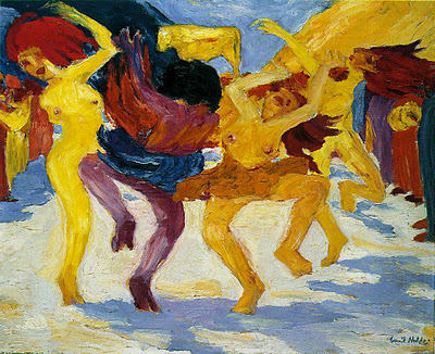
Emil Nolde, Dance Around the Golden Calf
Example: Attention is drawn to the central figure that is painted in strong shades of purple and blue – a striking contrast to the complimentary yellow of the other two figures. Although Nolde worked with warm and cool colours, these seem to be more discordant and disturbing.
6. Light
Direction of the Light :
Chiaroscuro (contrasts of light and shadow) or Even Lighting :
Atmospheric Light (to create mood):Example: “Rembrandt‟s use of chiaroscuro heightens the sense of drama in The Night Watch
Rembrandt’s Night Watch
7. Form and Effects
Use of outline to define form: (Are outlines clear?)
Use of tonal modeling (shading of form) to create 3-d forms:
Does the forms appear static (not moving) or appear to be in movement?
What feeling does the use of line create?
Example:Fauvists used expressive line – they did not use line to imitate the real, but like their use of colours, used line to express a feeling or the emphasize a form, or a shape that contributed to the feeling of a painting. Thick black Line, which often outlined forms were filled in with intense colours. Line was also often use as a decorative means as is seen in Andre Derain’s Dance or in Matisse’s Harmony in Red.
Matisse – Harmony in Red 1908-9
8. Technique
Smooth finish:
orThickly applied paint (impasto):
Effects: (e.g. implies texture of objects and garments such as marble, satin)
Do you feel natural texture in the painting, like softness of a fruit
What art movement, does the technique remind you of
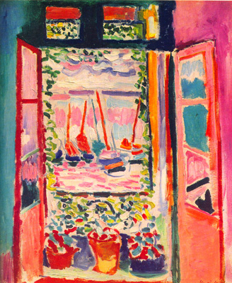
Example:The pure and unmixed colours were intensified further by applying thick daubs and smears. In Matisse’s Open Window at Collioure, for example, brush strokes also takes on a symbolic meaning; each level of space is characterized by a different type of brush-stroke. In this painting the brush stroke becomes a metaphor for the quality of time associated with the type of space. Flat areas of paint are used for the interior and architectonic spaces which have static time; curved short strokes for the plants around the window, and horizontal and vertical dashed lines for the ships at sea.
Matisse – Open Window at Collioure, 1905
In the Mountains at Collioure by Andre Derain you can see the repetitive brush strokes which which gave the Fauves’ paintings a very rough, unfinished look compared to the other artwork at that time. You can also clearly see the infleunce of van Gogh’s brush stroke.
Mountains at Collioure by André Derain
9.Context (known through research and knowledge of style)
Social/Historical/Artistic: e.g. Fits the artists’ personal style, Fits the style of the art period: How did the subject, theme, and form convey ideas, values, sentiments, beliefs, perceptions? What may the work of art say about the period and culture in which the work was created?
Example of a Question
Write an essay in which you make specific reference to at least TWO artworks of any local or international artist(s) you have studied, who you feel has/have investigated the issue of identity in his/her/their work.
Your answer should include the following information:
• Inspiration/Influences on the work
• Formal elements used in the work
• Themes and messages in the work that gives a sense of the
artist’s/artists’ identity.
Your answers should have an introduction to the specific question, and a conclusion.
There are only two questions that you really need to look at art, and those are: “What’s going on in this picture/sculpture/building?” and “What do I see that makes me say that?”
LOOK at the picture and figure out what you’re seeing, even if it seems incomprehensible; then FIND evidence in the painting that backs up what you see.
For example, let’s look at Edvard Munch’s famous The Scream (1893). What do we see? You might answer, that’s easy: a man who is scared and overwhelmed. OK, definitely — but how do we know it’s a man? Why is he scared and overwhelmed? What in the painting makes us able to say these things about it?
You might counter with: it’s a man because he’s bald and has a male body type. He’s scared because of the expression on his face — his mouth is open, his eyes are wide, he’s clutching his face with his hands. And maybe he’s overwhelmed by everything around him in the painting — this sharply tilted bridge, bright swirling sky, and the strange blue shapes behind him. Even his body is all twisted, like everything around him.
If you’re feeling overwhelmed yourself, not to worry. It’ll take a little bit of pushing yourself to get to the point where you feel comfortable jumping into a painting and exploring it, but practice makes perfect. Try visiting a museum with a friend and talking through a painting with them — you’ll both see things the other one didn’t, and talking about art out loud can really help you understand a piece.
Also, remember that every choice the artist makes is a conscious one. There’s a reason why you think the guy is scared and overwhelmed: because Munch himself decided to paint him with such an expression, decided to create a swirling, upsetting landscape around him, in those specific reds and blues. Figuring out the way an artist manipulates your interpretation of a piece is key to getting into the artist’s head.
Once you master getting yourself to answer those two basic questions, you’ve probably figured out what art historians call the “subject” of the painting — you know, what’s on the canvas. From there, you can easily start to explore the piece even further by asking yourself some other, more detailed questions.
Also look at this link for an example of Analysis of The Scream
Helpful Links
Analysis.com – loads of examples of artworks analysed
Name: Cubism – Term coined in 1908 by Louis Vauxcelles after hearing Matisse refer to a painting by Braque as nothing but “little cubes.” Like Impressionism and Fauvism, the term was originally derogatory.
Artists: Pablo Picasso, Georges Braque, Juan Gris, and Raymond Duchamp-Villon.
When: c. 1907-1918.
Where: France.
What: Analytic Cubism (earlier phase of Cubism): subject shown as if seen from several angles simultaneously (traditional perspective is abandoned); fragmented space. Synthetic Cubism (later phase of Cubism): separate elements are brought together in a layered collage look. Lettering sometimes added, as well as real materials (newspapers, labels, etc.).
Subject Matter: Portraits, figure studies, still lifes, landscapes.
Style: Analytic Cubism: dull, muddy, facets of color. Objects and background treated with similar concern. Synthetic Cubism: collage look, stencils, actual materials, usually vibrant color.
PAUL CÉZANNE (1839-1906) ‘Bibemus Quarry’, 1895 (oil on canvas)
Influenced by: Cézanne’s later work; African, Oceanic and Iberian sculpture; Rousseau’s “primitivism.”
LEFT: Pablo Picasso, ‘Head of a Woman’, 1907 (oil on canvas) RIGHT: Dan Mask from West Africa
Will influence: Orphism, Futurism, Cubo-Futurism, Constructivism, and Art Deco.
Quotes: “To be pure imitation, painting must make an abstraction from appearances.” – Georges Braque
GEORGES BRAQUE (1882-1963) ‘Violin and Jug’, 1910 (oil on canvas)
Analytic Cubism 1910-1912 – Characteristics
1. Analytical Cubism was concerned with breaking down forms analytically into simplified geometric forms across the picture. Objects and figures were broken down into geometric units, usually into two or three shapes by breaking the object down into fragments and then reassemble it.
2. Objects were shown in a prismatic way so that the viewer can see all sides at once.
3. Analytical Cubism rejected Single point perspective and sought to show the object from multiple angles, and in differing lights. It was a conceptual image of the object, rather than an optical image – an intellectual experiment with structure. Objects were displayed not in one place, in one time, in one space, within one light source, but from many vantage points.
4. Structure was paramount and colour was downplayed so that the viewer was not distracted.
5. They limited their palette to monochromatic earth tones and muted silvers, reducing the colour palette to several shades of one or two colours. to better to maintain clarity between the forms’ fragmented planes.
6. These were basically Cézannian colours: ochre’s for the planes, black for the contours and white for the stippling on the surface. From time to time, green will be used, but sparingly.
7. Their limited use of colour avoided any reference to mood or emotion By reducing the palette, Picasso and Braque were able to paint in colours or tones, which were neutral in their associations. Red and blue, for example, are colours with “moods,” yellow might be associated with an object, such as a lemon or the sun. The suggestion of mood or object through colours could lead to ideas of theme or narrative or of symbolism—something Picasso and Braque avoided in order to concentrate to the formal experimentation of their paintings..
8. There was no realistic modelling of figures and objects were represented in space that employed small, tilted planes, set in a shallow space which flattens all surfaces into a single plane.
9. Their subject matter was restricted to the traditional genres of portraiture and still life;
10. Analytical Cubists works were often very similar in appearance and style, but over time, their separate interests showed through. Braque tended to show objects exploding out or pulled apart into fragments, while Picasso rendered them magnetized, with attracting forces compelling elements of the pictorial space into the center of the composition.
PABLO PICASSO (1881-1973) ‘Still Life with Chair Caning’, 1912 (oil on canvas)
Synthetic Cubism (1912 – 1914)
1. The image was built up (synthesized) from new elements and shapes and was a symbolic style of art..
2. Separate elements are brought together in a layered collage look of mixed media. They were the first to use collage in art.
3. They also introduced the use of stencilled lettering as well as real materials (newspapers, labels, etc.).
4. Instead of relying on depicted shapes and forms to represent objects, Picasso and Braque began to explore the use of foreign objects as abstract signs.
5. Braque also began mixing materials such as sand or sawdust with paint to create interesting textures.
6. Other characteristics were a greater use of colour and greater interest in decorative effects.
7. The created a flatter space than with analytical cubism.
8. The paintings were composed of fewer and simpler forms based to a lesser extent on natural objects.
9. In synthetic Cubism the emphasis had shifted from the visual to conceptual. The object is conceived through a synthesis of one’s impressions and the meanings one gives to them. This synthesis does not require the accumulation of all the visual aspects; it can be created by reducing the object’s characteristics to certain essential clues (reduction).
10. Synthetic Cubism is also characterized by ambiguity. Since the painted or sculpted object no longer represents an existing object but is instead an object in itself, a contradiction arises between the two realities: that of the “conventional” object, which exists in one’s mind, and that of the new one, created by the artist, which exists both as the subject of the creation and as the creation itself.
Part 2 Second part of an animated slide show of significant Fauvist works from around 1905 – 1907. Matisse, Vlaminck, Derain, Braque, Manguin, Marquet, Gauguin, Camoin, Friesz and others.
Documentary Matisse
Characteristics of Fauvism
Fauvism continued the naturalism of the Impressionists and reflected the influence of Vincent Van Gogh, especially in the work of André Derain. In a series of paintings by Henri Matisse (1869-1954) and André Derain (1880-1954), completed in the small town outside of Paris, there was a new conception of light that separated colours, allowing the white canvas to glow through. Borrowed from Paul Cézanne, the unexpected source of light was combined with a renewal of subjectivity after the “objectivity” of Impressionism. The Fauves remained a disparate group of artists. Their identity as a group only grew over time. Fauvism was not a group that was purposefully formed, neither did they produce a manifesto defining their artistic aims What united them was their explicit focus on the use of colour as a means of emotive expression.
Name: Fauvism was named by Parisian art critic Louis Vauxcelles in his review of the 1905 Salon d’Automne: “Donatello au milieu des fauves!” (“Donatello among the wild beasts!”). The remark was made in reference to a room in the salon in which a classical-looking statue by Albert Marquet was surrounded by paintings by Matisse and others.
Artists: Henri Matisse, Georges Roualt, André Derain, and Maurice de Vlaminck.
When: c. 1905-1908.
Where: France.
What: First modern movement of the 20th century in style and attitude. Movement composed of a number of individual styles. Bold colour was a unifying element among the Fauves. Subject Matter: Images of contemporary life (influence of Impressionism) landscapes, cityscapes, and scenes of bourgeois leisure.
Style: Violently contrasting, non-descriptive colours, and flat patterns.
Quotes:
We are about to embark on a new phase. Without partaking of the abstraction apparent in van gogh’s canvases, abstraction which I don’t dispute, I believe that lines and colors are intimately related and enjoy a parallel existence from the very start, allowing us to embark on a great independent and unbounded existence…Thus we may find a field, not novel, but more real, and, above all, simpler in its synthesis… André Derain
What I dream of, he famously said in Notes of a Painter, is an art of balance, of purity and serenity, devoid of troubling or depressing subject matter, an art which could be for every mental worker, for the businessman as well as the man of letters, for example, a soothing, calming influence on the mind, something like a good armchair which provides relaxation from Physical fatigue. – Matisse
Characteristics of Fauvism
Andre Derain – Dance
1. Subject Matter/ Themes: Industrialization and urbanization was fully developed and technology and mechanization was beginning to dominate modern life and dictate the future. In reaction the Fauvists’ painting reflects a longing for an ideal golden age, long lost but re-found in the imagination.The “primitivism” of Fauvism is not just the artists’ interest in African tribal art, but also in subjects that seems to depict that lost joyful innocence of a simpler life. Most of the paintings were of still lives, rural settings, forests, portraits, especially women, and dance. In most urban settings man-made buildings were off-set by some natural idyllic element like a river or trees,
2. Emotions and Feelings: The artists sought to express their personal feelings and move away from traditional academic techniques and conventions in painting. The feelings they expressed were a reflection of how they imagined an ideal unspoilt life will feel like – joyous and innocent. How the artist felt about a subject were paramount. The term “pictorial autonomy” is often used to describe Fauvist paintings, which means that a new or imagined reality exists inside the painting, independently from the outside reality. This can be seen in Matisse’s Harmony in Red where the pattern on the table cloth feels like it has become alive and dominates the picture.
Matisse – Harmony in Red 1908-9
3. Context: The way they interpreted a subject was through their personal emotions rather than showing how it is objectively. To the Fauvists it did not matter whether color is right, because color reflected their subjective inner vision. Fauvists for example used unnatural colour combinations in their works to elicit a variety of emotional responses. Their use of colour did not abide by any laws, but it was more a way for the fauvists to depict their own emotions on the canvas. In this respect Fauve art can also be seen as a form of expressionism, although they did not delve into the darker emotions as did the German Expressionists. They used whatever colour that best expressed an emotion or feeling, as can be seen in Matisse’s Green Stripe.
Matisse – Green Stripe
In traditional art, both form and color are “right” or representational. The artist starts with form and the form determines the colour. Colour follows form; the artist cannot start with color. The traditional artist cannot use colour alone as a means of expression. Matisse’s expressive use liberated colour, so that it is no longer determined by form. His colour looks for a sensation that represents his subjective vision and state of mind. Therefore, it could be unnatural or non-representational. For the spectator, Matisse’s form may seem right but his colour may seem wrong, because it is not used to convey likeness, but rather sensation. As Matisse put it, “When I put a green, it is not grass. When I put a blue, it is not the sky.”
“Turning Road at L’Estaque” (oil on canvas, c. 1906)
4. Colour: Although Edouard Manet had long since done away with demi-teints (half-tones), the Fauve artists presented a new and purified form of colour painting, based on a light created through contrasts of hue, not of tone. The result was a highly coloured assertive surface, organized as a graphic design with strongly contrasting areas of colour. The artists established areas and zones of sometime dissonant colour. Local colour was rejected in favour of arbitrary colour: tree trunks were red, outlined in dark purple, the sky is yellow and green, and the background heaves upward with undulating shapes. Later on, by 1906, the colour juxtapositions were replaced with areas of flat colour, similar to Gauguin. Fauvists used pure and unblended colours in a way that has nothing to do with how the human eye views an object, person or a landscape.
“Collioure: le port de pêche” (81.5 cm x 100 cm, oil on canvas, c. 1905)
5. Form: Simplistic forms of their motifs, lack of detail, extremely simplified and distorted drawing, were characteristic of their rejection of expressing reality as it is. They emphasized the use of intense colour as a vehicle for describing light and space, but also for communicating emotion.
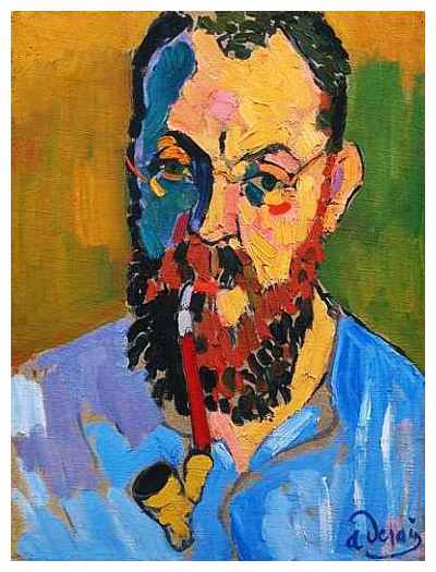
6. Texture: Impressionist harmonies and the uniformity of the texture of the surface, were eliminated in favour of deliberate dis-harmonies of style and colour. Fauve art paintings are dominated by bold, undisguised brushstrokes or markings. You can clearly see the strokes the painters used to apply colour to the painting. As a result, transition between adjacent colours is quite abrupt, as it is evident on Andre Derain’s portrait of Henri Matisse from 1905.
Andre Derain’s portrait of Henri Matisse from 1905.
The pure and unmixed colours were intensified further by applying thick daubs and smears. In Matisse’s Open Window at Collioure, for example, brush strokes also takes on a symbolic meaning; each level of space is characterized by a different type of brush-stroke. In this painting the brush stroke becomes a metaphor for the quality of time associated with the type of space. Flat areas of paint are used for the interior and architectonic spaces which have static time; curved short strokes for the plants around the window, and horizontal and vertical dashed lines for the ships at sea.
Matisse – Open Window at Collioure, 1905
Mountains at Collioure by André Derain
In the Mountains at Collioure by Andre Derain you can see the repetitive brush strokes which which gave the Fauves’ paintings a very rough, unfinished look compared to the other artwork at that time. You can also clearly see the influence of van Gogh’s brush stroke.
7. Perspective: Their disregard of three-dimensionality does not refer to disregard of perspective, as fauvist painters made use of the technique to depict depth in objects and landscapes. Instead, the issues that weakened the perception of depth on fauvist paintings were the seemingly autonomous bold strokes and the lack of subtle shading. This characteristic derives from the fact that fauvists’ priority was not the accurate representation of a surface’s appearance.In for example Green Stripe, Matisse used solid colours throughout, and used the intensity of his colours to create depth and shape.
Matisse – Joy of Life (1905 – 06)
Henri Matisse did several versions of his Joy of Life painting. In this version, the artist has used bold, flat, contrasting colors to create a work with much impact. His simplified figures with strong outlines . Foreshortening of perspective was also often used by Fauvists.
Definition: Foreshortening refers to the visual effect or optical illusion that an object or distanceappears shorter than it actually is because it is angled toward the viewer. Foreshortening occurs when an object appears compressed when seen from a particular viewpoint, and the effect of perspective causes distortion. Foreshortening is a particularly effective artistic device, used to give the impression of three-dimensional volume and create drama in a picture.
Foreshortening is most successful when accurately rendered on the picture plane to create the illusion of a figure in space.
8. Style/Composition The Fauves’ paintings were composed out of a reduction of the most basic and most powerful elements, drawing and colour. Their compositions were simplistic in form and made up of un-blended planes of bright and intense colour. Often in Fauvist paintings back ground and foreground are given the same focal point thus distorting the perspective, In for example Matisse’s “Open window at Collioure” the boats and the pot plants look like they are on the same plane of perspective – there isn’t a clear distinction between middleground and background, and in the Blue Nude the eye moves back and forth between the nude and background.
Matisse – Woman with a Hat, 1905
9. Light and Shadow: From Impressionism, the Fauve artists borrowed the negation of shadows by substituting intense colour for darkness. The resulting coloured shadows, that were really non-shadows, eliminated the academic division of tones.They emphasized the use of intense colour as a vehicle for describing light and space, but also for communicating emotion. In Matisse’s “Woman with a Hat” the light is for example suggested by the use of yellow in the background and on the face, rather than by the use of tints (white added) of the same colour as found in academic painting.
10. Line: Fauvists used expressive line – they did not use line to imitate the real, but like their use of colours, used line to express a feeling or the emphasize a form, or a shape that contributed to the feeling of a painting. Thick black Line, which often outlined forms were filled in with intense colours. Line was also often use as a decorative means as is seen in Andre Derain’s Dance or in Matisse’s Harmony in Red.