Posts Tagged ‘arts’

William Kentridge

Biography

I was six years old and my father was one of the lawyers for the families who had been killed (in the Sharpeville massacre). I remember once coming into his study and seeing on his desk a large flat, yellow Kodak box, and lifting the lid of it – it looked like a  chocolate box. Inside were images of a woman with back blown off, someone with only half her head visible. – Kentridge

To William Kentridge the box became a perfect metaphor for South Africa’s recent history. As an artist and film-maker, his life and career have been spent constantly contemplating and re-examinig South Africa’s recent history; the light and darkness that are both outside and within it and the essential incompleteness of its victims and those who observe or engage in this victimization.

Tide Table, 2003/04

Kentridge was born in 1955 into a wealthy Johannesburg family, descendants of Jewish refugees from the purges and pogroms of Russia and Europe.  (The term “pogrom” became commonly used in English after a large-scale wave of anti-Jewish riots swept through south-western Imperial Russia, present-day Ukraine and Poland, from 1881 to 1884.)  For generations the family had been deeply involved in politics and human rights issues in South Africa. Both his parents were lawyers, famous for their defense of victims of the apartheid.

From Felix in Exile, 1994

“My grandfather was a member of Parliament for 40 years. Obviously we’re talking here South Africa, a whites only parliament. I grew up in a family that was very involved with the legal battles against apartheid—the great treason trials in the 1950s and early ’60s, and later with the legal resources center that my mother founded. My father was involved with a number of very prominent cases that had political aspects to them, whether it was the inquest into the Sharpeville Massacre, the death of Steve Biko, or one of the trials of Nelson Mandela.” —William Kentridge

In 1976, he attained a degree in Politics and African Studies at the University of the Witwatersrand after which he studied art at the Johannesburg Art Foundation until 1978. There, he met Dumile Feni whose drawings had a major impact on Kentridge’s work.

By the mid-1970s Kentridge was making prints and drawings. In 1979, he created 20 to 30 monotypes, which became known as the “Pit” series. In 1980, he executed about 50 small-format etchings which he called the “Domestic Scenes”. These two groups of prints served to establish Kentridge’s artistic identity, an identity he has continued to develop in various media. Despite his ongoing exploration of non-traditional media, the foundation of his art has always been drawing and printmaking. (Ref)

Domestic Scenes, individual print of plate 3, the self-portrait of the artist on the sofa (1980). Mixed-method etching

Kentridge became involved in theatre by collaborating with the Junction Avenue Theatre Company and in 1979 he directed his first comedy entitled Will of Rebel based on the life of South African writer Breyten Breytenbach. He also worked as a set designer for film productions and taught design printing until he moved to Paris in 1981.

For three years Kentridge abandoned drawing to study mime and acting at the École Jacques Lecoq in Paris. In 1984 he went back to drawing and produced a series of large works on paper that showed the influence of his experience as an experimental filmmaker.

Kentridge Art in2

Art in a State of Grace, Art in a State of Siege, Art in a State of Hope, 1988, Silkscreen

 Between 1989 and 2003 Kentridge made a series of nine short films that allegorize South Africa’s political upheavals, gathered under the title Drawings for Projection.

 In 1992, he also began collaborating, as set designer, actor, and director of the Handspring Puppet Company. The Company created multi-media pieces using puppets, live actors and animation. It performed plays like Woyzeck, Faust and King Ubu that reflect on colonialism, and human struggle between the past, modernity and ethics.

 Throughout his career, William Kentridge has been involved in politics, fine art, theater, film, and television—moving beyond the specific political issues of  South Africa to address the human condition, exposing the nature of memory, emotion, and social conflict. (Ref)

Here’s a short documentary on Kentridge; influences, themes, symbolism, metaphors and techniques of his work. 

Part 1

Part 2

William Hogarth, Time smoking a picture, 1797

 Influences

Throughout his work one can identify a variety of artistic influences, both from South African as well as from the European continent. Kentridge has always had an ambivalent relationship to the influence of European art and culture, focused by his own German, Jewish and Lithuanian roots. The influence of satirists,  who provided critical commentary on their times and its social issues, such as Honoré Daumier, Francisco Goya and William Hogarth is clear. He also often used European classical themes as frameworks for contemporary South African subjects. Kentridge’s fusion of Expressionism, art and theatre finds its context in the interests of South Africa’s Resistance Art movement of the 1980s. (Ref)

Honoré Daumier, NADAR elevating Photography to Art, 1862

Kentridge’s obsession with drawing began when he met Dumile Feni.

Dumile Feni, The stricken household 1965

Dumile made remarkably strong demonic drawings, either in ballpoint pen on a smaller scale, or in charcoal on a large scale. That was the first time that I understood the power of figurative, large scle drawings – that they could be so striking … He had the capacity to express things on a scale that I thought drawings could not achieve. He is the key local artist that influenced me. – Kentridge

Dumile Feni, Horses, 1967

Dumile’s pivotal impact on Kentridge contrasts strongly with his youthful disinterest with the conceptual and minimal European and American art of the 1960s and 1970s, and specially the paintings of the New York School with which Kentridge was familiar with. To Kentridge the abstract expressionism of that era appeared to be stuck in abstractionist silence, apolitical and self-indulgent.

Non-figurative work look so apolitical to me, that painting seemed an impossible – Kentridge

South African General [ca. 1991], large drypoint print.

Geaorg Grosz

Kentridge thus went back into art history and found inspiration in the early 20th century German expressionist work of Max Beckmann, Otto Dix, Käthe Kollwitz, Ernst Ludwig Kirchner and Georg Grosz, the early 20th century French art and the Soviet filmmakers and designers of propaganda posters.

No escape from the people’s revenge! – 1941

Max Beckmann, Otto Dix and Käthe Kollwitz also used charcoal as a medium for social comment. According to Kentridge, for example,  his character Soho has its origins in the images of industrialists from Russian and the early Futurist propaganda drawings, of George Grosz and German Expressionism.

You behave!

Francisco de Goya , The sleep of reason produces monsters, 1799

Kentridge’s 1979 series of monoprints entitled the ‘Pit’ shows the earliest references to Goya both in the intentional awkward poses that the actors assume, and in the shadowy observers.

Max Beckman, Departures, Triptych,c.1944

His interest in the triptych format was inspired by Max Beckman and Francis Bacon. Beckmann, whose work express the agonies of Europe in the first half of the Twentieth Century reinvented the triptych and expanded this archetype of medieval painting into a looking glass of contemporary humanity.

Francis Bacon, Triptych 1973

In the triptych Kentridge recognized the possibilities to express his interest in the concepts of time, space, memory and change.

Firstly you have a series of images of the same place, but each is different because that space is occupied by a different center piece each time. Time has passed between each image, objects have been rearranged and even the viewpoint has changed slightly. Secondly, and far more importantly, is the dislocation of space … You set up the continuity between images and then refuse to let it happen. Working with drawings also has to do with story telling … There is no necessary continuity between the images. – Kentridge

Through the work he did as an art director on other people’s movies he realised that he could construct a drawing on the same principles that you would to  design a film; not be constrained by the normal demands of naturalistic perspective, space or lighting.

Kentridge’s films evoke the late silent cinema of Russian and German Expressionism, most directly in the predominance of black and white, the absence of dialogue, and the use of intertitles.

From Other Faces, 2011

Characteristics of his Work

Kentridge shows a distinctive vision of the complex history of South Africa, the legacy of apartheid and more broadly, the nature of human emotions and memory. Through his drawings, films, installations and sculpture, he reflects on the psychological landscape of South Africa which has experienced great upheaval, violence, racial and social injustice, the effects of colonialism and the politics of apartheid, and confronting acceptance of responsibility and the telling of truth.

Although Kentridge has created some works that directly refer to the political situation of South Africa during the late- and post apartheid era, the core of his artwork features a more complex framework for human thought and behaviors on an intimate level, filtred through his experience of Apartheid, the transitional period, and Post Apartheid.

‘I have never tried to make illustrations of apartheid, but the drawings are certainly spawned by and feed off the brutalized society left in its wake. I am interested in a political art, that is to say an art of ambiguity, contradiction, uncompleted gestures and uncertain things. An art (and a politics) in which my optimism is kept in check and my nihilism at bay.’ – William Kentridge

Though grounded in South Africa, his work resonates in more universal ways, exploring the relationship between desire, ethics, and responsibility, our changing notion of history and place, and how we construct and interpret these histories.

His interest in theatre continued throughout his career and clearly informs the dramatic and narrative character of his art as well as his interests in linking drawing and film. His work as a draughtsman has been expressionistic and dominated by pastel and charcoal, and generally the drawings are conceived as the basis of animated films.(Ref)

Exhibition curator Carolyn Christov-Bakargiev, described Kentridge’s work as ‘an elegiac art that explores the possibilities of poetry in contemporary society, and provides a powerful satirical commentary on that society, while proposing a way of seeing life as a continuous process of change rather than as a controlled world of facts’. Suzanne Blier calls his work poetic grenades.

Although he derives many images and forms from well known masterpieces of Western Art, Kentridge also uses found images from press photographs, advertisements or books.

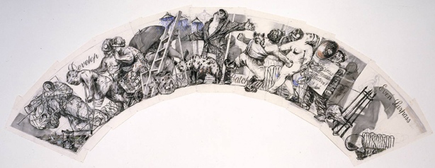
Arc/Procession: Develop, Catch Up, Even Surpass 1990

Themes

The overall theme of Kentridge’s works could be summarised as: how political realities impact on individual lives, or the extent to which politics does or does not find its way into the private realm. According to Kentridge his work is “a portrait of Johannesburg,” filtered through the internal conflict of an individual. His work explores colonial oppression and social conflict, loss and reconciliation, and the ephemeral nature of both personal and cultural memory.

“Forgetting is natural, remembering is the effort one makes.” William Kentridge

Memory and erasure / remembering and forgetting

Kentridge’s work focuses on the way forgetting and remembering are closely intertwined. He believes that past events fade into the distant background of our minds, yet our identity is shaped by this forgetting.

Kentridge’s technique of rubbing out parts of one drawing and making the next drawing over the top is a metaphor for this process of ‘disremembering’. This process has been coined by art critics as ‘partial erasure‘ because not everything in the drawing is erased. The resulting layers of partially erased marks could be interpreted as layers of memory as well as the traces of the past in the form of abandoned mining and civil engineering structures around Johannesburg.

Kentridge’s theme of remembering and forgetting is closely tied to events in South Africa, in particular the Truth and Reconciliation Commission. This tribunal was set up in 1996 to investigate the crimes committed under Apartheid. It had the duel role of ensuring that past injustices are not forgotten and to enable the South African people to move on. While the themes of remembering and forgetting are played out through individual characters in his films Kentridge presents this as universal condition.

Images from Zeno Writing, 2002

Images from Zeno Writing, 2002

Relationship between personal and public; Kentridge’s art explores the way personal issues mix with broader social and political questions. For example, Zeno Writing (2002) brings together drawings, documentary footage from World War I, and filmed cigarette smoke to ask two questions: How does one bring this external world into everyday life? And: How do the larger questions of the world become part of one’s psyche?

Shadows; Shadows began in William Kentridge’s practice as shapes cast by animated figures in his films. Later shadows become a subject matter in themselves.

Still from Journey to the Moon, 2003

Shadows are created using devices such as torn pieces of paper and everyday objects like a coffee pot or scissors which feature in his films and drawings. In Journey to the Moon (2003) for example, the shadow of a coffee pot becomes a space ship. The sculptural work Procession(2000) features 26 figures cast in bronze modelled on the shapes formed by shadows.

Shadow functions as an indirect or oblique view of something. It is used as a metaphor in Kentridge’s practice for the relationship between the past and the present, the often confusing space between what is ‘right’ and what is ‘wrong’ and the fact that we all carry the potential seed of our own demise.

The Battle Between Yes and No, 1989, Screen print

Kentridge’s use of Comedy and Satire; In Kentridge’s film some of his imaginative graphic transformations are comic or tragi-comic. In Sobriety, Obesity and Growing Old (1991) Soho Eckstein, the archetypal businessman, is lying in bed with his cat. The cat suddenly jumps on his face and becomes a gas mask.

His comedy plays on the contrast between rational outcomes and illogical expectations, or the reverse, confounding our expectations. What happens is unexpected or what is expected never happens.

Range of media in Kentridge’s art practice

While drawing is at the heart of his practice he works across a range of media and disciplines including writing, poetry, directing, opera, engraving, painting, printmaking, theatre design and acting.

His technique is linked to his thinking about politics and his worldview; “The thing with charcoal is you can find the form; you keep adjusting it, you rub it out, you redraw it”. This thinking and rethinking, drawing and redrawing, in the process of embodying a complex idea, is the foundation of Kentridge’s craft. For Kentridge “ drawing is a process of constructing meaning.”

The swiftness of his construction and the shifting provisional worldview that underpins it, is like living in South Africa.

Detail from Kentridge’s “7 Fragments for Georges Melies”

What does it mean to say that something is a drawing - as opposed to a fundamentally different form, such as a photograph? First of all, arriving at the image is a process, not a frozen instant. Drawing for me is about fluidity. There may be a vague sense of what you’re going to draw but things occur during the process that may modify, consolidate or shed doubts on what you know. So drawing is a testing of ideas; a slow-motion version of thought. It does not arrive instantly like a photograph. The uncertain and imprecise way of constructing a drawing is sometimes a model of how to construct meaning. What ends in clarity does not begin that way (Kentridge, 2003)

His style is sketchy showing obvious mark making, primarily in symbolic black and white. His use of primarily black and white not only focus his work on the narrative of the images, but it also reflects the divisions in a social political environment as well as personal internal divisions of his subjects. Although colour plays a relatively small role throughout his work, he incorporates traces of primarily red and blue in his work.

He chooses not to paint because in his view , the medium itself is too assertive; he is more interested in the narrative than in the work’s materiality. His working process itself is essential to the outcome. The drawing fluctuates in form, developing organically and changing, while his eraser acts as to accent, to edit and to modify the charcoal and pastel marks.

If (a) choice has been shattered between the two rooms, what space is between them, what kind of viable way can there be? – Kentridge – Stereoscope

Metaphors and Symbolism in his Work

By using metaphor the unknown is defined by the known. The onlooker thus recognizes a metaphor on the grounds of his existing knowledge and experience of the world and reality and he knows that the metaphorical statement to be literally impossible and/or feasible. (Ref)

Although Kentridge draws on his perceptions of the South African experience, his expression of his themes is humanist and reflects issues beyond South Africa’s contemporary history. He communicates by means of metaphors; and with repeated use, his pictorial motifs have become a personal hieroglyphic code, a shorthand conveying multiple messages and performing varying functions in the narrative. The inconstancy of ironic meanings, the deliberate conceptual ambiguities and the wealth of artistic allusions all contribute to the density of his texts. They remain open to alternative interpretations, but they become more legible to viewers who are familiar with his work.

Light and Dark; To Kentridge the physical and metaphysical qualities of light, dark and shadows is a way of thinking about the world and how perspectives of memory is gained or lost in the passage of time.

From Stereoscope" (1999)

From Stereoscope” (1999)

Metamorphosis: In Kentridge’s films the function of metamorphosis is to connect different events, plots and images, which in turn connects different scenes of time and space. Through the transitional stage of metamorphosis, the gap between the illogical or unexpected images unfold without obstacle.

Shadows in Kentridge’s work, implies a split self; reflecting the roles we play in life and the illusory ideal self, similar to the Jungian psychological concept of shadow, for example; his characters Soho and Felix are two different sides of one character rather than two fundamentally different characters.

According to Kentridge, “one‟s relationship to one‟s own shadow – which is not the same as oneself, which one does not own, but which is an inescapable attribute and accompaniment” is a “midpoint between a familiar self and the otherness of the rest of the world”.

From – Stereoscope

Objects and architecture in his work most often date back to the 1950s period, reflecting according to Kentridge, that a lot of his work is trying to mine a childhood set of responses to the world.

The first time you see a picture of violence there is a kind of shock that you don’t get once you’ve seen thousands of pictures like this on television. There is an element of trying to go back to an earlier stage, of trying to recapture the sensitization, and I think part of the images of drawing backwards in time has to do with trying to capture a different way of seeing. (Ref)

From – History of the Main Complaint, 1996

The act of looking, is a crucial motif in his art practice. Literal examples of this motif are the pair of eyes reflected in a rear-view mirror in The History of the Main Complaint or the colonial land surveying equipment through which Nandi and Felix Teitlebaum view each other in Felix in Exile. For Kentridge, however, what one chooses to represent in the world has always been as valuable as how one chooses to represent it.

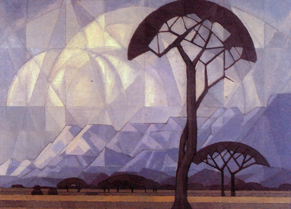
His series of animations were called  Drawings for Projection. which is a concept, according to Kentridge, of how an object is viewed. A tree for example has as many projections as it is viewed. Each person sees the same object in a different way, so that one object may have thousands of projections. Reversely, for Kentridge each one of us is also a projection station.

From – Felix in Exile, 1994

For Kentridge “what we do when we look through a camera lens” can be regarded “as a metaphor for what we do when we look through our own lives”: we may “understand the artificial nature of looking through a camera, but we don‟t understand the unnatural activity of looking when we are just looking, how when we look it is not simply a matter of the world coming into us, but it is us constructing the natural world as we understand it.”

Camera (Central Boiler Station), 2010. Indian ink, charcoal and pastel on page from central boiler station ledger book.

Drawing from Tide Table: Officers with Binoculars. 2003

Other objects used for viewing, like the stereoscope works as a surrogate for the camera. Like the X-ray, the theodolite, the M.R.I., the cat scan, binoculars, and other instruments that have appeared in his works, which represent different ways of seeing, and different ways to represent the world. To Kentridge this is a way of understanding the world through a representation; an actual X-ray or M.R.I., again, is one way, and the stereoscope is another way to understand the world.

The megaphone, that often appears as part of his iconography was inspired by seeing Lenin using a megaphone. A megaphone is also an object that have become iconic in resistance art images. In Kentridge’s work the megaphone may stand for a symbol of faceless power and dictatorship or may simply represent the artist’s own voice.
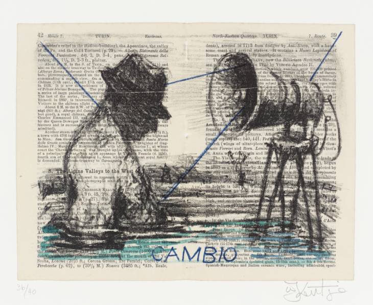
Cambio 1999

Self-portraiture; The incorporation of Kentridge’s own figure, is never simple self-portraiture, but a means whereby the artist acknowledges personal and collective responsibility. It is also a clear declaration of a preoccupation with the human condition that makes his work both social and general.

William Kentridge. Drawing for the film Stereoscope, 1998–99

Presenting the male figure in the nude implies that the character is unconventional, or ‘outside culture.’ In contrast with accepted norms, where it is ok to depict women in the nude as representations of beauty, it is more important for white men to be clothed.

Characters; Many of the characters in Kentridge’s films become symbolic representations. The characters of Ubu and Soho Eckstein symbolise an Apartheid vision of South Africa and the darker side in us all.

Kentridge’s films generally focus on individual characters. Thus thematics in Kentridge’s art evolve through the device of characterisation. There are two main characters who appear in most of the films: Soho Eckstein who is a Johannesburg industrialist and Felix Teitelbaum who is the sensitive poetic type and an artist. While Soho and Felix are drawn as separate characters, they represent different sides of the same person and more universally our own alter egos.

Other characters include Faustus and Zeno, both tragicomic figures who struggle with their own idea of themselves as opposed to how they appear to others.

Another two important characters in Kentridge’s films include Nandi, and Harry who is the leader of the poor and oppressed.

William Kentridge, An Embarkation. Charcoal on paper, 1988

Landscape: Kentridge has written extensively on concepts of landscape and memory. Kentridge draws a parallel between the exploitation of the natural landscape and that of South Africa’s people under Apartheid. History, memory, geography and identity constantly shift and change.

‘Drawing is not unlike the structure and evolution of the South African landscape.’

He has discussed the long tradition of the South African landscape in paintings and in particular the celebratory landscapes of Jan Volschenk (1853-1936), and J.H. Piemeef (1886-1957). Kentridge calls their versions of the South African landscape “documents of disremembering.”. He has also cited how the landscape of Auschwitzbears bears little to no trace of the World War II carnage. In early “American” painting and the Hudson River School, acts of disremembering were the feature characteristics of the art. Idyllic settings provided a corollary to American ideals of Manifest Destiny and the taming of the rustic outdoors, including the Native Americans in their way. It is in this light (or shadow) that Kentridge’s work can be seen. (Ref)

From Felix in Exile

“The landscape hides its history . … there is a similarity between a painting or drawing—which is oblivious to its position in history—and the terrain itself, which also hides its history”. By creating “imperfect” works filled with smudged images and traces of what has been erased, Kentridge’s work counters this “hiding” or absorption of history by the landscape.

In an introductory note to Felix In Exile, Kentridge writes, “In the same way that there is a human act of dismembering the past there is a natural process in the terrain through erosion, growth, dilapidation that also seeks to blot out events. In South Africa this process has other dimensions. The very term ‘new South Africa’ has within it the idea of a painting over the old, the natural process of dismembering, the naturalization of things new.”

In his work he never forgets the bodies that are now only streetlamps or steel girders.

In his open landscapes, such as in the Embarbarkation for example, the vista and the endless space sets a mood of loneliness and loss.

‘Felix in Exile’ (Death of Nandi), 1994

The film Felix in Exile (1994) which was made just before the first  general election in South Africa, and questioned the way in which the people who had died on the journey towards South Africa becoming a democratic state would be remembered. He uses the landscape as a metaphor for the process of remembering and forgetting. For example in Felix in Exile, Nandi, observes the land with surveyor’s instruments, watching African bodies, with bleeding wounds, which melt into the landscape. She is recording the evidence of violence and massacre that is part of South Africa’s recent history. Kentridge thus makes the connection between how landscape forms and erodes and how our sense of history (i.e. what is remembered and what is forgotten) is malleable.

Red: In “ Felix in Exile, ” red color is used extensively in Nandi’s depictions of landscape. The places where the corpses lay, as well as their wounds, were marked clearly in red. Red symbolizes blood, wounds, death, and violence. For example, when Nandi was shot down on the ground, the blue water flowing down from the faucet turned red. It is a declaration of Nandi’s death. The dark red blood flowing out from the old wounds of the unknown corpse is a silent narrative of South Africa’s violent history

Blue: Blue is associated with peace, waiting, hope, retrospection, and sorrowfulness. In “ History of the Main Complaint, ” a pail with blue water is placed in a corner close to Soho’s bed in the hospital. Here, blue water symbolizes redemption and hope.

Stereoscope,” 1998–99

Water: In his dominant palette of black and white, the occasional touches of blue often signifies water and water’s ambiguous sensual fluidity and capacity to renew. Blue water further symbolises emotions, emotional connection and healing in his films.

Felix in Exile, the flood of blue water in the hotel room, brought about by the process of painful remembering, symbolises tears of grief and loss and the Biblical flood which promises new life. (Ref)

… mental pictures are like reflections in water … the reflection is not like  the original, nor the images like the real object – Aristotle

Another possible symbolic meaning of water is “ seeing one’s own reflection. ” This echoes - that everyone is seeking his/ her missing half. To him, the so-called “ missing half ” is the forgotten memory and conscience, in other words, the kindness and innocence inherent in humanity.

In Kentridge’s films, water, dream and drawing imply each other. They are metaphors for love that is out of reach, forgotten memory and history, dreams in the past and future, eternal redemption, or the missing half.

Fish: Within the context of Johannesburg 2nd Greatest City after Paris water as an element becomes, a medium for sensuality and freedom and the fish becomes a metaphor for love. The fish symbol is also repeated in Kentridge’s other animation films. (Ref)

http://www.artthrob.co.za/05editions/profile014.html

Untitled, 2007 Lithograph and collage

Rhino; The rhino is a symbol of an exploitative, colonialist view of Africa, a symbol for the subjugation of a continent stripped of its natural resources for European benefit. This was developed previously in an earlier animation, Mine (1991), in which Soho Eckstein, the mine owner, digs up a whole social and ecological history out of the earth and receives a miniature rhino from the miners, African heritage reduced to a trinket, as he drinks his morning cup of coffee.(Ref)

Hyena; The symbolism of hyenas in South Africa is associated with evil, dark spirits and mischief. It became a prominent symbol in Resistance art in South Africa, as symbols of repression and oppression, and often stand in for oppressive authorities.

kentridge other faces 2

Technique used in his animated films

Animation literally means to bring to life. This happens when still images or
drawings are combined to simulate the illusion of movement. This technique
literally personifies the drawings or photographs to tell the story by means of
the visual element. Dialogue, sound and colour can be added to enhance the
illusion. (Ref)

Drawing is a testing of ideas – a slow-motion version of thought. It does not arrive instantly like a photograph. The uncertain and imprecise way of constructing a drawing is sometimes a model of how to construct meaning. What ends in clarity does not begin that way. Kentridge

The animated films of William Kentridge evolved when he decided to record the process of creating a drawing. Rather than starting with an idea that is then executed, Kentridge relies on these freeform processes and the resulting juxtapositions to find connections and raise questions. (Ref) He does not work out the story board of the film before he begins, it rather develops in the process of making the film, or in the process of making a drawing. According to Kentridge, all his work begins with the impulse or the desire to draw.  His technique is more about making a drawing than making a film.

He uses a sheet of paper hanging on the wall, onto which he makes drawings that will be modified and photographed hundreds of times. Unlike the commercial technique of cell animation, which uses a new drawing for every frame of film, Kentridge’s animation technique is simple and primitive: he draws and adjusts his rough charcoal drawings in succession  by the -introduction of new marks (re-drawing), or the erasure of pre-existing ones by using an eraser or a cloth. He then shoots one or two frames, goes back to the drawing, changes it, goes back to the camera, and so on. By erasing certain areas of a drawing and re-drawing, he creates the next frame.

There are not thousands of drawings, as you would have in commercial animation technique, only 20 to 40 different ones, which are the key frames for the major sequences.

To shoot the next scenes, he reworks a drawing or draws a new one and continues the filming process. By using this sequential animation technique, Kentridge creates movement within the context of time and space. Several of these large drawings may be needed for a single scene. Through this process,  a whole new set of drawings are created that Kentridge believes he would never have arrived at otherwise. The actual filming process becomes a way of arriving at a set of drawings. (Ref)

The elements of line and tone, especially in the broad strokes of his large drawings, are equivalents for, rather than simulations of the reality that a pictorial language based in colour would produce.

His erasure technique leaves grey smudges, ghost images and traces of the whole progress of each sequence on the paper. Filming not only records the changes in the drawing but also reveals the history of those changes. Traces of what has been erased are still visible to the viewer. As the film unfolds, a sense of fading memory or the passing of time and the traces it leaves behind are portrayed. These traces capture the passing of time and the layering of events in remembrance, so that it becomes a metaphor for how events fades in memory, or how all that is left of historical events in the landscape is just traces. (Ref)

Kentridge’s drawings explore the borders between memory and amnesia, drawing and erasure. The process of re-drawing and erasure means that each drawing is poised in a state of uncertainty. Each stage of the drawing carries with it the visual memory and history of its recent past. (Ref)

His technique is likened to palimpsests, or also called  inedited technique. This animation on a palimpsest allows for great freedom in developing the concepts of history, memory, loss, and renewal, all of which arise in Kentridge’s examination of the social climate in South Africa.

In all of his animated works the concepts of time and change comprise a major theme, which he conveys through his erasure technique. Unlike the  conventional cel-shaded animation, whose seamlessness de-emphasizes the fact that it is actually a succession of hand-drawn images. Kentridge’s technique grapples with what is not said, what remains suppressed or forgotten but can easily be felt. (Ref)

http://www.art21.org/anythingispossible/slideshow/on-animated-films/

William Kentridge. 9 Drawings for Projection (1989–2003), 2005.

Synopsis and Background of Drawings for Projection

Between 1989 and 2003 Kentridge made a series of nine short films that allegorize South Africa’s political upheavals through the lives of three characters: a greedy property developer, his neglected wife and her poet lover. He eventually gathered the films under the title Drawings for Projection. In 1989, he began the first of those animated movies, Johannesburg, 2nd Greatest City After Paris. The series runs through Monument (1990), Mine (1991), Sobriety, Obesity & Growing Old (1991), Felix in Exile (1994), History of the Main Complaint (1996), Weighing and Wanting (1998), and Stereoscope (1999), up to Tide Table (2003) and Other Faces, 2011.

Over the course of the films, Kentridge tells the story of Soho Eckstein, Mrs. Eckstein and Felix Teitlebaum. The early films focus on Soho’s expansion of his mining empire on the outskirts of Johannesburg and his struggle with Felix Teitlebaum over his wife. In Sobriety, Obesity & Growing Old, the loss of his wife induces feelings of personal as well as social guilt. The fifth film (Felix in Exile) focusing on Felix entirely, and the next three turn back towards Soho and his struggle for forgiveness. Finally, in Stereoscope, Soho’s industrial success is undone by violent uprisings in the street, but he has regained the love of his wife. This brief synopsis of the films describes the framework, upon which Kentridge creates layer upon layer of meaning. (Ref)

The individual is taken as the starting point, around which Kentridge weaves the complexity of South African life during apartheid and post-apartheid into the narrative. In addition, this individual refers more than once to Kentridge himself, introducing an autobiographical element in his artwork. Telling the story starting from the trivial daily life of the three characters not only serves as an attractive feature for the audience, but also allows a symbolic interpretation indicative of the tunnel vision of a South Africa under international siege at the end of the Apartheid.

‘By the time this film [Johannesburg, 2nd  Greatest City after Paris (1989)] was made, worldwide pressure on South Africa to abolish the apartheid system had reached perhaps its greatest intensity, with any number of cultural and economic boycotts in place to isolate the nation as much as possible until it did so. By creating a film in which the main characters are caught up in seemingly pointless brooding about their personal affairs, Kentridge makes an important point about the peculiar form of tunnel vision characteristic of societies under siege. – Dan Cameron

The last three films explicitly tackle issues of memory and guilt. This story line cannot be interpreted without regarding the establishment of the The Truth and Reconciliation Committee, set up in the National Unity and Reconciliation Act of 1995. The Commission was established to provide a public forum for the victims of state racism to confront their perpetrators and to have the brutality of apartheid publicly exposed and admitted. The goal was to provide ‘as complete a picture as possible of the nature, causes and extend of gross human rights violations committed between March 1 1960 and December 5 1993.’

Without explicitly referencing to  the activities of the committee, it is clear that the story line of Kentridge’s film cycle has been consistently – be it consciously or subconsciously – been influenced by its existence.

While every film, as a separate entity, which allows for a number of connotations, one can distinguish the most significant layers of political meaning in the recurring themes  (Ref)

Images from Felix in Exile

Felix in Exile, 1994

In Felix in Exile, the fifth film of the series made between September 1993 and February 1994, Kentridge depicts the barren East Rand landscape as witness to the exploitation of and violence against both natural and human resources. Isolated in a hotel room, Felix peruses the survey charts of Nandi, a young black woman who maps the history of the terrain. Figures and structures are subsumed into the landscape or night sky, allegories for how the land can bear the scars of crimes against humanity.

Through his two main protagonists, Felix Teitlebaum (a sensitive, artistic everyman) and Soho Eckstein (the stereotypical empire-building businessman), Kentridge collapses the usual moral distinctions between irresponsible capitalist and socially-aware artist, between the perpetrator of injustice and the awakening social activist. As the distinction between the two characters blurs, we are made aware of the probability that impulses normally considered to be polar opposites coexist within an individual.

Created right before the first general elections in South Africa, Felix in Exile examines the nature of national memory when faced with the sacrifices made to reach that point in contemporary South Africa. In the film, Felix meets Nandi, an African woman surveying the death and destruction after a brutal massacre, against a landscape that threatens to absorb the bodies and erase all traces of their existence.

This film warns that people are covering up or choosing to forget the realities of the past as part of their creation of a new South African identity. Felix, the well meaning, if slightly ignorant artist, awakens from his naïve reverie to a fuller grasp of this harsh reality. Nandi serves here as a metaphor for the painful but necessary process of remembrance. Additionally, this work points out the similar properties of both landscapes and paintings, which both depict a certain reality while concealing the history of their development. (Ref)

Drawings from History of Main Complaint

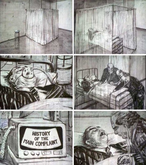
History of the Main Complaint 1996

Kentridge created the sixth film History of the Main Complaint in 1996 during the initial hearings of the Truth and Reconciliation Commission, at which apartheid’s crimes were first publicly admitted while the perpetrators were granted indemnity in the hope of healing profound social and historical wounds in this post-apartheid society. In the film Soho lies comatose in a hospital ward, suffering from the weight of his past acts as well as those for which he is implicated due to his race and class. MRIs and CAT scans reveal his affliction, as memories of violence committed against black South Africans float across the screen. The relationship between individual and collective guilt is played out when Soho regains consciousness only through acknowledging his own responsibility. (Ref)

Kentridge began this film as a project to determine the feasibility of combining his unique style of charcoal animation with the music of Monteverdi, alongside an exploration of modern scientific methods of examining the body. What begins in the film as an examination of Soho’s comatose body evolves into a journey through his memory in which his persona seems to merge with Felix’s as he surveys scenes of death. In one scene, he relives an accident in which his car struck and killed a man. It is the realization of his responsibility for this death that finally brings him back to consciousness. When the hospital curtains are withdrawn, however, we find Soho back in his office, and it is unclear whether his journey has changed anything. This medical exam serves as an allegory for the reconciliation process, whose ultimate moral effectiveness is unclear. Of particular interest is the fact that his examiners are also in pinstriped suits (Soho’s industrialist uniform), perhaps suggesting their complicity and thus shared responsibility with their patient. (Ref)

Automatic Writing, 2003

By Isabel Baraona

 Automatic Writing was made 2003. Within Kentridge’s work, Automatic writing can be interpreted as an allegory of the intimate and fluid relation between story telling through image and/or words. According to Kentridge, the sequences with several successive transformations of words, numbers, isolated letters or sentences in other elements, work as a calligraphy associated with “automatic writing”. Automatic writing was a common method used by the Dadaists and Surrealists’ to write poetry or to draw images. In the XIX century it was used by mediums to get in contact with spirits of the diseased; and also, as an instrument of psychoanalysis  since it easily allows the “user” to get in touch with his or her subconscious.

The content of Automatic writing is unmistakably self-referent in many levels and it can also be seen as implying the importance of his wife’s Anne presence in the atelier. William Kentridge explains the role played by this female figure: “(…) she gets drawn into the words and disappears again and drawn in to words and disappears again and the third or the fourth time it grows into me next to her. (…) she disappears back in to words and a self-portrait kind of representation is left at the table.”

She plays a more indefinable role than the conventional “muse”; her presence in the studio also works as a metaphor for the emotional inner-life, a mediator between public and private space.

Analysis of Works

To analyse, or to read any of Kentridge’s works, you need to be familiar with his oeuvre, his metaphors and symbolism which serves like key to his personal alphabet. You will see the same metaphors and symbols repeated throughout his works, in different contexts, which are all placed in context of the South African History, within the framework of Johannesburg and his personal experiences of the events. Each mark is a trace and reference to things of the past – thus history. His individual artworks cannot be analysed in isolation, but must be seen in context of the rest of his works.  Kentridge’s prints are often starting points for further explorations in his other works.

The Conservationist Ball;

The Conservationist Ball; Culling, Gamewatching, Taming,1985

His interest in in the triptych format was inspired by the work of Max Beckmann and Francis Bacon. The triptych format was ideal for his interest in story telling, the progression of time and social commentary.

This large triptych displays many of the features that distinguish William Kentridge as an artist.  It is primarily in symbolic black and white. His use of primarily black and white not only focus his work on the narrative of the images, but it also reflects the divisions in a social political environment as well as personal internal divisions of his subjects.

It also is not strictly a painting, though subtle elements of gouache is incorporated, which provides a minimal touch of colour to the predominantly black and grey imagery. But neither is it decisively a drawing. The ambiguity of technical procedure is a distinctive feature of Kentridge’s artistic personality and a link between his cinematic and pictorial work. This triptych also contains many of the metaphors and symbols that appears in his later animations.

Characteristically, he establish an evocative setting, an emotionally charged ambiance in which the scenario unfolds. In Culling and Gamewatching, the atmospheric space is a deep, receding interior. In the third panel, Taming, the setting is a claustrophobic deep, alley with steep sides of barricaded city walls, filled with wrecks of cars, creating a feeling of a post apocalyptic scenario.

The pictorial elements of the three scenes include recurrent Kentridge motifs and metaphors: men in evening dress, symbolic beasts like the rhino, cheetah and the hyena. Included in panel I is a camera and in panel II, binoculars, metaphors for the act of looking, which is a crucial motif in Kentridge’s art. Typically also, is his partial self-image, which is reflected in the mirrors of Panel I and II and on the billboard in Panel III. To Kentridge the incorporation of his own figure, is never simple self-portraiture, but a means whereby he acknowledges personal and collective responsibility. It is also a declaration of a preoccupation with the human condition that makes his work both social and general.

The characters in the Conservationist Ball are preoccupied and self-contained, connected to the world outside through their private drama only by the mirrored presence of the artist, the unobserved eavesdropper. In contrast the hyena in Panel III stares out accusingly and meets the viewer’s gaze head on.

The satirical substance of the title and subtitles is communicated in various subtle details of the scenes enacted, in iconographical allusions and in visual puns:

Diego Velazquez, Las Meninas, 1656

Panel I, Culling, in which repeated echoes of Velazquez’s Las Meninas add overtones of secondary meaning is set in an artist’s studio. He uses a dramatic perspective, which adds to the feeling of intrigue and discomfort of the image. It depicts a moment in an enigmatic human drama, in which hypocrisy, infidelity and callousness each seems to play a role.

Panel II, Gamewatching, shows the careless pleasures of the Café Society, but puns on their diversions – the nature of the game, the trophies of the hunt.    The rhino is a symbol for Kentridge of an exploitative, colonialist view of Africa, a symbol for the subjugation of a continent stripped of its natural resources for European benefit.

Panel III, Taming, shows the outcome of panels I and II, and depicts a  commentary on the consequences of human folly. Its visual theme is a decaying city artery, clogged with the remnants of a reckless past. The only living creature of this unnatural habitat is a scavenging hyena – survivor and temporary monarch of the urban wilderness. The symbolism of hyenas in South Africa is associated with evil, dark spirits and mischief. It became a prominent symbol in Resistance art in South Africa, as symbols of repression and oppression, and often stand in for oppressive authorities.

Familiar with the social satire of William Hogarth (1697-1764), whose work he had emulated with his own parable of Industry and Idleness in 1986-7, Kentridge brought this treatment to the current South African situation,  exposing the effects of ‘superior’ colonial culture on the landscape of South Africa which it has exploited, referred to in the Tamming, where the environment has been ‘tamed’ to become a desolate wasteland.

The Boating Party, 1985

The Boating Party, 1985

In the charcoal and pastel triptych, “The Boating Party” (1985), Kentridge recalls the title of Pierre-Auguste Renoir‘s Luncheon of the Boating Party (1881) but the charm of the Impressionist Paris, has given way to Kentridge’s vision of a city in which the duality of man is exposed.

Auguste_Renoir, Luncheon of the Boating Party, 1880-1881.

Auguste_Renoir, Luncheon of the Boating Party, 1880-1881.

This triptych depicts a  Café situated in an outdoor pavilion and the scene suggests the ambience of upper class society. Details draws freely on impressionist art; well-dressed couples dance or are served by waiters, binoculars rest on tables, and numerous other details recall the  Café and theater scenes of Renoir and Dega. Just as Kentridge recently left Paris and returned to Johannesburg, when he created this work, the overlay of French Café  Society is swept aside in a flood of grotesque images, specific to South Africa.

The art historical implication of the title is immediately overridden by the rendering of the scenes. As opposed to the idyllic scene of Renoir, the scene has changed to one of horror. Amidst the revelry we see panting dogs and raw meat atop tables, and behind the back of the elegant woman a burning tyre falls, a clear reference to “necklacing” and the violent political situation in South Africa during that time.

The dinners still seem to be languid, at ease. In the first panel of the triptych, a woman with a particularly haughty expression clasps a warthog like a lapdog, but the waterhog which appears in the first panel is cut up and appears as a jelly in the third.

This contrast between the wealthy privileged lifestyle and the chaos and violence in the townships is further reflected in the use of charcoal and pastel and choice of colours. His use of soft pastels forms a stark contrast with the background violence and heightens the feeling of unease one feels when looking at the art work. His line drawing is also soft and flowing in the women but sharp and rough beyond the fences, in the dog and the burning tyre.

His use of charcoal as a medium with the minimal colour provided by pastels has a historical reference to the early 20th centuary where it was used as a medium of social comment by artists like, Max Beckmann, Otto Dix, Kathe Kollwitz and South African Artist Dumile Feni. He however not only uses it for social commentary but also for its softness and quickness on paper. The black and white and shadows itself serves as a metaphorical comment on the divisions in society and the Jungian psychological concept of the shadow of the divided self, which he would explore further in his animated movies.

The angular composition is emphasized by the turquoise railing which also serves a device of continuity in throughout the three panels.

By borrowing historical art themes, Kentridge not only translated modern art and culture to South Africa, but also encapsulated his feelings concerning his troubled homeland under Apartheid and his mixed feelings about political art, resulting in ambiguity and contradictions.

kentridge casspirs_full_of_love 2b

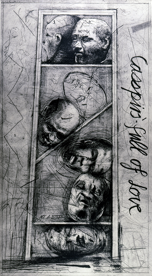
Casspirs full of Love, 1989

Casspirs Full of Love, appears deceptively simple compared to the complexity and baroque – like compositions of his earlier triptychs. Neither does it have the depth of perspective of his earlier works. At face value it appears to be a still life depicting a vertical structure resembling a shelved box containing seven severed heads, reminding one of a cabinet of curiosities, or a shelf of heads in a museum waiting to be catalogued. Yet, like his other works, it is far from static and has multiple layers of meaning referring to Kentridge’s rejection of all forms of tyranny. To use one of Kentridge’s expressions; ‘”A whole blackboard of equations reduced to a single line.”

The drypoint intaglio was based on a poster-sized drawing Kentridge made in 1989, on the occasion of his solo exhibition. The title appears in sloping, cursive handwriting on the right side of the image running vertically from top to bottom. ‘What comfort now?’ is written in dots on the left side. Above the first rung-like horizontal partition of the box the words ‘not a step’ is written. The head at the top bears the number 1. The two heads in the narrow, top partition appear to have more western features than those below, which look African.

On the surface, this print refers ironically to the state of emergency prevailing in South Africa during the turbulent political and social climate of the late 1980s , when the revolt against the the Apartheid system was in full swing and the government was under pressure both from external and internal sources. Despite the state of emergency which gave the security forces broad powers to arrest and detain suspects at will, leading to many state-sanctioned murders, as well as banning the media from documenting the racial unrest, there was large scale social unrest and mass demonstrations. The MK (Umkhonto we Sizwe –  Spear of the Nationmilitary wing of the ANC ) also carried out some bombings of civilian, industrial and infrastructural sites during this time.

The title of this work refers to a radio message on a popular radio program for South African troops, in which a mother wished her son in the army on the South African border ‘a good tour of duty’ and ‘a safe return’: “This message comes from your mother, with Casspirs full of love.” Kentridge plays on that irony by forging the association between the heartfelt wishes and the cabinet full of decapitated heads, which refers to the duality that existed within South Africa.

Casspirs are armoured military vehicles; their name is an anagram of the abbreviations CSIR (Council for Scientific and Industrial Research – the organization that developed them) and SAP (South African Police). The Casspirs were mainly used by the police force and were used first to protect its borders with Angola and Mozambique and later by the to quell riots and demonstrations in the black township communities in South Africa during states of emergency imposed by the apartheid government. The army used mainly Buffels.

The Casspir, became emblem of the violence, oppression and injustice of Apartheid, a way of repressing all hope and faith. In the left hand bottom corner is an outline of a hammer. The hammer symbolises destruction, and deconstruction; that which destroys certainty, embematic of the uncertainty and turbulence of the 80s in South Africa.

‘Casspirs’, were designed and built by the South African security forces. Police would fire shotgun rounds, rubber bullets, tear gas, or water cannon from them.

Kentridge captures the tension between the violence employed by the Casspirs and the message of love sent by friends and family to conscripts in the security forces; contradictions inherent in the apartheid state. This tension is echoed on an aesthetic level through the highly charged, textural surface of the print, contrasted with the soft cursive of the inscription.

Tension is also created through the compositional elements as the ladder like structure appears skew and off balance, so that the picture does not feel static, even though it depicts inanimate objects. This dynamic, rather than static feel of the etching is further emphasized by the scratchy aesthetic of his lines and the strong zig zag line to the left which echoes the diagonal slat in the center of the structure, where the severed heads seem to balance precariously causing  a feeling of discomfort with the viewer. The head in the center is surrounded by lines that gives the effect of of ripples in the water or a feeling of movement. The whole of the image has a feel of instability, reflecting the instability and turbulence of the times.

Through technique of drypoint that is based in drawing, and allows for revision, layering, looseness and speed of illustration, Kentridge  retains his characteristic scratchy, sketch aesthetic range of expressionistic mark making and the free, gestural effect of his smaller drawings and animations.

To Kentridge the technique itself alludes to the historical aspects associated with the medium. Intaglio has a history as a democratic, easily distributed medium.  Artists like Francisco Goya and Otto Dix used etching to satirize the powerful or to illustrate government related atrocities (Ref)

The obvious interpretation is that heads belongs to those killed in riots and demonstrations. The words ‘not a step’ both confirm and deny the ladder-reading of the image, urging us to look deeper. Kentridge’s metaphors are deliberately ambiguous and can be read on multiple levels and often refer not only to one event in time.  Heads in a shelf-like structure  in a desolate landscape, also appears in his movie “Johannesburg, 2nd Greatest City after Paris,” 1989. Here again the heads refer to those slain in revolt.  But why the shelf-like structure?

kentridge jhb heads

William Kentridge, “Johannesburg, 2nd Greatest City after Paris,” 1989. Production stills

Its meaning becomes clearer in Black Box / Chambre Noire which is Kentridge’s reflection on the history of  the 1904 German massacre of the Hereros in Southwest Africa (now Namibia). The heads of some of those killed were sent back to the Berlin Institute of Physical Anatomy, to be measured, catalogued for scientific research. An estimated 3,000 skulls were sent to Germany for experimentation. These heads were only recently returned, like Saartjie Baarman’s remains.

images from Black Box/Chambre Noire, 2005

 In the 1991 film Mine, there is also a scene where the miners sleeping on concrete  bunks are depicted to look like heads on a shelf, which in turn visually links to the well known diagram of slave ships.  It is also linked to the title sequence of Mine where a head ambiguously appears to look either like a miner’s head wearing a lamp, or a crowned antique Ife head from Nigeria . The head as icon therefore not only alludes to the victims of revolts against Colonist and Apartheid rule but also alludes to an exotic tourist or colonial view of Africa’s otherness. The structure in this context can then also allude to a cabinet of curiosities or a museum shelf.

Sequence from Mine 1991

Sequence from Mine 1991

http://africa.si.edu/exhibits/evidence/kentridge1.html

Mine Shaft and Slave Ship, 1991

Opening frame from Mine – a miner’s head wearing a lamp or a crowned antique Ife head from Nigeria?

kentridge mine

See the Mine on Vimeo

The Structure can also be linked to the slave ship diagram, illustrating the most economical way of transporting slaves, and the ladder like descend of the mine shaft, as a metaphor for the social-economical structure and conditions in South African and the colonial rule since 1900 and thereafter. It therefore not only refers to a specific incident or example but also the general principle on which a whole capitalist system was abused and maintained, with little or no concern for the social issues involved. (Ref)

Unlike Kentridge’s other animation films, Mine differs in that it presents a vertical cross-section of a mine. A lift carries the workers up the mining shift, out onto the land, which is metamorphosed into Soho’s bed. The film constantly shifts from below to above and vice versa to portray the contrasting surroundings and situations.

This vertical compositional element is also found in the composition of Casspirs full of love, where the ladder-like structure is both the center of the composition and focus, reminiscent of the vertical ascent or descent of Mine. The title is also written vertically, bringing more emphasises to the vertical structure. The structure further divides the composition between right and left side, reflecting the equivalent of the political separation in South Africa .

The vertical structure also suggests key themes of Kentridge’s work – that of memory and the irony of the Western World’s impulse to bring knowledge and light to the dark continent and its tragic consequences in the exploitation of Africa’s resources and its emphasis on the ‘otherness’ of Africans.

In much of the early literature on Africa the nature of the Europeans’ mission was described as the bearing of gifts of civilization, Christianity, peace, justice and good government to the natives. The four C’s – Commerce, Christianity, Civilization, Colonization – were deemed by many liberal-minded Europeans to provide the most effective recipe for the transformation and regeneration of Africa. (Ref)

The structure’s likeness to a cabinet of curiosity brings to mind the historical association of cabinets of curiosities as a microcosm or theater of the world, and a memory theater. The Kunstkammer, or cabinet of curiosity, predecessors of modern museums, conveyed symbolically the patron’s control of the world through its indoor, microscopic reproduction. (Ref) This connection further strengthens Kentridge’s focus on the underlining causes of the situation in South Africa.

In Mine (also a play on mine as personal possession) when Soho depresses the coffeemaker’s plunger, he initiates a journey to the center of the earth: the plunger drills a deep shaft into the mine of the title, into the shadowed realm that underlies our doing, our thinking, our aspiring. Each stratum passed by the plunger is crowded with artifacts natural and unnatural, bodies and things once covered. (Ref) History has to be excavated to reveal the truth. We have to work at uncovering what we felt when we were first exposed to violence, because we become de-sensitised and memory fades with time.

For Kentridge ambiguity and irony is where reality, history,  memory and wishful thinking meets in a single point. What is on the surface is like a monument to a historical event of massacre – This event in the memory of – it does the remembering for us. 

Although Kentridge draws on his perceptions of the South African experience, his expression of his themes is humanist and reflects issues beyond South Africa’s contemporary history. He communicates by means of metaphors. Casspirs full of Love illustrates Kentridge’s multiple layering of meaning especially well. On one hand it can be seen to depict those slain during the turbulent years of the 1980s but on the other hand it can be seen as a visual monument to all the deaths and suffering in the wake of Colonization and Apartheid. Unlike most Protest or Resistant Art of South Africa from the 80s, Kentridge draws his visual vocabulary not only from that period, but his work can be seen as a protest against all forms of oppression.

Footnote

Drypoint is a printmaking technique of the intaglio family, in which an image is incised into a plate (or “matrix”) with a hard-pointed “needle” of sharp metal or diamond point. Traditionally the plate was copper, but now acetate,zinc, or plexiglas are also commonly used. Like etching, drypoint is easier for an artist trained in drawing to master than engraving, as the technique of using the needle is closer to using a pencil than the engraver’s burin.

http://www.coolhunting.com/culture/william-kentridge.php

References

American Society of Cinematographers
http://www.theasc.com/blog/2010/05/24/william-kentridge%E2%80%99s-%E2%80%9Cnose%E2%80%9D/

Art 21
http://www.art21.org/artists/william-kentridge?expand=1
http://www.art21.org/artists/william-kentridge/images

Artthrob
http://www.artthrob.co.za/99may/artbio.htm
http://www.artthrob.co.za/03mar/reviews/goodman.html

Art in the Studio @ Pitt
http://pitt.libguides.com/content.php?pid=109198&sid=2319538

Artwriter.com.au
http://www.artwriter.com.au/news/william-kentridge-talks-to-artwriter-about-his-latest-sydney-exhibition/

Daniel Bosch, Dispatches from William Kentridge’s Norton Lectures
http://artsfuse.org/53944/fuse-dispatches-lessons-drawn-william-kentridges-six-drawing-lessons/

Dan Cameron, William Kentridge
http://books.google.co.za/books/about/William_Kentridge.html?id=FuDVQgAACAAJ&redir_esc=y

David Krut Projects
http://davidkrutprojects.com/7777/william-kentridge-at-edinburgh-printmakers

Marianne Eliott
http://www.westerncape.gov.za/text/2010/3/18_arts_january_february_50-53.pdf

Guggenheim
http://www.guggenheim.org/new-york/collections/collection-online/artwork/9423

Marian Goodman Gallery
http://www.mariangoodman.com/exhibitions/2004-10-23_william-kentridge/

Kate McCrickard – Magic Flute, 2007
http://www.davidkrutpublishing.com/4609/i-am-the-bird-catcher-by-kate-mccrickard

Metropolitan Museum of Art
http://www.metmuseum.org/toah/hd/kuns/hd_kuns.htm

MoMA – William Kentridge
http://www.moma.org/interactives/exhibitions/2010/williamkentridge/
http://artinprint.org/index.php/exhibitions/article/the_politics_of_geography_and_process

Museum of Contemporary Art
http://12artspace.wikispaces.com/file/view/William_Kentridge_Education_Kit.pdf

Michael Rothberg, Progress, Progression, Procession: William Kentridge and the Narratology of Transitional Justice
http://michaelrothberg.weebly.com/uploads/5/4/6/8/5468139/rothberg_kentridge_naratology_transitional_justice_.pdf

Norton Lectures
http://mahindrahumanities.fas.harvard.edu/content/norton-lectures

Johann Oppermann, Contrasting Time and Space in William Kentridge’s Film: Johannesburg 2nd greatest city after PARIS
http://repository.up.ac.za/bitstream/handle/2263/15043/Oppermann_Contrasting(2003).pdf?sequence=1

Johann Oppermann, The Mine metaphor in the work of William Kentridge
http://repository.up.ac.za/bitstream/handle/2263/15351/Opperman_Mine%282001%29.pdf?sequence=1

Franklin Sirmans, William Kentridge
http://www.flashartonline.com/interno.php?pagina=articolo_det&id_art=814&det=ok&title=WILLIAM-KENTRIDGE

South African History Online
http://www.sahistory.org.za/people/william-kentridge

Michael Stern, Africa and Otherness
http://darkwing.uoregon.edu/~gerscan/ger_posters/hum_300_s_11.pdf

Susan Steward, A Messenger
http://www.parkettart.com/downloadable/download/sample/sample_id/184

Lucy Bena Stuart-Clark, Fragments of Modernity, Shadows of the Gothic: questions of representation and perception in William Kentridge’s I am not me, the horse is not mine (2008).

Tate
http://www.tate.org.uk/art/artworks/kentridge-casspirs-full-of-love-p11838/text-summary
http://www.tate.org.uk/art/artworks/kentridge-cambio-p78560/text-summary

Lilian Tone, Interview with William Kentridge
http://artarchives.net/artarchives/liliantone/tonekentridge.html

The Legacy Project
http://www.legacy-project.org/index.php?page=art_detail&artID=456
http://www.legacy-project.org/index.php?page=art_detail_large&artID=453&num=1

Karen Verschooren, William Kentridge: Complexity and intimacy – Redefining political art in the South African late- and post-apartheid context
http://www.core.org.cn/NR/rdonlyres/Comparative-Media-Studies/CMS-796Fall-2006/EDF7F3AF-E526-42A0-82C8-1F25AF7DEB0A/0/verschooren1.pdf

Viera Pawlikova-Vilhanova, The African Personality or the Dilemma of the Other and the Self in the Philosophy of Edward W. Blyden,1832-–1912
http://www.aepress.sk/aas/full/aas298d.pdf

Wen-Shu Lai, Aesthetics in William Kentridge’s “ Drawings for Projection ”
http://ed.arte.gov.tw/uploadfile/periodical/2172_AE0602_00240043.pdf

Wikipedia
http://en.wikipedia.org/wiki/William_Kentridge
http://en.wikipedia.org/wiki/Cabinet_of_curiosities

To understand the emergence of Modernism, the World Fairs that had a great influence on both Design and Art Movements, and movement away from realism.

Dr. Giuntini presents a lecture where she discusses modernity, popular culture, and the influence of the World Fairs.


Art History Unstuffed by Dr. Jeanne S. M. Willette have great Podcasts; they are also available through iTunes and can be listened to on your iPad

“Painting 1: Preface to the Avant-Garde”

There is some historical disagreement over when and where the avant-garde movement in the visual arts began.  But it is clear that that the notion that changes in art come from the margins not the center came into existence and began to impact painting by the middle of the nineteenth century.  What were the aesthetic and cultural conditions that made the avant-garde possible?

Listen to the Podcast on “Painting 1: Preface to the Avant-Garde”

The Avant-Garde Before the Great War

The decades of the fin-de-siècle period in Europe were fruitful ones, years of innovation and experimentation in painting.  “Ism” followed “ism:” Fauvism, Cubism, Futurism, German Expressionism, ended only by the Great War.  New independent Salons and the burgeoning artist-dealer system provided new opportunities for cutting edged artists to show their work.  Working experimentally, these artists developed a new language for a new art for a new century.

Listen to the Podcast The Avant-Garde Before the Great War

Painting 2: Manet to Post-Impressionism

Although the Pre-Raphaelite artists initiated the artistic interest in contemporary urban life and the problems of modern people, the Parisian artists are given credit for learning how to express modernitéin formal terms.  The French painters found the seventeenth century Dutch painters important precursors.  Inspired by the depiction of ordinary moments of daily life among the middle class in Holland, the emerging avant-garde artists began to rethink, not just how to handle modern content, but also how to use paint itself so that their art could be “of its own time.”  The result of this experimentation was an evolution of painting into the twentieth century.

Listen to the Podcast on “Painting 2: Manet to Post-Impressionism”

The few black artists who made any early inroad into the urban South African art scene occupy a position parallel to that of Africana painters, who were primarily producing an accurate pictorial record of the curious exotic details of fauna and flora, and studies of the indigenous people.

In tandem with the colonial and apartheid view that blacks were a ‘breed’ apart, what many white collectors expected of black artists was an art that, through their eyes, represented cultural apartness, or what was called “native studies”. Such works were those depicting the ‘authentic’, mystical and exotic African, showing ‘tribal’ life and customs –  like for example Gerard Bhengu’s ‘Smiling Young Man with Feathered Headdress’ (undated).

Gerard Bhengu, ‘Smiling Young Man with Feathered Headdress’, undated

Early Pioneers

The foundations of fine art by black South African artists were laid by early pioneers; John Koenakeefe Mohl, Ernest Mancoba, George Pemba and Gerard Sekoto. All of these early figures had produced artworks unprecedented in terms of the history of art by black South Africans. It was an art that was a response to the changing conditions of black experience, with an increase in Christian influence and pressure from a white controlled economy.

Their art was also formed as a result of the influence of a western approach to art making, and the introduction of materials and techniques associated with the European tradition. These artists had had the opportunity to study both locally and abroad.

John Mohl, Ploughing, 1956

John Mohl, Ploughing, 1956

Of the early pioneers only Mohl was able to have any direct influence on art developments in South Africa in the forties. And it is for this reason that he can be considered to be the father of township art. He was certainly the first black artist to work and exhibit as a professional fine artist in Sophiatown and Soweto, and the first artist who offered art classes in the township.

John Koenakeefe Mohl

In the 1930s and 1940s, Mohl and Sekoto painted images of the township and township life of the black and ‘coloured’ working class, against a backdrop which most whites, because of the divides of segregation and class polarisation, knew very little about black.  Through their art they revealed to whites, the primary consumers of art at the time, the lives of people who were confined to townships when they were not toiling in the white economy.

In depicting those who were considered only good enough to keep the wheels of industry turning and the kitchen sinks of leafy white suburbs clean, Sekoto, along with Mohl and Pemba, pioneered a genre that is today commonplace and a cornerstone of South African culture – ‘township art’. Every artist who has worked in this genre,  follows in the footsteps of Mohl, Sekoto, Mancoba and Pemba.

Township Art

The label, Township Art, was coined originally in reference to the movement that blossomed in the black townships during the 1960s. Correctly, therefore it applies only to that historical phenomenon and the works of art that issued from it. Township art became a kind of hothouse, in which a generation of  young black artists ripened.

The main identifying features of of Township Art were its subject matter and its source. The artists involved were mainly residents of the black townships on the outskirts of Johannesburg; most students of the Polly Street Art Center; and their primary theme was the everyday life of the community in which they lived. Township Art was essentially concerned with the human situation. Conceived amid the the daily angst and hardship of existence in a deprived society, it testified to the spiritual resilience of the artists.

Social circumstances were even less favourable than in Sekoto’s day. Sophiatown’s and District Six communities and culture had been forcibly removed and dispersed. The anonymity of life in the sprawling Soweto, the loss of community cohesiveness and the feelings of displacement that followed the destruction of Sophiatown gave rise to a yearning for self-affirmation and to give a definition to a collective identity. It is therefore not surprising that Township Art coincided with the dawning of Black Consciousness among the townships residents.

Yet, the wave of self-expressive energy that surged out of Soweto in the sixties was not motivated by political agendas. Though their records of daily life were often permeated by subjective emotions, there was little ideological content in the earlier work.

Fear, charcoal on paper, 1966 (Dumile Feni)

Lack of resources meant that many black artists had to rely on media other than oil-painting, and making a virtue of necessity gave added force to their work. Black artists also made striking use of the accessible and relatively cheap medium of the linocut, charcoal and pen drawing and watercolours.

Feni (known as Dumile), for instance, became a master of drawing, often in ballpoint pen. He encapsulated profound personal emotions in images of poverty, brutality and fear. Dumile’s powerful sense of anger, frustration and despair at the deprived lives of his fellow black South Africans fed into work of extraordinary power; his distorted figures seemed to have been physically deformed by the very forces of society. Called “the Goya of the townships”, he painted his own version of Picasso’s Guernica, a cry of pain at human suffering. (Ref)

African Guernica - Dumile Feni

African Guernica – Dumile Feni

By the Mid-seventies, perspectives shifted as Black Consciousness gained impetus and township residents became increasingly politicised.

Some Artists of this Era

Gerard Bhengu

Peter Clarke

Ernest Mancoba

Gladys Mgudlandlu

George Pemba

Gerard Sekoto

Michael Zondi

References

Esme Berman – Painting in South Africa

Archival Platform -Emile Maurice –  Gerald Seto
http://www.archivalplatform.org/blog/entry/from_the_art_archive_gerard_sekoto_resistance_artist/

Marie-Lais Emond – Township art: South Africa’s political writing on the wall

Click to access Townshipart.pdf

Kayla Reid – Introduction to Township Art
http://www.a1articles.com/an-introduction-to-township-art-1304917.html

Polly Street Era
http://www.sahistory.org.za/archive/polly-street-era

South African art – emerging Black Artists
http://www.southafrica.info/about/arts/919961.htm#.UTcnCdZgdC0


There was a big difference between the general pattern of artistic activity in South Africa and the circumstances that gave rise to Modern Art movements in Europe.  Initially South African Art was extremely conservative, mirroring the prevailing cultural conservatism.

Introduction

Accepted Artwork in South Africa tended to be landscapes according to traditional Western Art Principles whose aims since the Renaissance period was to create art works that copy reality. Until Modernism, art was seen as an illusion of a small piece of reality in a frame. The principles of perspective were used to create an illusion of 3 dimensions on a flat surface.

Modernism is a term applied to the innovative development of the arts in the 20th Centuary which saw a break with realism and naturalism and other such traditional art forms. Post-Impressionism, Cubism, Surrealism, Dadaism, Expressionism were all born in this era and the artists saw themselves as shifting boundaries, the ‘avant-garde’; confronting the widely accepted ideas that already existed. Modernism can be seen to represent the breakdown of appearance in works of art of the form of the natural world into shapes, colours and materials. Exaggeration, distortion and abstraction are all tools used. (Ref)

Thomas Baines

In traditional South African art during the colonial era, artists’ artwork generally depicted images of South Africa in as  accurate detail as they could make it. Artists such as Thomas Baines travelled the country recording its flora, fauna, people and landscapes, which was a form of reporting for people, much like National Geographic would do today..
Later artists excepted by the South African public and institutions, like Jan Ernst Abraham Volschenk and Gawie Cronje still continued to use traditional Western Art principles to depict especially landscapes of farms and the country.

Jan-Ernest A. Volschenk

Gawie Cronje

Towards the end of the 19th century, several artists began, through their work, to show an artistic vision of life as lived in South Africa, for its own sake. With Union of South Africa in 1910 which brought the formal end of the colonial era, art was beginning to form its own national identity. Artists like Irma Stern and Grerard Sekoto started to use the techniques of post-impressionism, fauvism and expressionism, using bright colour and unusual composition, with a personal point of view. Artists like Pierneef and Walter Battiss also started to look at the indigenous rock art in South Africa with their stylistic form, simple outline and flat colour and overlapping planes, as well as using geometric interpretation of objects introduced by the Cubists.

Western Primitivism vs ‘”White Settler” Primitivism

In Europe the adoption of ‘primitive art’ motifs and themes served as a revolutionary tool against established ‘art’ in art-salons after the First World War. Utopian parallels were drawn between the ways ‘primitive man.’ White people in the colonies with European origins also called “White settlers” experienced an emerging preoccupation with a national identity. To form a national identity, that is different from their European origins, both the natural environment and the indigenous culture were incorporated as reference points in their art.

Unlike their European counterparts, South African Artists, had actual knowledge of the indigenous  people. Artists like Irma Stern and Mary Stainbank in their depictions of African people considered person and place to shape content.  In contrast, Western primitivism made references to cultural artefacts as a visual, formal and expressive tool without considering cultural identity.

The attempt of “white settlers” to define themselves as ‘native’ is often seen as a sort of cultural colonization. Often the suffering of the indigenous people are ignored, whilst elements of their culture are affirmed and displayed.  Settler primitivism, as opposed to European primitivism, where cultural expressions draw on native imagery, can be seen as an effort to find their own identity within the country in which they settled. Both Irma Stern and Walter Battiss use this element of “settler primitivism” in their art to find their own identity while at the same time being influenced by contemporary European Art Movements.

For both Irma Stern and Mary Stainbank images of black personages affirmed their identity as different, and it also acted as confirmation of the nature of that identity.

It is hard see from our current perspective just how revolutionary the work of Irma Stern and Mary Stainbank was to the conservative South African viewers and critics of their time. At that time (1920s) the use of the black person as a subject in art was hotly debated not only in  South Africa but also in Britain.

In 1926, the Durban based industrialist Karl Gundelfinger, donated an annual prize of 20 guineas for the ‘best painting of native life’ This event introduced a move beyond the colonial habit of constructing the ‘other’ as insignificant and degenerate. Gundelfinger’s intended to encourage the direct observation of indigenous peoples, not only to introduce an indigenous subject matter, but also to encourage artists to paint and draw the human figure in an art context ruled by landscape painting. This annual event helped to the lift the taboo that had existed in South Africa until about 1928 to use a black person as subject matter. Much interest in African and South African indigenous cultures emerged at this time.

However, both Stainbank’s and Stern’s work of indigenous black people, despite being representational albeit simplified and stylised, were also severely criticised by a literally minded audience who expected the art work to be a representation of a specific life-situation, and described by a suitably literal title. These works were not fully ‘abstract’; but certainly displayed modernist characteristics such as simplification, exaggeration and stylisation, features that the conservative South African audience found intolerable.

Helen Sebidi – The Child’s Mother Holds the Sharp Side of the Knife

During these years black artists were mostly neglected due to lack of training and resources, as well as a supportive gallery system. It is almost paradoxical that while  the white artists were looking for inspiration to traditional African Art, during the same time, it coincided with the phenomenon of Township Art – a wave of unprecedented productivity by black urban artists, whose art was characterised by the urge to identify with Western realistic tradition. In the nature of their themes, however, the township artists displayed a social consciousness and humanism, as opposed to the more abstract forms and followed instead figurative directions.

From 1950s

From the 1950s and especially during the 1960s the quest for identity had become a universal concern. It was spurred on both by greater awareness of the contemporary international art scene and by a growing consciousness of the dissimilarities in physical surroundings, cultural ethos and sociological habit, which distinguished the experience of South African Artists from that of their counterparts in Europe or the USA.

Although South African artists were influenced by International Art Movements there were other forces operating in their own environment that were pertinent to their particular situation. South African Artists searched for a closer identification with the traditional spirit of Africa itself, reflected in the ritual sculpture and surviving lore of tribal cultures. It was not so much the romance and mystique of Africa, as the character and essence of the African experience that South African artists of this period sought to realise in their paintings.

Questions arose for many South African artists; if the artist desired to be true to his personal experience, could he/she validly express themselves in idioms identical to to those of London, or New York, or Paris? Yet, in failing to to adopt the new international trends, were they not denying their awareness of their generation and their age?The questions were not just academic; nor were they limited to art alone. They reflected the dilemma of South African society. Not identical to in character or outlook with North Atlantic nations of the West, nor identical in populace or ethos with traditionalAfrica = Who were we? … What were our spiritual and moral anchors? … Where do we belong?

Alexis Preller. Hieratic Women 1955-57.

Most of the White artists who began their careers during the fifties were members of urbanised communities, they tended to be more preoccupied with the manipulation of form than with their urban lives and patterns of experience. However, associated with the search for personal commitment that gathered urgency during the next decade, there came about a reassessment of the role of content in a work of art, and a subtle alteration in the nature of the themes explored.

The signs were pointing to a growing humanism in South African expression. Those born just before or during World War II tended to steer away from pure abstraction and to search for figurative forms through which they might express their humanist inclinations.

Cecil Skotnes, “Visit to the battle site”, 1974

The idioms employed in the new figurative styles were quite unlike the former realist conventions and their messages were frequently encoded in unconventional symbolic forms. Although we may not easily recognise the objective sources of their subject matter, we cannot fail to be aware of the dramatic emphasis in all their work on the human condition and predicament – on human relationships, on pain, on isolation and on the desensitising and depersonalising influence of the modern technological environment.

Some examples of artists in the category;

Irma Stern

Walter Battiss

Cecil Skotnes

Sydney Kumalo

Alexis Preller

Helen Sebidi

Mary Stainbank

Edoardo Villa

Gavin Younge

Some Influences

San Rock Art

African tribal art

Ndebele architecture & wall decoration

Fauvism

German Expressionism

Cubism

Pop Art

New Abstraction and OP Art

References

Contemporary African Art – The Modernists
http://www.contemporary-african-art.com/south-african-modernists.html#sthash.o8GjtijL.dpuf

Esme Berman – Painting in South Africa, 1993, Southern Book Publishers

Chess In London
http://chessaleeinlondon.wordpress.com/page/4/?archives-list&archives-type=cats

Leslie Back, Memories of Irma Stern
http://www.showcook.com/2011/travel-culture/memories-of-irma-stern-by-leslie-back/

BE Liebenberg – Mary Stainbank, Modernism and the ‘Spirit of Africa’
http://scnc.ukzn.ac.za/doc/ARTS/ART/Liebenberg_BE_Mary_Steinbank_modernism_Spirit_of_Africa.pdf

Rsaart’s Blog
http://rsaart.wordpress.com/

SouthAfrica.info
http://www.southafrica.info/about/arts/art.htm#ixzz1n0qmw0Zs

Short Biography


Irma Stern was born in 1894 to German Jewish parents at Schweizer-Reneke,  in the North West Province of South Africa. During the Boer War her father, and two brothers were imprisoned because of their pro Boer sympathies. Irma and her young brother, were taken by their mother, to Cape Town.

After the war the children went to Germany with their parents. Although the family returned to South Africa for short periods while Irma was growing up, they spent the years of the First World War (1914-1918) in Germany. Her stay in Germany during the First World War had a major influence on how she perceived Africa compared what she experienced in Germany during the war. In comparison Africa appeared idyllic, and her work reflect this view of Africa as “Paradise.” Irma decided to become a painter and was supported in her decision by her parents.

Eternal Child – 1916

She studied in Berlin and Weimer. Her first independent art work The Eternal Child, was rejected by her first teacher and she left to study with the Expressionist, Max Pechstein in 1916 who encouraged and influenced her work and helped arranged her first exhibition in Berlin before she returned to South Africa with her family in 1920. She was initially derided as an artist (culture of ugliness) in Cape Town and her work was not understood by the conservative South African art establishment. Irma Stern remained passionate and was regarded as an established and excepted artist by the 1940s.

She was both a pioneer and rebel in South African art circles as she introduced the conservative South African to Modernism during the 1920’s and managed to shift the prevailing perceptions about art over the following four decades. She traveled widely throughout Europe and Africa. She worked in a wide range of media including oils, water colour, gouache, charcoal as well as ceramics and sculpture. She died on 23 August 1966 in Cape Town at the age of 71.

Influences

Max Pechstein, an important member of ‘Die Brücke’ and a leader in the German Expressionist movements introduced Irma to German Expressionism. The Expressionists, in their intense identification with their subject matter, whether natural scenery or human situation, they conceived their paintings not as recoeds of events and scenes, but rather as vehicles for communicating an emotional experience from one psyche to another; it was not the mere appearance of the subject, but the sensations it aroused within the artist that were given form and colour in their compositions. Their works were also  characterised by violence of colour.

Max Pechstein had a strong influence on her style and artistic philosophy, helping her to express her emotions in a personal visual language. The Expressionists also introduced Irma to nature and ‘primitive’ man as a source of artistic expression. Although the Expressionists were her formative influence, her work and the themes of her work did not reflect the “angst” of the Expressionists, but rather the idealised and romanticised view of the Fauvists and Gauguin. She also used the loose expressive brush strokes of the Expressionists, arbitrary colours, unusual angles in compositions, and distorted and stylised representations of her subjects. It was therefore more the visual devices of the Expressionists that influenced her work. Her work were nevertheless, immensely more subjective in approach than anything the South African public had seen before. The South African public and critics were not yet ready to accept the raw exposure of an artists’s personal emotions.

Irma Stern

Searching I roamed the world – to arrive at the origin – at beauty – at truth – away from the lies of everyday – and my longing was burning hot – then the darkness opened up and I stood at the source of the Beginning. – Paradise -From Irma Stern Journal

Her African heritage became important to her and through her later travels she explored her personal myth of exotic Africa as ‘Paradise’. The exotic other was an important feature in her work. Irma Stern travelled extensively in Europe and explored Southern Africa, Zanzibar and the Congo. These trips provided a wide range of subject matter for her paintings and she collected artifacts that featured in some of her Still Life paintings. These African and Medieval artefacts could have represented to her, as it did to European collectors, the idea of Otherness, the exotic.

The following video taken in the Irma Stern Museum shows the collection of artifact she collected.

Irma Stern

Irma Stern Museum

However, while most European artists of Stern’s generation, Modigliani and Picasso included, painted Africans as objects–exotic, long-limbed and indistinguishable from each other, Stern, herself an outsider, both because of her Jewish heritage and her lifelong reputation for being “difficult”, portrayed Africans as individuals. In an era that has begun to regard even Gauguin as a neo-colonialist, Stern had a fresh outlook on another culture. (Ref)

Aim and Characteristics of Art

Irma Stern did not regard her models as mere objects. To her the human figure is not merely an impersonal form behind a picture plane; it is a human personality. The two subjects that occur most frequently are people, of every occupation and complexion; and fruits-and-flowers, of equivalent diversity. All her works are characterised by her vital use of line and colour. When Stern depicted a cluster of flowers in a vase, it was not depicted as a lifeless array of  shapes and colours, but as an expression of organic growth and vigour.

Page 39 – And painted pictures with my heart’s blood. Page 40 – And gave them to the people and stood alone – and all laughed and slung mud at me.

“Painting paintings through my heart’s blood.” – Irma Stern

The central theme of her art is the struggle of how to relate to the other. – Who are we, Who are we in Africa? She saw Africa as the incarnation of freedom and painted a romanticized Africa. It is speculated that for her Africa represented the idealized self as well as the sensual aspects that was missing in her own life. She colonized her African experience and transformed the experience through art.

Stern “identified with her subjects in one specific sense: their grace was for her more than just a metaphor for freedom; it was the very incarnation of freedom that she sought and which was denied her in her private emotional life, she’d “‘colonise[d]’ that part of African experience that she could use in her work [and] unashamedly seized it and brought it back to her studio where the exotic raw material was processed into her art”  – Dubow.

 Malay Girl with Hibiscus - 1944

Malay Girl with Hibiscus – 1944

She used expressive brushstrokes, thick paint and bright colours  to show her idealised, view of the world, rather than the suffering of Africa. In her portraits of the African peoples, she identified with the spiritual and emotional beauty she encountered, finding artistic freedom in her emotional and sensual response. Her subject matter included still life compositions, landscapes and portraits from the different regions she visited. The use of thick paint sometimes applied with a palette knife creates a sense of emotional intensity expressed in the choice of subject matter, be it landscape, portrait or still life. She used her painting as a means of self-discovery and personal revelation. Irma Stern never did any self-portraits, and it has been suggested that she projected her inner self-image as an exploration of her own sexuality.

An interest in primitivism and exoticism was an important component of European Modernism, but primitivism obviously had other implications or connotations for the South African spectator. The significance of primitivism in Stern’s work was frequently minimized in contemporary criticism, possibly since this was felt to be one of the major alienating aspects of her oeuvre.

In Europe the taste for the primitive had been a “search by weary sophisticates for the primal essence, the life force that reposed in traditional primitive art” (Dubow 1974). In Germany in particular, primitivism, with its notion of harmony with nature, was believed to be able to counter the effects of modern psychic stress . In South Africa the primitive was a definite reality and not an illusory, Edenic fantasy. The depiction of black people that granted Stern recognition in Europe, led conversely to estrangement in South Africa. 

http://www.the-art-minute.com/paul-gauguins-trouble-in-paradise/

Paul Gauguin – Spirit of the dead Watching

The Rand Daily Mail  reported that the “critic Fritz Stahl of Berlin… said that she had done for South Africa what Gaugin  had done for the South Seas”. 

Like Gauguin, she saw the civilization as threatening the primitive culture. Disillusioned with Europe with Hitler’s rise to power, Stern looks for an alternative to European ‘civilisation’ in what others consider darkest Africa. In the process, she inverts the colonial relationship to Africa, equating Africa with civilisation and Europe with barbarianism.

“I get terribly frightened when I think of Germany’s future – so much hatred that has to be overcome and so much blood that still has to be shed! The foreign countries stand shuddering with horror and wonder about the barbarism of the twentieth century,” she wrote134, clearly identifying with “the foreign countries’” horror. “I am going to the “savages” [den Wildern] and probably I shall meet cultured people there,”

The difference between Stern’s exoticism and that of Europeans was that as a (South) African she was believed to embody “the primal essence – that life force that was perceived as the gift of tribal society in general, and African tribal art in particular”  In other words, Stern symbolized the exotic and was felt by Europeans to have immediate access to a quintessential spirituality. The contrary supposition may also be true – that South African spectators had no place for the celebration of the primitive, precisely because it was for them an ominous force that had to be subjugated. (Ref)

Examples of Paintings analysed by previous students:

The Hunt – 1929

The Hunt was a product of her journey to Swaziland and Natal during the 1920’s. A group of hunters are it seems preparing for a hunt. All of them are either naked or just wearing a loin cloth. Stylized hunting dogs are in the foreground. In this painting one can see the the idea of the idealized other; the subjects serves as a source of visual inspiration to her. She does not consider the social, political and economic implications of their situations. Details are exaggerated and stylised to create an ideal image of a  “noble savage”

Les Demoiselles d’Avignon – Picasso

There are loads of books about Picasso on Stern’s book-shelves and Les Demoiselles d’Avignon(1907) and the influence can clearly be seen in The Hunt (1926). We get the mask-like flatness and two dimensionality but Picasso’s renegade glee, his sexualised sense of attack, those razor-like breasts and angles, has declined in Stern’s hands into genteel decorative curves, lines and S-shapes.  (ref)

The composition is busy and almost bursting at the edges of the frame. A feeling of activity is created by the use of lots of angular lines often intersecting with each other. The use of colour gives a feeling of joy and excitement which reflects the Fauvist use of colour rather than the feeling of anxiety that one feels when looking at German Expressionist works. She also use arbitrary colour mixed with local or real colour, loosely applied creating gestral, expressive marks. She also made use in this painting of juxtapositioning of complimentary colours. (colours that intensify each other when placed side by side, that is yellow and purple; red and green; blue and orange). She also uses the strong outlines in black so often found in Fauvist paintings. The shadows are also heavily accentuated so that it almost becomes part of the pattern.

Although there is a feeling of depth in the painting, the perspective is distorted as there is little difference between foreground and background space. The colours does not become less vibrant in the back ground and some figures in the back ground are out of proportion in relationship with each other on the particular plane of depth. The area of focus appears to be the three figures in the foreground. The overall impression of the painting is one of vibrant colours and pattern, but one does not feel any emotions in the subjects and they almost appear like bored models posing for a fashion shoot. They are stylized to resemble the angularity found in African sculpture.

Still Life with African sculptures – 1938

Irma Stern often used her Still Life painting to experiment with technique and composition. Her technique in her still lifes are much freer than her paintings of human figures. In still lifes she could also arrange each object to reflect the idea she was trying express. In this still life we see featured two African sculptures which must be part of her collection from her travels through Africa. Along with it is a blue spotted jug with what seems to be two paint brushes in it. Next to it is a can of beverage and a bowl that could contain either floating petals, or soup. Behind the figures is a bright red hanging cloth with white African print.

She uses arbitrary colours in African sculptures, that just gives an impression of aged wood rather than a realistic representation. Bright blue, purple, and red in loose brush strokes highlights the shapes and form of the sculptures, rather than the western traditional use of carefully graded colours to indicate shadow. The rest of the objects are treated with realistic colour but shows clear mark making, rather than blended and one does get a feel of realistic texture.

In my opinion the central sculpture is the focal point as it is more defined in both colour and line than the figure next to it and the red cloth in the background is contrasted with the cooler colours of the figurine. The yellow colour of the wall is juxtaposed with the red of the cloth, creating a feeling of depth as the background appears cooler than the foreground. Overall the perspective is realistic but with distorted forms.

One gets the feeling that this still life represented a slice in her life. It feels homely because of the introduction of the seemingly random can and bowl of containing what looks edible. Yet there is a feeling of sadness in the way the two figures relate to each other and the central figure’s hands are broken off.

Repose – 1927

Repose was inspired by her trip to Swaziland and Natal. The Swazi women are placed in a colourful and decorative setting with naturalistic details like St Joseph lilies and pawpaws that gives the painting a feeling of exotic. The two semi naked women are lying in the forest. at ease with their nakedness. Their warm bronze like colours makes their bodies feel as if they are glowing, which are emphasized by the copper jewellery they are wearing.

Your eye is drawn to the white of the lilies in the foreground which stands out against the darker colours of the rest of the painting. Traditionally white lilies are a symbol of purity which may also be a symbol Irma Stern placed there to show how she feels about the subject –  the African paradise before “the fall” – where like in the Biblical Eden they were not yet aware of their nakedness in their innocence.

Your eye is also lead all over the place because the painting is very busy.with bright rich colours. There is a feeling of foreground and background in the painting mainly because the objects in the foreground are more in focus in the foreground and the background images are more blurred and she uses loser brush stroke in the background and cooler colours. The trees at the back of the women, and the bushes and leaves are very blurry. It seems as if the background is shallow, almost like a backdrop on a stage.

The brush strokes she uses in painting the women is gives a feeling of the real texture of smooth skin but in the rest of the painting it is looser almost washed. She also uses tonal modeling on the bodies which contrasts with the stylised treatment of the rest of the painting. The figures are also clearly outlined in black.

The painting reminds me of the warm rich colours of Gauguin as well as his paintings of the tropical islands as an idealised primitive world..

Pondo Woman 1929 – Pretoria Art Museum

Pondo Woman, which was painted in 1929, may not appear today to be sensational in either style or subject matter, but during the twenties, exhibitions of similar works were investigated by the police on grounds of immorality. And when Irma Stern exhibited in Johannesburg in 1933, the editor of the Sunday Times called it “Irma Stern Chamber of Horrors.”

Her critics felt that she simply could not draw and had no right to foist her her graphic deformations on the public. Viewers were quick to seize on details like the hands. Her colour colour, too, offended, as to the public it appeared haphazard in application as compared to the traditional art they were used to.

Thus far, the attitude od most South African painters towards their subjects had been cool detachmant. This was especially true od so-called ‘native studies’, which were treated either as dry ethnographical descriptions or as loftily rhetorical, ‘noble savage’ presentations. Irma Stern in contrast, identified herself emotionally with every subject that she painted; this subjective involvement is one of the most forceful features of her style. The revolutionary quality of works like the Pondo Woman was therefore as much as a result of the concept as in method.

The influence of German Expressionism is clear in this painting, specifically regarding the conjunction of (nude) figure and lush landscape. Pondo Woman was the result of Stern’s frequent visits to Pondoland (the Transkei) during the 1920s. It shows a woman with downcast eyes in an introspective or self-absorbed mood, and it exudes that gentle eroticism that was commonly believed to be a metaphor for primitivism and exoticism.
(From Irma Stern’s first exhibition in Pretoria, 1933  – Jeanne van Eeden)

Typical Stern stylistic elements were the merging of foreground and background, the overall treatment, the strong colours, the use of dark outlines and line for decorative effect, and the simplification of form. The naturalism of the figure is contrasted by the stylised treatment of the background.  The figure is represented in a state of contemplation.

A Still Life of Dahlias and Fruit (1960)

Irma Stern painted many Still life paintings With still life compositions artists can plan and arrange each element deliberately to bring across a particular emotion, atmosphere or message. Irma also used still life painting to experiment with colour combinations, and composition, and technique. She often used her still life paintings to express something, which often reflected a part of her life.:To me the colour of her still life paintings show her feelings; they are sometimes good and they are sometimes bad. In this painting I feel warmth and peace in the painting because of the warm colours of the flowers and the  brightness of the fruit and vase.

The first thing that draws my eye is the basket on the table with the fruit in it because the colours of the fruit stands out against the contrasting purple background (juxtaposed) bringing out the yellow and greens of the fruits. The yellow fruit especially stands out and my eye keeps on being drawn between the the different tone of yellow in the vase and the yellow in the fruit basket. The brightness of colour is found throughout the painting and each colour emphasized by using complimentary colours to each area of particular colour.The red-brown of the table makes all the yellows, purples and greens seems brighter. The over-all effect is that the painting has an exotic tropical feel.

Her brush strokes and mark making is much freer in this painting than when compared to her earlier works, where she used shaded form, tonal values of colour to achieve convincing three-dimensional form. In this painting the background is treated in a 2D way using only loose brush strokes, in an almost abstract expressive way, with no blending of the colour. Like in Fauvist painting it almost feels unfinished compared to traditional Western Art where the brush strokes were carefully blended. There is no attempt to create realistic texture in any of the objects. Shading and texture are just implied by simple rough strokes of colour.

I get the feeling that in this painting she just let go of all rules and just enjoyed painting the riot of colour found in the flowers and fruits, almost like the brightness of colour found in Spring after a grey winter. Most of the flowers in her still life paintings were from her own garden or from friends.To Irma Africa was the land of colour and this she expressed in my opinion in this painting.

Pondo Woman – 1929

The painting dates from 1929, Stern’s most sought-after period. The muted landscape and the plain white of the woman’s robe and head-dress draw the viewer’s eye intensely to the sitter’s face. Her eyes look away, but her look, despite the stylised decorative markings across the cheeks, has something about it that could be haughty or just intensely private. Its power lies as much in its strength as in its mystery: you can’t really tell what she is thinking, but thinking she is. (Ref)

Irma Stern

Bahora Girl – 1945

“Her mode of speech was so polite and well-formulated,” Stern once said of her subject, according to a Bonhams press release. “It was a lovely harmony in this young girl, slim and tall, with the gently movements of a well-bred race. Her eyes were like dark pools, swimming with the glance of tragedy curious in so young a face, yet so common in the eastern woman.” (Ref)

http://artmarketmonitor.com/2011/09/26/irma-sterns-two-arabs-sets-record-of-2-6m/

Two Arabs

http://blogu.lu/exergy/index.php/2012/03/27/irma-stern-si-spiritul-feminin-al-africii-negre/

Woman wirt BrassThese portraits are easy to recognize because they have been framed in solid wood frames carved African motifs. In 1946 will make a trip to Central Africa, also very important, and there will be contacted malaria. recovery from illness will restrict freedom of movement, but not quite, because in 1947 it will make a second trip east. Following a period of “calm Expedition”.

Still Life with African Pot

Sill Life with Magnolias and Pumpkins – (The Huge Magnolia trees are still in her garden, now the Stern Museum)

Key Words for Irma Stern: The exotic other, colonization, struggle,  identity, primal nakedness and innocence, colour, pioneer, rebel, romanticized Africa, alienation/loneliness

Bibliography:

Claudia, B.  Braude – Beyond Black and White; Rethinking Irma Stern

Esme Berman – Painting in South Africa

Brandon Edmonds – Various Artists at the Irma Stern Museum
http://www.artthrob.co.za/Reviews/2011/07/Brandon-Edmonds-reviews-Two-by-two-by-Various-Artists-at-Irma-Stern-Museum.aspx

Alan Crump, Irma Stern – Expressions of a Journey

Irma Stern’s first exhibition in Pretoria, 1933  – Jeanne van Eeden

http://repository.up.ac.za/bitstream/handle/2263/14624/vanEeden_Irma(1998).pdf?sequence=1

Irma Stern Museum
http://www.irmastern.co.za/index.htm

Intelligent Life
http://moreintelligentlife.com/story/the-grande-dame-of-south-african-painting

Josh Trapper, Irma Stern Painting Sells for …
http://blogs.forward.com/the-shmooze/132574/irma-stern-painting-sells-for-staggering–mill/

Johan Borman Fine Art
http://www.johansborman.co.za/artist-biographies/stern-irma/


Leslie Back, Memories of Irma Stern
http://www.showcook.com/2011/travel-culture/memories-of-irma-stern-by-leslie-back/


Power point
http://reddamart.files.wordpress.com/2010/09/i-sekoto-laubscher-stern-battiss-preller.ppt.

Peter Clarke works across a broad spectrum of media. But he also has a literary side as an internationally acclaimed writer and poet. Of these three roles, he jokes:

“Had I been triplets, it would have made it much easier because each could have his own job. There are times when I go through a writing phase and there are times for phases of picture-making but there is never a dull moment.” (Ref)

Clarke is well known  for his depictions of the social and political experiences of ordinary South Africans.

http://www.arttimes.co.za/news_read.php?news_id=4995

south african art times

Although he and his family were forcibly removed from their home in Simon’s Town during the apartheid era, his art is without bitterness. Often humorous, it is rather a scrutiny and celebration of life in all its aspects, and an expression of his ongoing delight in ordinary, everyday experiences. (Ref)

Clarke is best known for his graphic prints, particularly his woodcuts, and more recently he has moved into collage. He also uses leather, glass, found objects and other mixed media to produce his colourful work.

Biography

Peter Clarke was born in 1929.Clarke finished his schooling in 1944 and worked as a ship painter in the Simon’s Town dockyard. In 1947, he read an article on Gerard Sekoto, the first South African black artist to be represented in a public collection. Sekoto’s success inspired him to become an artist, and in his early twenties he declared that he would make his living as an artist, which was a highly unusual ambition for a young black South African at the time.

In this Video Peter Clarke discusses October Landscape and talks about his background

October Landscape 1964

Clarke is largely self-taught and has learned much from books and magazines. He did however, receive some informal art tuition, which began in 1947 in District Six where he was taught by the London-born artist , John Coplans. In 1948, these classes moved to the Roland Street Technical College, Cape Town where they were run by pioneering members of the New Group.

With assistance from his life-long friend, James Matthews, Clarke held his first solo exhibition in the newsroom of the newspaper, The Golden City Post, in 1957. At that time he said: ‘Before my exhibition, I was just another coloured man. Our people took it for granted that only whites could do such things. Now they are becoming aware of the fact that we can do these things too; that we are human beings.’

Clarke later worked with Katrina Harries at the Michaelis School of Art , University of Cape Town in 1961, and then spent time at the Rijksakademie van Beeldende Kunsten in Amsterdam and at Atelier Nord in Oslo. (Ref)

Over the last sixty years, Clarke has reflected on his country’s social and political history and is often referred to as the ‘quiet chronicler’. His work constitutes a subtle critique of apartheid and its social consequences as well as more recently, aspects of the ‘new’ South Africa.

Peter Clarke’s art is about people, and in his reflection of humanity and in the contribution he has made to his country’s cultural development, he has become an inspiration to many other artists.Although largely self-taught, Clarke was encouraged by taking informal art classes and studying European masters that he saw reproduced in books – including Picasso, and the South African modernist Gerard Sekoto (the first black artist to be represented in a South African public collection). Witty, sharp, poignant, aesthetically memorable, Clarke’s work provides an extraordinary context for discussion of his country as it prepares to celebrate 20 years since the momentous elections that brought Nelson Mandela to President.

His early pieces, reflect the social disruption of the Cape Flats. Works from the late 1960s refer to the trauma of forced removals from Simon’s Town, and the ambitious paintings he began making during his trips to America, Norway and France in the 1970s.

Clarke works from his home in Ocean View, Cape Town. He has never had his own studio and this fact impacts upon his work. Printmaking can be awkward if not impossible in a small space and this restriction has helped trigger Clarke’s recent move to alternative media.

The confines of home have also impacted on the scale of his work. Small artworks are more practical and Clarke says his work has therefore tended to be smaller. He says: “I do make tiny prints at home but one has to improvise terribly and [working from home] does have an impact on size and the amount of prints you can produce.”

Clarke works consistently, interspersed with other activities, in a natural rhythm that oscillates between writing and art making. “I work when the idea strikes. I don’t have a regime; while I work the ideas come. I’m not interested in waiting around for the muse,” he says.

Listening to Distant Thunder - 1970. Oil and sand on board,

Listening to Distant Thunder – 1970. Oil and sand on board,

Although his work has naturally evolved over time, Clarke says its latest twist towards collage heralds a more abrupt and obvious change. He says:

“Up to a certain time, I worked in a narrative manner. I had things to say and it was also expected of black artists to make statements about the state of affairs in the country. But it was a phase and I felt at the time that I also wanted to produce artwork without it necessarily making a statement about anything in particular.”

“After 1994, I started feeling that one must also explore other things beyond the statement.  I felt it was a time for liberation, a renaissance as being felt [in South Africa] in any case. So I gave free reign to working with various kinds of material like coloured paper, cloths, labels and whatever I also became aware at this time of a lot of scrap material – like junk mail. Some of it is so colourful. I realized I could use it as material.

“South Africa is a very inspiring place.  I am very much interested in people. If I decided only to work in a figurative way, there would be no end to what I want to say about people. People here are more involved with each other. The climate has a lot to do with it. And the variety of people – the physical variety – is very exciting in fact and the way people interact or not. I used to think of South Africa as a mad house but a mad house is far more interesting, really. Had I lived in Europe, my art would have been completely different and probably not at all figurative.

“My earliest influences were the Mexican artists of the 1930s, 40s and 50s and the German Expressionists. I have also been very interested in Japanese art. It has a very attractive style. In the early 1940s and 50s, I also began thinking about what an art teacher [at school] had said. And I took evening classes at St Phillips in District Six where I came into contact with others involved in that space. The interaction led to exploration through books and exhibitions in Cape Town.

Peter Clarke Landscape White Sheep

Peter Clarke Landscape White Sheep

Influences

He was an extremely versatile artist, a book illustrator, a poet, a gifted writer of short stories, and a book-binder. As a printmaker he has been influenced by the prints of the German Expressionists and by Japanese woodcuts. He also has a strong interest in 20th-century Mexican artists such as Diego Rivera (1886–1957) and David Siqueiros (1896–1974). Their subject matter, with its strong social and political content and their depiction of ordinary people in a bold, naturalistic style, influenced his approach. (Ref)

Peter Clarke

Ruin 1964

By the time Clarke painted Ruin, the group areas act had been in effect for 14 years, tearing apart families, destroying homes and communities. In Ruin Clarke reflects the prevailing despair through an abandoned shack and a sollitary  crippled figure limping out of the picture plane, increasing the viewer’s discomfort with complimentary colours and a jagged composition. (Ref)

With retrospect, Clarke thinks the theme of space is recurrent through his work. He says: “Physical space, mental space these seem to have been a preoccupation throughout my life.” Even his poetry has reflected this concern, as the words of one of his poems describe: “Sunlight reflected in a distant window”.

Wind Blowing on the Cape Flats 1960

In Wind Blowing on the Cape Flats, Clarke portrays a scene from a settlements outside city centre, so typical of Township Art, conceived amid the daily angst and hardship of existence in a deprived society. Clarke gives a view of the Cape Flats with people struggling to move in die wind blowing on the sand dunes. Clarke reflects the harshness of life on the Cape Flats by focussing on the harshness of the weather – the blinding sun and the merciless wind. (Anyone who has experienced the South Easter in the Cape heat , combined with the stinging sand, will understand the extreme discomfort.) The stylized, strongly defined shapes are reminiscent of both Japanese woodcuts and Mexican Expressionism (See Diego Rivera 1886 – 1957) (Ref)

The girl with the bag forms the focal point as she is the biggest shape and is placed in the centre of the painting. The lines of the grass and the shadow of her legs leads the eye to her.  Clarke also simplified his shapes; they are generalized shapes and do not show individual features, for example the box-like houses and the ripples of the sand blowing on the dunes become patterns.

On the Dunes – 1960

This is the third in a series of films of Peter Clarke talking about his work at the Wind Blowing on the Cape Flats exhibition. Here he talks about Winter sun, Amsterdam.

This is the fourth in a series of films of Peter Clarke talking about his work at the Wind Blowing on the Cape Flats exhibition. Here he talks about the works he collectively calls the ‘Ghetto Fence Series’.

Peter Clarke

some pathways to education lies between thorns

Here’s a Video of Peter Clarke discussing Some Pathways to Education lies Between Thorns

“I’ve been interested in space for a very long time, since early childhood in fact. Not only that kind of space, but also the spaces that separate people. The spaces that people have to traverse. In this particular work, what inspired this one was the fact that in South Africa, in the rural areas there’s a great deal of having to walk to school. Often children travel long distances every day. Going to school and traveling back afterwards. When I for instance spent a while in a village called Tesselaarsdal in the earlier part of my career there was one group of children who walked five miles to school in the morning and then walked the five miles back after school. So I was seeking out the difficulties involved in gaining an education. And so the title eventually came to me for this particular one, ‘For Some the Pathway to Education Lies Between Thorns’.”

“This is a lino-cut print. It is a reduction lino-cut print. What I mean by reduction is I draw on the block, cut very carefully. I’ve already decided in my mind that this is going to be a five colour block print…a five colour print…and so I cut the block and I ink for the first stage, print it, then I cut it further, ink it a different colour, printed it and so on, until I’ve completed the block. I’ve completed the block and what will remain over on the block so what has printed the darkest colour here. It is actually a very simple process, but I’ve felt with many adult artists that I’ve spoken to about print making, they haven’t the foggiest idea what I’m talking about until I actually show them how it is done.” (Ref)

The medium of reduction lino cut lends itself towards clear-cut lines creating sharp black outlines which emphasises the sharpness of the thorns, and the sharpness of the foliage in the foreground. The composition has a horizontal emphasis focused on the line of five children walking with purpose through the thorny bush. There is little depth in the artwork with the focus on the horizontal. Even the sky is treated in a decorative manner rather than an attempt to indicate depth.

The artwork is divided into three sections; the sky, the line of children and the thorny bush. The strong horizontal lines are broken up by the sharp but decorative lines of the grasses, plants and thorny bushes, and in the sky by the strong zig-zag lines, broken-up colour and speckled patterned texture.

He uses a limited palette of colours; soft browns, ochres and blue-greys, with splashes of white, which also reflects the harsh conditions of the children.

The figures of the children are simplified and angular, so that they almost appear like African woodcarvings. The African ethnic feel is especially strong in decorative patterning of the girls’ dresses. There are no soft lines which perhaps reflects the harshness of the conditions the children faces in order to receive their education. Even the grasses and the plants in the foreground feels as if they are rather dry and prickly, than soft. Yet, the children seems oblivious to ” the thorns on their path” to education, and the long walk, rather it appears that they are so focused on their goal, nothing else matters.This is emphasized as they are all focusing forward and the lines in the foliage also bends towards the same direction.

The general simplification of forms and decorative use of line helps to give the overall impression that Some Pathways to Education lies Between Thorns, could very well be an illustration for a children’s book, which lends and ironic element to the theme, as many children under Apartheid would not even have access to books.

Peter Clarke

Before the Storm = koki on paper – 1961

Peter Clarke’s work shows the hardships and suffering of the coloured
community in Cape Town. The Group Areas Act led to the relocation of many
coloured communities to the Cape Flats in areas such as Atlantis, Ocean
View, etc. These sandy areas were located far from their jobs and led to
displaced communities. In this work a young boy (focal point), is the largest
figure is playing a flute amidst a field of Arum lilies. The three white arum lilies
in the foreground bring sharpness to the front and encircled him. In the
background simple houses are painted of the disadvantaged community.
Aerial perspective is created by the smaller figures Two figures, a dog, a
wagon, and a piece of wood is shown in the background.
Clarke gives dignity to the boy playing the flute – it is as if the music carries
him away from the mundane hardship of his everyday life. There is a strong
awareness of modern international styles in his works which is seen in the
stylisation and simplification of his shapes. The angularity in the shapes
shows an expressionistic influence. Everything is stripped down to basic
shapes without much detail. The colour is subtle, mostly greens, blues and
browns. His clothes form a contrast between the cool blue shirt and warm
yellow shorts. There is a dreamlike atmosphere. Expressionism, hard
outlines, etched shapes/stylized-simplified

Peter Clarke

Flute Music 1961


Abandoned House, 1982, Linocut

Wood gatherers - 1967

Wood gatherers – 1967

Ruined Houses at Simons Town

Peter Clarke, Afrika which way?, 1978. Gouache and collage

Afrika which way? Shows a boy, thorn bushes, birds freed  from a cage by the boy, and a wall with graffiti.  The names that appear on the  wall – Cabral, Luthuli, Kenyatta, Nkrumah and Nyerere.  Also written on the wall are the  names of the European colonial powers – France, Britain, Belgium and Portugal.

Among the slogans on the wall is “We shall overcome”, the title of a freedom song that was sometimes sung during the South African struggle for liberation. 

Bibliography and Further Reading

Art Times
http://www.arttimes.co.za/news_read.php?news_id=4995
http://www.smacgallery.com/pdf/news/Art%20Times_Peter%20Clarke_May%202011.pdf

Artthrob
http://www.artthrob.co.za/03sept/artbio.html

Great SA Art Masters Series – Peter Clark

Click to access Art%20Times_Peter%20Clarke_May%202011.pdf

Habitat
http://www.habitatmag.co.za/articles/Peter_Clarke.html#

Interview with Peter Clarke
http://www.scenicsouth.co.za/2012/03/interview-with-peter-clarke-world-renowned-artist-and-writer-from-ocean-view/

Peter Clarke introduces For Some the Pathway to Education Lies Between Thorns
http://www.iniva.org/exhibitions_projects/2013/peter_clarke/peter_clarke_introduces_his_work_for_some_the_pathway_to_education

Royal African Society
http://www.royalafricansociety.org/blog/culture-interview-peter-clarke-artist-82

South African Creatives
http://sacreativenetwork.co.za/2012/09/one-of-south-africas-most-highly-regarded-living-artists-peter-clarke/

Standard Bank Learner Resources on the Art of Peter Clarke

Click to access peter_clarke.pdf

South African History Online
http://www.sahistory.org.za/people/peter-clarke

Basics of Typography Design

Definition of Typography

The act or art of expressing by means of types or symbols; emblematical or hieroglyphic representation.

The art and craft of designing typefaces is called type design. Designers of typefaces are called type designers. In digital typography, type designers are sometimes also called font developers or font designers. (Ref)

Every typeface is a collection of glyphs, each of which represents an individual letter, number, punctuation mark, or other symbol.

The term typeface is frequently confused with the term font.

Crash Course In Typography

What is the difference between Typeface and Font?

According to Mark Simonson a typeface is:

the physical embodiment of a collection of letters, numbers, symbols, etc. (whether it’s a case of metal pieces or a computer file) is a font. When referring to the design of the collection (the way it looks) you call it a typeface. (Ref)

Fonts don’t just display letters as words and sentences. They convey emotion, attitude and tone. They call out what information is most important and help you navigate through a site.

Cameron Chapman sums it up:

The mood of a typeface is an important part of how it should be used. Different typefaces have strikingly different moods. Commonly used moods include formal vs. informal, modern vs classic/traditional, and light vs dramatic. Some typefaces have very distinct moods. For example, Times New Roman is pretty much always going to be a traditional font, which is why it’s so commonly used for business correspondence. Verdana, on the other hand, has a more modern mood.

Some typefaces are more transcendent, and can convey almost any mood based on the content and the other typefaces they’re combined with. Helvetica is often considered one such font.

The following animation  Type High is an introduction to the principles of typography through letterpress, to serve as a typography primer for novice students and for classroom instruction. It was a self-initiated project under the guidance of Raphael Attias in his class, Interactive Text, Sound and Image, at RISDType High was part of a larger toolkit that allowed students to interact with type anatomy, composition and type in the real world. Produced in stop-motion animation, it explains the grammar of typography in the RISD letterpress shop. The video was made by Lynn Kiang.


Basics of Typography – Great Links

Intro to Typography Basics

The Basics of Typography

A Crash Course in Typography ( Excellent – all you need to know)

8 Simple Ways to Improve Typography in Your Designs

A great GIF showing the history of the alphabet from Reddit 

History of the Alphabet

The infographic below presents a history of typefaces, incorporating fun tidbits from tech, pop culture and the web. Do you know what font the Google logo is? 

History of Western Typefaces

From Mashable

Gerard Sekoto

Wits Art Museum, Johannesburg, is currently presenting Song for Sekoto 1913 – 2013, an exhibition celebrating the centenary of Gerard Sekoto.

See a slideshow of works from the show here

Short Biography

He was born 9 September 1913 in Botshabelo, a German missionary station (Lutheran Church) for the Pedi community in Middleburg, Transvaal. He had a strict Christian upbringing and his family were quite well educated. Music also played an important part of his early upbringing within the missionary environment and throughout his life.

He became a teacher near Pietersburg but after he won a prize in a national art competition in 1938 he left teaching and moved to Sophiatown, where he started to paint full time. During the 1940’s and early 1950’s Sophiatown became a center of black art, politics, and culture; however, in 1955, the ruling South African National Party passed the Group Areas Act which ordered for the removal of the black residents of Sophiatown

Local artists Alexis Preller and Judith Gluckman taught him to work in oil. He was unhappy in the racially segregated environment in Johannesburg, and moved to District Six in Cape Town where he developed his distinctive style. In 1945 he moved to Eastwood in Pretoria where most of his best known paintings were painted.

In 1947, he decided to move to Paris in self exile, the year before the election that brought the Afrikaner Nationalist government into power and just before Apartheid became official.  Through his music he paid for his living and art school expenses. It was only in the 1960’s that he started to receive recognition for his art and held several successful international exhibitions. He never returned to South Africa and died in 1993. Sekoto is remembered as “the father” of black modernism in South Africa, and he remained a role model for future black artists.

Geral Sekoto

Interior Sophiatown 1939

His art can be divided into three periods: the late 1930s in Sophiatown; the early 1940s in District Six; and 1940s in Eastwood, Pretoria. His work in Paris from 1947 onwards was less characteristic as is seen in the Senegalese Dancers which shows Cubistic infleunce. He is recognized as a pioneer in urban black art, and social realism. His work became less about recording views of his environment or observed reality, and more about using line, form, shape and color as expressive means in and of themselves.

Dancing Senegalese Figures 1967

Influences

His work was influenced by the socio-political environment of South Africa in which he grew up where black people had less rights than white people. His style of painting was also influenced by Post Impressionists like Van Gogh whom he was introduced to while teaching at the Khaiso School. The thick brushstrokes of Van Gogh possibly influenced his earlier work such as Poverty in the Midst of Plenty (1939).

Poverty in the Midst of Plenty (1939)

During 1944 he lived near Distric Six in Cape Town, a neighbourhood whose cultural blend, racial mix, and later demise was similar to Sophiatown’s. According to some observers he was influenced by the expressionist work of Maggie Laubser, who had lived in Berlin during the 1920s. Through these experiences Sekoto gained exposure to the work of White South African Artists who followed international trends, and through them to the major styles of European modern art.

Yellow Houses – Sophiatown 1940

Analysis by Esme Berman;

History was made in 1940, when Johannesburg Art Galery  bought Sekoto’s Yellow houses – a Street in Sophiatown, it was the first work by a black artist to enter the museum’s collection. This artwork differs from many of Sekoto’s other Sophiatown paintings of the time in that the emphasis is on the setting, rather than on its human occupants. In most of the township scenes that he completed before and shortly after 1940, the figures are the primary subjects of the pictures and they are usually brought into the foreground, close to the picture-plane. Although Sekoto went to pains to establish the context of the individuals or activities depicted, seldom were the buildings or the streets themselves the centre of attention.

In Yellow Houses, however, Sekoto is portraying the place. The small figures, almost insignificant in relation to the broad ribbon of uneven, unpaved road, serve to dramatise the bleakness of the dry surroundings; and the lushness of the environment is further emphasised by the triangular patch of garden in the foreground, where green life struggles through the dry red soil.

The structure of the scene is more sophisticated – and more conventional – than many of his other compositions of the period. The strong diagonal movement that takes the eye into the distance is interrupted, and focus effectively returned to the immediate vicinity, by the the firm vertical of the blue building to the right. The restated vertical accent of the gatepost, right up against the picture-plane, acts like a finger pointing to the sunny yellow houses that provide the title of the painting.

In contrast with their drab surroundings, those neat domestic buildings appear cheerful and inviting, havens from the outside glare. It is afternoon in Sophiatown; the workers are still away in the city; and the life of this side-street is concealed behind those yellow walls, inside the houses, towards which children are proceeding.

From his position in the dwelling just behind the blue gatepost, Sekoto has given us a long view of the street. To contain the scene within so small a format, he has miniaturised all pictorial data other than the yellow wall, denying this work the bright, contrasting slabs of colour that activate the elements of his more typical close-up views.

During the Eastwood period, the influence of Expressionists can be seen especially in his colour use and distortion of perspective. The simplification of his figures also bears a resemblance to the influence of African Art on Post Impressionists. In some paintings you can also see the influence of the Impressionists treatment of Shadows where there are only coloured shadows. Later work showed the influences of Cubism.

Aim and Characteristics of Art

Although Sekoto’s style resembles some characteristics of Post Impressionist like Gauguin and Van Gogh, the subjects of his paintings reflects the South African socio-political environment in which he grew up.

The images he selected for depiction were part of his personal exploration of the novelty of urban life (Johannesburg was only 50 years old when he arrived there).  They were also experiments with modernistic styles, and a method for representing the experiences of black people in South Africa. Many of them showed this experience in a positive light, but they also contained the beginnings of Resistance Art, especially in such works like Song of the Pick.

Sekoto’s works shows the social tensions of black culture in South Africa. The subject matter of his paintings included scenes of poverty of township life and expresses the feelings of the suffering the black people experienced in a segregated South Africa. His style of work was termed  “figurative expressionism”where the images and perspective were still recognisable but distorted to express the hardships of the peoples lives that he depicted. He can also be referred to as a “social realist”. Social Realism depicts social and racial injustice, economic hardship, through pictures of life’s struggles; often showing working class activities as heroic in simple everyday situations.

sekota-milkman  1945 - 7

Milkman 1945 – 47

He used strong and bright colours such as red, orange and black. Sekoto also used unusual viewpoints, often with distorted and unusual perspective. He rarely painted white people, and then only as warders or foremen/the boss. According to Sekoto he wanted his art to promote understanding among races rather than destroy it.

Prison Yard 1944

Prison Yard 1944

Ernst Ludwig Kirchner, Berlin Street, 1913

The composition of Prison Yard shows the influence of the German Expressionist Ernst Ludwig Kirchner, it its unusual diagonal angle, strong expressive and contrasting colours and grouping of subjects.

Examples of Paintings analysed from previous students:

Song of the Pick (1946-47)

Sekoto draws his inspiration mainly from his every day life. In Song of the Pick he paints in a romantic realistic style, that reminds one of Realists like Courbet and Millet. His style of painting is also called social-realism. Romantic Realism means that although the image is recognisable, and depicts the life of ordinary people, the use of colour is arbitrary, and the subject is softened and more attractive than it is in reality. That is you do not see the sweat and the dirt, or the agonising expression on the faces.

This painting especially shows Sekoto’s feelings about the conditions of black people in South Africa during his time. Sekoto rarely painted white people in his paintings except to show the people’s resentment towards for example the foreman. Everything in this painting focus on the foreman who is the focal point. Your eye is immediately drawn to him. He stands on bright yellow earth, with a yellow jacket and hat and it feels as if the light is coming from behind him. All the picks of the the workers also points diagonally towards him. The diagonal lines creates a feeling of tension.

The workers shapes are emphasized by the repetition of almost the exact line giving the painting a rhythmic feeling which perhaps is a visual representation of the the rhythms of African worker’s “call and answer”songs and a reflection of the title –  Song of the Pick.

(We could not find any South African rhythmic worker songs recorded , so this African chain gang song is the closest worker songs that labourers in Sekoto’s painting would have sung – same rhytm. These work songs are universally sung in Africa where monotonous work is involved)

The colours of the workers are mostly in soft pastel colours, painted in harmony with the background. Bright Primary colours are used to highlight the pastel colours. The paint is applied in a manner similar to the techniques used by Post Impressionist painters with loose brush strokes and on some of the workers bold black shadows which creates patterns rather than tonal modelling of graded colour as is found in traditional Western Art principles.

The yellow pastels of the foreman’s clothing and the earth he stands on is repeated in the patches of colour on workers clothing and in the yellow brush strokes in the red earth they stand on. This strengthens the feeling of harmony in the composition. The patterns created by the repeated shapes of the workers with the bright colours, reminds one of traditional African bead work  The bright colours does not feel joyful though, it has a menacing feel about it.

The menacing feeling is strengthened by the anticipated movement of the picks about to strike.  As all the attention is focused on the foreman one feels that they are about to strike the foreman rather than the earth. The contrast between the light area of the boss and the darker area of the workers, as well as the diagonal line of the workers, also heightens the feeling of drama in the painting.

You can’t see any individual faces of the workers in the painting. This is maybe a statement of how black people felt in a segregated South Africa – faceless masses.  The earth the workers stand on and the earth the boss stands on is painted in different colours which creates a very definite segregation the workers stand and the foreman.  This may be a reference to the Land Act where whites and blacks were not allowed to live in the same areas.

Song of the Pick is a good example of the type of social-realism Sekoto was best known for. Just like Courbet and Millet in the time of the French revolution, the viewer is made aware of the hardships of the ordinary person in South Africa. Through his work, Sekoto created empathy for the ordinary people in South Africa.

Sixpence a Door (1946 – 47)


Sekoto wrote about his Eastwood painting Sixpence a Door:

Our home was close to the playing ground which was in the centre of the township. On Sundays Zulu dancers would come and put up a tent. People would be eager to see inside but many would hang around outside with curiosity as they did not have the sixpence to spend.

Sekoto painted this painting during the period when he was living in Eastwood in Pretoria, just before he left South Africa in self-exile to France. The painting shows a scene from the township life. On Sundays Zulu dancers would put up a tent and it cost 6 pence to watch them dance. Some people did not have the money to go inside and would hang around outside with curiosity. The theme reflects his life, his vision of Africa which is different to the way a European would have seen the subject.

To me the focus point is the tent because it’s bright yellow stands out against the orange building and the surrounding contrasting cool greens and blues of the landscape. The horizontal shapes of the tent and the building is also the largest objects in the painting and blocks the view of what is happening behind it. You can just get a feeling that there is a lot of activity behind the screen and the building because you can see a crowd of people gathering in the middle ground between the buildings and the background landscape. Children are standing on the ledge of the the building to the right trying to see what is happening. The group of people are standing in front of the tent also forms a barrier to what is happening behind it. This creates a feeling of curiosity in the viewer as well; What is happening that everyone want to see?

Sekoto uses distorted perspective in the painting because the lines and forms of the background are just as clear and the colours just as bright as it is in the foreground, instead of becoming more blurry and faded towards the horizon as it would in traditional western painting using aerial perspective. The linear perspective on the buildings is also not quite right but rather emphasize the space between the buildings where the people are gathered to watch the dancers. The people watching from the road to the left, are proportionally not quite right either, because they are almost the same size as the figures in the foreground against the tent, but they do feel further away because their shapes are less distinct and thinner. The road on which they are walking leads the eye into the background.

The shapes of the figures have been stylized and simplified but they are still recognizable as humans. The stylization of the figures reminds one of the shapes of traditional African sculpture. The mountains and vegetation in the background has been stylized so that they feel like patterns with heavy black outline and shading. The blue horizontal line amongst the green in the background is an arbitrary use of colour because you will not find blue grass in nature but it adds to the feel of lush green surrounding in contrast with the warm colours in the foreground. The use of arbitrary colour and heavy black outline and shadow  creating patterns, shows the influence of Post Impressionist artists.

The shapes and forms in the painting has been shaded so that you feel real forms rather than flat 2 D shapes. Sekoto also used his brushwork on the landscape to feel like repeating patterns creating a feeling of rhythm, perhaps giving a feel of drumbeat that one would hear with Zulu dancers. In contrast the grading of tone on the figures is done with soft brushwork. He uses a limited palette of colour; yellow, orange, red, green, and blue which also gives the painting a feeling of harmony and rhythm.

In this painting we can see Sekoto’s characteristic use of Romantic, Social-Realism. He shows ordinary people in an ordinary life as heroes but he does not paint the ugly dirt but rather romanticise the image by painting it more beautiful than it is. He also shows the warmth of his own feelings towards the subject seen through the eyes of an African living in Africa. You get the feeling that Sekoto remembers this scene with a happy feeling. He recorded a scene from a historical period in South Africa that is now gone.

Prayer in Church 1945 - 1947

Prayer in Church 1945 – 1947

In Prayer in Church, Sekoto could have depicted a scene from his life in the Lutheran Missionary. One wonders whether the preacher could be a representation of his father. The figure represents a typical expression of his work during his life at Eastwood in Pretoria where most of his best known paintings originates from.

The preacher in the background attracts the viewer’s eye as a dominant focal point with the white cross almost glowing on the pulpit.  He is raised above the congregation against a dirty mustard yellow background. The composition is well balanced in both cool and warm colours and placing of the people. The perspective appears realistic with the pictures in the background blurred to vision.

The congregation’s backs are turned towards the viewer, except for the children whose faces are covered with their hands in prayer and a small child in the foreground plays. All the people are dressed in blues and blacks which against the dirty yellow of the walls creates a sombre mood. It feels more like a funeral than just a normal church meeting and one feels that he choose this particular moment to express the sorrow of the people’s suffering. Even the light that streams in through the window out of view feels like a cold winter’s morning light.

The technique he uses is characteristic of this period of his paintings. He uses fine brush strokes that reminds one of the Impressionists brush work with no well defined outlines but the theme he uses is a typical South African scene in the environment Sekoto grew up, showing him as a social realist.

Self Portrait 1947

Key words for Sekoto: Social-Realism, Romantic-Realism, Figurative-expressionism, distorted perspective, stylized figures, bright colour

Mary

Bibliography:

Arrested Motion
http://arrestedmotion.com/2009/10/auctions-sekoto-painting-sets-record-for-the-south-african-artist-at-auction/

Esme Berman – Painting in South Africa, 1993, Southern Book Publishers

Drawing at Duke
http://drawingatduke.blogspot.com/2009/11/gerard-sekoto.html

Johans Borman Fine Art
http://www.johansborman.co.za/exhibition-work/art-that-inspires-our-10-20-anniversary-gallery-i/prayer_in_church__455_x_505_cm.jpg/

John Peffer, Art and the End of Apartheid

Juan Carlos Boveri
http://boverijuancarlospintores.blogspot.com/2011/08/gerard-sekoto.html

Power point
http://reddamart.files.wordpress.com/2010/09/i-sekoto-laubscher-stern-battiss-preller.ppt.

Wikepedia
http://en.wikipedia.org/wiki/Social_realism

Visual Art Notes – Annaliese

Short Biography

Jacobus Hendrik (Henk) Pierneef was born in Pretoria. His father, Gerrit was an immigrant Hollander, who was a master-builder, carpenter and building contractor. (In the period before the first World War the concepts architect, masterbuilder and building contracter were not clearly defined as separate as it is today.). His father was also a close friend of of president Paul Kruger. Henk went to the Staats Model School in Pretoria where he took his first art classes,. He was very good in drawing and one of his teachers inspired his love for nature and his interest in rock formations.

During the Anglo-Boer War they left for the Netherlands or face imprisonment. In Holland both Pierneef and his sister could also get the medical care they needed. They stayed at first in Hilversum where Pierneef worked in a paint factory after school and learnt techniques of mixing paints and also went to night-classes in Architectural drawing. Later they went to Rotterdam, there he studied for a year at the Rotterdam Art Academy. This experience brought Pierneef into contact with the works of the old Dutch masters.

They returned to South Africa when Pierneef was 18 and both him and his sister had no longer needed the medical care for their respective conditions.  Pierneef wanted to study architecture, but his father experienced financial difficulties and young Henk Pierneef was sent to work. He continued to study artistic techniques, encouraged by his godfather, Anton van Wouw. The Irish artist George Smithard encouraged him to develop his own South African style of painting and taught him the graphic mediums like etching and linocuts.

In the aftermath of the Boer War there was a lot of bitterness among Afrikaners towards the British. As Milner also wanted to Anglicize Afrikaners on top of the suffering endured during the Anglo Boer War a strong sense of nationalism was born among the Afrikaners. Within this atmosphere Pierneef took up the cause of Afrikaner art and culture and illustrated many books of Afrikaans Authors as part of the second language movement to get Afrikaans excepted as an official language. He also lectured on developing a South African identity in arts and crafts. He painted and made linoprints in his spare time while earning his living at other occupations, and it was only 1924 that he became a professional artist.

Pierneef’s art can be divided into two periods; work done before his second visit to Europe and the work done after 1926 when he returned to South Africa. The first phase shows a search for an individual style and the second phase, the period between 1925-1935, was the time in which he attained full maturity and when all the influences flowed together to the full synthesis of his personal impression of the South African landscape and his unique style and vision.

The Dutch artist van Konijnenburg’s philosophy had a particular influence on him. He met with the artist during his second visit to the Netherlands and corresponded with him for many years.

Pierneef’s second visit to the Netherlands also made him aware of mass-produced consumer goods which were also available in South Africa and how it was affecting the the taste of Afrikaners. He launched a campaign against it in articles and speeches and encouraged traditional Afrikaner arts and crafts.

In 1928 Pierneef shocked the traditionalists by including some stylized modern art in the Cubist style and which some called it ” Futuristic ” works in an exhibition. These were not accepted as well as his traditional works that he became known for, and after bad reviews, and a turning of art trends against Abstract art in Europe after the War, he reverted back to his old style.

Pierneef accepted a commission in 1929 to paint 32 panels for the interior of the then-new Johannesburg Railway Station, considered to be some of his best work. In 1933, he was commissioned to do seven murals for South Africa House, the South African embassy on Trafalgar Square, London. Pierneef completed this work in 1934. He died in 1957, Pretoria.

Influences

In the his earlier years Pierneef was influenced by the Impressionist style and Post-Impressionists’ colour palette and treatment of light . Through this influence he observed the light effects found only in Africa, which is very different to the European light. Also influenced by the European interest in primitive art, he was the first South African artist to study Bushmen rock art and the traditional tribal art of South Africa in his search to find a uniquely South African style. The rock paintings of the Bushmen are a stylized art form in which the colours are adjacent to one another, on one plane, and there is no shading or modulation of colour. In certain types of light, the South African landscape takes on a flat, 2 dimensional quality. In the bright  midday sun objects lose their volume and the strong light reduce them to two dimensions, making them into flat planes and texture seems to disappear. This suited his geometric style of painting.

He believed that the triangle was the basis of African art and often used the triangle both in his compositions and for decorative borders in his graphic art works.In is graphic work he developed his own geometrical Art Nouveau Style.

Returning to Europe in 1925, he was exposed to many stimuli but it was Dutch artist and theorist, Willem van Konijnenburg’s (1868-1943) ideas who had the most influence on Pierneef’s art. It was the integration of Van Konijnenburg’ philosophy regarding the spiritual effects of mathematical proportion, linear rhythm and simplified form and the symbolic use of the the horizontal and vertical line in painting, that became the foundation for Pierneef’s mature style.

According to the particular philosophy of van Konijnenburg, the principles of geometry was used to emphasise the linear elements in painting to achieve harmony, balance and unity. For both van Konijnenburg and Pierneef rhythm of colour, of line, and of tone created harmony and a feeling of tranquility. Both shared a love of Architecture.

Konijnenburg was also regarded to be a Symbolist. In reaction to the Impressionists the Symbolists sought internal light.instead of the natural light of the Impressionists, The Symbolists wanted to create a landscape of the soul rather than the natural landscape of the Impressionists. The symbolist movement did not see nature as appealing decor, but as a reflection of the emotional life.Trees were for example personified and perceived as possessing souls.These elements can also be found in Pierneef’s mature work.

In 1928 he did a range of paintings that showed the influence of the abstracted geometric shapes and planes of the Cubists. He used it to develop a unique South African Cubistic landscape style with the Symbolist philosophy as basis.

Aim and Characteristics of Art

“Jy moet saamry op die wa met jou volk,” (You must ride the wagon with your people.) Pierneef.

Pierneef’s philosophy of life was formed by his desire to promote everything that was truly South African; art, architecture, music, together with his quest for harmony and order. He was a great painter of landscapes, trees, and flowers, but rarely did still life paintings or human figures. Most of his landscapes were of the South African Highveld, uninhabited and with dramatic light and colour.

For Pierneef art and architecture were inseparable because for him both depended on the structuring of space and proportion. One can say that he interpreted the landscape through with a structural bias. He often treated mountains and rock formations as structures and even his trees were sometimes used like collonades through which the landscape in the background is seen in perspective. The Architectural structural elements in his paintings are emphasised by his simplification of subjects that reveal their basic structure.

 An Extensive View of Farmlands, 1926

An Extensive View of Farmlands, 1926

His reduced and simplified the landscapes consisted of geometric structures, with flat planes, lines and colour that represent the harmony and order in nature.His particular style was also called monumental-decorative style as the decorative elements were dominant and presented in broad, clear and simplified lines and planes, with the strong linearity depicted in a subdued palette of pale colours, usually tone values of the same colour.

Clouds and trees were especially of interest to him and reflected the theme and the underlying symbolism of the painting. Not only did the specific trees have specific symbolic meanings to Pierneef but as they were also characteristic of particular geographic areas, he used them to describe the character and atmosphere of the particular area. He also used the trees as elements to structure the composition.

Pierneef developed this visual language based on the character of the land and the quality of light to be found in Africa. The most characteristic elements of his work was the light and colour, and the geometric structuring of his compositions. He achieves unity of composition in his work by using Although he stylized the the elements in his paintings towards abstraction his work never became non-representational as it did with Mondrian.

Examples of His Work

Johannesburg Station Panels 1929 – 1932

Johannesburg Station Panels 1929 – 1932

Background to the Panels:

Both Stellenbosch and Rustenburg Kloof  were part of the Johannesburg Station’s 32 panels. They were placed in the old Johannesburg Station as adverts to travel the country. As is characteristic of monumental art the paintings had to form a synthesis with the architecture of the building and give expression to the idea contained in a building which in this case was a railway station from where people departed to the different landscapes of South Africa depicted in paintings. The Station Panels were executed in the formal, ordered style for which Pierneef has become best known. The technique that Pierneef used on the panels was to make numerous field sketches that were blocked off and enlarged onto the canvas. Dark outlines of forms were then drawn in, followed by flat areas of colour. A cartoonist would use exactly the same method and it is this technique that gives the paintings such a graphic feel and suited the requirements for the murals in his monumental-decorative style.

Old Johannesburg Station

As monumental mural paintings, the paintings had to flow together with the architecture and at the same time emphasise it. The panels had to be placed in arch-shaped niches and Pierneef echoed the arches of the building in the panels. The arch is reflected in the composition of the paintings; even in the lower part of the panels the arch is reflected in the light and shade effects in the foreground – symbolically drawing heaven and earth together in a cosmic circle, reflecting Pierneef’s personal philosophy.


The size of the panels was a problem to Pierneef as they had to be slightly higher than they were wide and this resulted in a vertical quality that dominated the whole. The verticality meant that Pierneef could not give full expression to the “ver verlate vlaktes” (distant desolate plains), the wavy fields and endless horizons which are so typical of South Africa, however, he was, however, still able to capture atmosphere so unique to the varied parts of the country.

He was also limited in what colours he could use in the paintings, as the colours had to be “wall colours.” The colours in his paintings match the soft tints of the marble columns in the hall. To emphasise the unity he used only a limited number of colours and repeated them in different panels. Blue, green, red and purple were used for the landscape and a mixture of whitish grey, silver and gold for the clouds. The same colours were subtly combined to create a warm or cold atmosphere or to suggest certain morning or evening moods, desert-scapes, or mistiness. In this way he mixed reddish purple with grey and blue, cold colours in themselves, into sunset moods and created warmth.

These pictures shows some of the station panel paintings with real photographs of the scene it represented.

Stellenbosch (1932)

Careful, mathematical composition is a hallmark of the panels.
His fine sense of proportion can clearly be seen in these paintings. An analysis of Stellenbosch shows that he constructed his work along square and diagonal lines. It is based on the proportions contained in the golden section,used since the Renaissance times, by many artists and architects, who have proportioned their works to approximate the golden ratio, especially in the form of the golden rectangle, in which the ratio of the longer side to the shorter is the golden ratio, believing this proportion to be aesthetically pleasing. Basically breaking down the composition down into thirds.

A Fibonacci spiral which approximates the golden spiral, created by drawing circular arcs connecting the opposite corners of squares in the Fibonacci tiling and a tiling with squares whose sides are successive Fibonacci numbers in length.

Rustenburg Kloof (1925 – 32)

This is the actual Rustenburg Kloof – you can clearly see how Pierneef Stylized the scene to make it more dramatic.

The mathematical composition of the panels is also clearly visible in this painting, as well as their circular structure. The arch of the clouds is echoed in the ochre earth forming a circle . The circle is reinforced by the use of tone, so that the eye is drawn to the centre by the pale yellow of the cliffs behind the Camel thorn tree. The darker shapes of the trees in the foreground help to form a frame for the light mountains in the background. The cliff seems immense behind the contours of the central wooded dark areas as there’s no middle ground to give a sense of its scale. Looking at the photograph it seems as if Pierneef made the cliffs proportionally much higher and more dramatic than they really are.

As is true of Pierneef’s characteristic landscapes, he also reduces his subjects to their essence (stylize), leaving out unimportant details and emphasising only the main features in this painting. The broken linear vertical and horizontal treatment of the rock face is reminiscent of Mondrian’s non-representative style of white ground, upon which was painted a grid of vertical and horizontal black lines and the three primary colours. Some writers do say that Pierneef was familiarized with Mondrian’s work during his second visit to Europe and that he was intrigued by it. In some of his preparatory for Rustenburg Kloof drawings this aspect is especially clear.

Mondrian (1913) Tableau No. 2/Composition No. VII, 1913.

The trees and the landscape are rhythmic and balanced. The long horizontal skyline, the strong vertical element and the arch of the open sky form the basic pattern of the composition, which can also be interpreted symbolically.

The composition is well balanced in both colour and line. The colours emphasise the geometrical outline and separate the different levels and planes from one another. The light purple shadows of the cliff in the background is echoed by the mountain in shadow at the right of the painting. The vertical lines of the trees and the rock formation is rhythmically repeated to gently lead the eye through the painting. The vertical and horizontal lines in the painting emphasize the geometric structure underlying the composition, as well as the geometric structure of the rock formation that forms the basis of the mountains.

His intellectual approach and structure strengthens the mood of African scenery. Pierneef often within a single image, combined different perspectives and different times of day of the same scene. For example the light in this painting is based on an early morning light, and in reality you wouldn’t see those clouds early in the day at Rustenburg Kloof. The foreground area also is depicted at the angle which will give the overall composition the most drama rather than how it actually is. This aspect is both an element of the multiple perspectives/the multiple view-point of the Cubists and Romantic landscape artists but it is synthesized into a uniquely South African style.

We take it for granted that the camera shows us what is “real”, but it only captures a moment. Pierneef gives us a highly stylised version of the world, that conveys a reality far truer to our memory and our emotional recall of the South African landscape. What he shows in a landscape is how a particular moment impresses upon our senses and emotions when we first encounter an awe inspiring scene in nature. Often when we take a picture of what we see we are disappointed because it lacks the drama we remember.

Composition in Blue (circa 1928)

Composition in Blue is one of Pierneef’s more abstracted and heavily stylized works that was rejected by the public and after which he reverted back to a more representational style. In this painting has taken his favourite Highveld landscape, trees and clouds and fragmented it into geometric forms using a limited palette of colour, reminiscent of the Cubist style, but he used the Cubist style to describe the illusion of reality and used it for a different aim.

The eye is drawn to the central source of light in the clouds and then back to the tree in the center of the composition from where your eye is guided by the other trees deeper into the background and back up the the mountains into the sky. The dark vertical shapes of the trees diminishing in size almost forms a path that rhythmically leads the eye into the painting.

It is composed according to strict mathematical principles and philosophy where the cosmos is seen as a geometrically ordered whole and the artist is seen as striving to make the rules of this higher reality visible through mathematics.
The composition is divided into the golden thirds both by the vertical and horizontal lines as well as by his use of colour. In the foreground the warm colour of the earth is divided into thirds horizontally by bands of purple-brown and ochre. The background and the middle ground forms a harmonious whole in graded blues divided into thirds by the horizontal lines of the trees emphasized by the tonal values of the blues. The strongly emphasized  horizontal lines in this painting can be seen as a visual expression of the national anthem’s Die Stem words
Uit die blou van onse hemel, (From the blue of our heaven)
Uit die diepte van ons see, (From the depths of our sea)
Oor ons ewige gebergtes, (Over our eternal mountains)
Waar die kranse antwoord gee, (Where the cliffs echoes answers)

If you took away the strong contrasting vertical lines of the trees, especially the one in the foreground, however, the painting would have lacked the drama.

To Pierneef the clouds symbolically represented “clouds of our Dear Lord,” an omnipresent creative force. In the centre of the composition is the umbrella shaped Camel thorn tree. To Pierneef the tree is not simply a natural object, it was a means of expression, thought, and a feeling.To Pierneef the tree was both a psychological projection of man and a symbol of life, forming a link between heaven and earth. In this painting the dominating tree is both a symbolic link between heaven and earth and a stylistic device that links the sky of the background to the earth in the foreground. The leadwood tree in particular was a symbol of eternity to him.and the Camelthorn symbolized the Bushveld. The Camelthorn in this painting is stylized through omission of detail and simplification of its large shape to its basic shape to fit in with the shapes in the sky.

The clear association which Pierneef creates between heaven and earth in this painting gives shape to Van Konijnenburg’s philosophy that the task of art creation as the bearer of of the idea was to realise this harmony and that geometry was the vehicle whereby it could be done – art begins where nature ends.The forms of reality had to be stylised to give expression to an idea. This can also be called Realistic symbolism or an art in which symbols are expressed realistically. Pierneef however, took the philosophy and visually synthesised it into his own, reflecting his vision of the spirit of Africa.

Key Words or Pierneef: Architecture, African Light, Structure, Stylization, Geometric structure, flat planes, Cubism, balance, clouds, trees, Symbolism, Romantic landscapes, Afrikaner Nationalism, Highveldt landscape

Pierneef, 1928

Pierneef, 1928


Bibliography:

P.G. Nel, J.H. Pierneef, 1990, Cape Town
Absolut Art Gallery
http://www.absolutart.co.za/masters/jh-pierneef
Smart Art
http://www.arcyart.com/sah-pierneef.htm
Straus Art
http://www.straussart.co.za/news/cutting/2010-09-01-pierneef-panele-by-die-rupert-museum-stellenbosch
http://www.straussart.co.za/ajax/highlight/12/162
Stephan Welz & Co
http://www.swelco.co.za/Index.cfm?fuseaction=news.start&ID=5651583
Travels with Pierneef
http://carlbecker.wordpress.com/about/
Wikipedia
http://af.wikipedia.org/wiki/L%C3%AAer:Pierneef_1925-32_Rustenburgkloof.jpg
The years up to 1925 and Pierneef’s long awaited visit to Europe
http://upetd.up.ac.za/thesis/available/etd-08252009-101616/unrestricted/02chapters4-5.pdf