Inhabitat
Great for ideas on recycling art and green designs
Marvellous Art Musings
Marvellous Art Musings interactively muses on twentieth century and contemporary South African art and showcases the vibrant South African art scene
The works ofMary Sibande depicts her alter-ego Sophie, a domestic worker who finds refuge in dreams where she emancipates herself from the realism of an ordinary existence, cleaning other people’s homes.
Mary Sibande developed the character of Sophie in series of life-size sculptures and photographic prints. According to Sibande they are a collection of fantasies and imagined narratives, developed from her personal history. Her mother, grandmother and great-grandmother were all maids. Sibande was the first woman in her family allowed to study and she wanted to celebrate this.
“I wanted to celebrate them (the domestic workers). I think they are heroes. It was so hard to put food on the table.”
Sibande uses the human figure as a vehicle for exploring identity in context of a post-colonial South Africa. In the process she also comments on the stereotypical depictions of especially black women in South Africa. The figures used in sculptures are casted from the artist’s own body in fiberglass and silicone, the same material used for shop window mannequins. Sophie’s Victorian costumes are handmade mainly from the blue fabric typical of domestic workers uniforms and workmen’s overalls in South Africa.
Her sculptures and photographic work depicting the domestic work are not intended to create feelings of shame, anger or humiliation in the viewer , but rather to transcend this reality where the domestic worker is able to liberate herself. The implication is that we can all be freed from the past. This is particularly significant for the victims, perpetrators and beneficiaries of Apartheid.
In these works Sophie’s eyes are closed reflecting the aspect that daydreams are products of inner dialogue. The works have a theatrical quality which places them in a realm of fantasy. Her dress is a protest against being a maid and at the same time it is the facade that allows her fantasies to come to life.
According to Sibande, faith and fashion have always been areas of interest for her. “People don’t just wear plain clothes but explore different possibilities of how and when to wear their clothes. I am often reminded of the ‘Sunday special clothes’ one wore as a child, this idea has matured and become a standard idea at places of worship. It is almost as if looking your best and worshiping are birds of a feather. Ideas of gender and race seem to be also another space of exploration. The work was an attempt at subverting the image of the inactive or passive woman.“
The Reign, 2010.
Sibande raises the ordinary women high above the ground, to hero status, thus simultaneously celebrating South African women who have been negatively affected by Apartheid, yet lived courageous lives.
In Reign, Sophie reveals a purple undercoat beneath her trademark blue frock, revealing at the same time a starting point for her later Purple Shall Reign works.
Mary Sibande, A Terrible Beauty is Born, 2013
Her latest works are an offshoot from her earlier sculptures of Sophie Ntombikayise. Mary Sibande employs the human form as a vehicle through painting, photography and sculpture, to explore the construction of identity, particularly black women’s identity, in a postcolonial South Africa.
Sibande draws inspiration from a specific event in the late 1980s, in which the police sprayed protestors with a water cannon laced with purple dye to enable them to identify and arrest anti-apartheid activists. This act motivated Mary’s interest in the roles that colour played in the history of this country. Colour remains a predominant factor in our social interactions and it continues to play a dominant role in our perceptions of one another as South Africans. In Sibande’s view it is like a monster that we are all too familiar with. On a personal level, this new work comes full circle as Sibande connects it back to her very first exhibition, where she displayed a figure – that represented her – in purple attire.
Sophie-Ntombikayise, 2009
This new body of work marks Sibande’s break with her alter ego ‘Sophie’, both figures, however, still have their eyes closed. This suggests that the purple encounter is a further daydream/fantasy of an undepicted external Sophie. In A Terrible Beauty is Born (2013), the domestic worker’s uniform is removed from the Sophie figure by the purple creatures. The tentacled creatures are referred to as “non-winged ceiling beings”. Given that the uniform was instrumental to the reading of much of the political content of Sibande’s previous work, through the connection to her family history, this suggests a release from the connotations of servitude with which they are imbued. In this sense, the implication is that Sibande’s duelling figures could be read in terms of the splitting of the super-ego; Sophie Blue, defined by (unjust) social conventions and the Sophie Purple, impulsive, instinct-driven.
Purple Shall Govern, 2013
According to Mary Sibande;
This sculpture was dressed in a purple costume and its function was about taking control of identity (or my identity) through its gesture and naming. In a way, purple for me has become about taking control of elements that were not afforded to black people in apartheid South Africa. So, the title The Purple Shall Govern is about extending that declaration to the next level, and taking it to a performative level. Purple for me is a colour of privilege, I am attempting to use this privilege afforded to me by those who have fought for it.
‘Purple is a colour of royalty. The clergy and the royalty of England wear, or wore, purple if they were meeting an important person. Purple dye was expensive and only the rich were able to wear it. So I thought: ‘I like the idea that this colour places you. I thought, I am actually privileged and rich at the same time. I am not like my mother, I am not like my grandmother and I’m not like my great-grandmother. And I needed to elevate the figure that represented me.’
It is a reference to a march that took place in Cape Town in 1989, where the police sprayed protesters with purple dye to mark them for arrest after the march. The slogan that emerged was that the “purple will indeed govern”My question is whether they will govern even though they are marked to be arrested.”
For Mary Sibande the purple tentacle, root-like appendages, puts Sophie in limbo where she is evolving. You can’t exactly say what they are but according to Sibande;
I have recently encountered Gilles Deleuze and Félix Guattari’s concept of the ‘rhizome’. They say a rhizome has neither a beginning nor and end, but always a middle. The philosophers speak about the idea of roots that build up a body. With this work, the ideas of violence are insinuated and yet the violated and the violator are connected.
Francisco Goya, Fight with Cudgels’, c. 1820–1823
The figures’ gestures are ambiguous in being neither violent nor defensive, in reference to Francisco Goya’s Fight with Cudgels. The creatures are Sophie turned inside out. They are a look at intestines, an inspection of the mess within.
This work is about deconstructing the familiar ideas built into my work. In other words, questioning what Sophie, the character, had dreamt of. The way to make sense of the dreams is to interrogate their nature, their context and how they built themselves up. In the process of letting go of older ideas of my work, I am opening doors for new challenges.
‘The Purple Shall Govern’ presents the next chapter, in which Sibande speaks of her own aspirations, desires, fears and anxieties of being a woman. The concept of rebirth, where she refers to the idea of transitioning from the person you were before into a new or different idea of yourself – death and rebirth – is extensively explored.
Penny Siopis is a South African of Greek descent. She was born in 1953 in Vryburg in the northern Cape. She mainly focuses on issues of race and gender, both in history and contemporary society. She also uses many different media and techniques to explore these themes, such as painting, photography, lithographs, film/video and installation of found objects.
Her earlier work, in the 1980’s, is characterized by her still lives, Baroque banquet paintings and ironical history paintings, focusing on questions of race and gender, as represented in public history, and memory. Her later works shows a concern with shame, violence and sexuality.
Infleunces
The themes of Penny’s work were influenced by the social environment in South Africa and especially by how women were treated and viewed throughout history and in contemporary South Africa. In her earlier work her style of painting was characteristic of classic Baroque style but used purposely as a comment on how the visual interpretation of gender and race in itself was a selective perception, and also a form of discrimination. By using the tradition of Western painting with its illusion of reality, she focuses our attention on prejudices often visually mis-represented in Western traditional art. Her later work shows influences of Japanese prints and is painted in an Expressionistic style.
Aims and Characteristics
Through her work Penny covers diverse areas of focus, and themes, reflecting the social and political changes in South Africa. She also uses many different media and techniques to explore these varied themes. She also used random objects in her work, to comment on colonialism, gender, and discriminatory practices of all kinds. To Penny Siopis each found object has its own past, and once played a role in someone’s life. Possessions embodies people’s personal memories and experiences, but have also become a part of the wider social history and symbolism.
Brief Outline of Penny Siopis Work:
Cakes: Tapers, 1982, Oil and candles on canvas
1980”s; Her early work in the 80’s were of mainly of cakes. Her family owned a bakery. Penny Siopis became well known for her Baroque banquet paintings such as “Melancholia” during this period. The subjects of Siopis’s artworks during the mid 80’s were mainly banquets, painted in oil with incredible attention to detail.
Still-life with water-melon and other things, 1985, Rembrandt Van Rijn Art Collection
In these paintings with their rich colour, she copies the texture of lace cloths and doilies, using a domestic icing syringe and literally wove the patterns out of paint. In these Baroque Banquets, the paint becomes the embodiment of emotion. The Paint also becomes a metaphor for the human body, as the thick oil paint dries rapidly on the surface and dries very slowly on the inside, just like emotional hurt seemingly heals on the surface but inside it takes a long time to heal. This also evokes associations with other organic matter, flesh, in particular, that changes in time, congealing, forming skins, and losing its juices.
The impasto brushwork makes real shadows that add to the dramatic painted shadows.
Her work during this time period already showed her interest in gender issues as well as her interest in objects used as a metaphor, comparing the way in which women’s bodies are offered, to the presentation of food at banquets.
Melancholia, (1986), Oil on canvas
After she returned from her 6 month stay in France, she painted a series of “Ironic History,” commenting on the mis-representation of history, by Western patriarchal society. Examples of this period is “Piling Wreckage upon Wreckage,””Dora and the Other Woman” and “Patience on a Monument.” She used random objects in her work, which commented on colonialism, gender, and discriminatory practices of all kinds.
Piling Wreckage upon Wreckage
1990’s: In the next stage of her development she extended her range of media from oil paints and collage techniques, and incorporated her love of details, of debris, and of layers of association, to include monumental installations of found objects, film and video.
“Long I have been intrigued with the idea of an object as narrator. As the saying goes, “If walls (chairs, lamps, cutlery, or bowls) could talk, what tales they would tell?”
Reconnaissance (1990-1997), Installation
To Siopis each found object has its own past, and once played a role in a life, and embody personal memories and experiences, but have become a part of social history. Cumulatively, massed together in wall embrasures, built into mounds or strewn across a floor, the different objects which make up Siopis’ installations become integral parts of a new whole. History and personal memory are dissected, autopsied and diagnosed. Her film “Verwoerd Speaks” which was produced for the exhibition “Truth Veils” at Wits University, coinciding with the TRC: “Commissioning the Past“. The film shows her interest in the ‘found’ object as symbolic of the transition between public and private.
Definition of Installation art: It can be either temporary or permanent. Installation artworks have been constructed in exhibition spaces such as museums and galleries, as well as public and private spaces. The genre incorporates a broad range of everyday and natural materials, which are often chosen for their “evocative” qualities, thus making a statement about something. Installations also includes new media such as video, sound, performance, immersive virtual reality and the internet. Many installations are site-specific in that they are designed to exist only in the space for which they were created. – Encyclopedia
“The expression of history in things is no other than that of past torment”.
Model Prisoners, (2002) Lithograph
2000 – 2007: The next stage of her development is represented by her “Pinky Pinky” and “Shame” series which incorporate most of the techniques typical to her artworks; oil paint and found objects – as well as glass paint and lithographs. In her Pinky Pinky series, she explores issues surrounding gender and the vulnerability of young teenagers in South Africa. ‘Pinky Pinky’ is described by Siopis as an urban legend which is constantly invented and reinvented through the telling of the story. It can be described as a hybrid creature: half human, half animal and being neither female nor male but both simultaneously.
“Pinky Pinky: on all fours,” (2007), Mixed Media
The “Shame”series is visually beautiful because of the free forms and colours, but ugly in its message. The duality serves to represent the beauty and intimacy a girl’s body can encapsulate, but also the violence that can destroy it.
Penny Siopis. Shame series, Mixed media on paper
In these series of paintings she use thickly applied oil paint to create almost three dimensional forms, and almost tactile texture to explore her interest in prejudice, shame and “moral panic”. In these works she explores the psychology of ‘shame’ and ‘a poetics of vulnerability’,The predominating colours are pink and red. The effect created by these techniques makes the paintings feel alive with a close reference to flesh and skin. She explains her choice of medium by saying:
“Paint acts as flesh: It dries slowly, and is moist underneath for years. Eventually it cracks and wrinkles”.
One of the films included in the installation, To Walk Naked, is a short documentary about a particular instance in apartheid South Africa in which a group of black woman stripped in front of white policemen intent on bulldozing their homes, using their nakedness and ‘shame’ as a weapon of resistance.
Spirit, ( 2009), Ink and glue on canvas
2007 – 2009: Her work during this period becomes more Expressionistic and is focused on giving expression to intense emotional states. In a series in which she describes as a ‘human tableau’ she focus on issues of emotional, sexual and physical abuse. She uses the associative and symbolic qualities of both her imagery and her chosen materials, including oils, liquid ink washes and viscous glue, to express her subjects. The process itself becomes important to her explorations.
“I start simply by being struck by an image. Something odd, curious, dramatic. The image can come from newspapers, books, movies, magazines, other art, my imagination or direct experiences. Many of these images are at once violent, erotic, tragic and beautiful. They are atavistic and elemental as well as social and analytical at the same time. Many allegorise deep human experiences like collapse, disorder, decay and formlessness. Process, chance and materiality (literally paint, ink, canvas, paper, glue acting on a surface) excite me, especially when unpredictable. I value this unpredictability. It creates a vital tension or energy between form and formlessness, balancing them on a knife-edge.”
Yoshitoshi yanagibashi, Shinryu nijushi toki (1880)
Little Flame, (2010), Ink and glue on canvas
2010: Her work has great changes from the 1980’s and although the female subject is still at the centre of her work, her aesthetic and techniques has shifted dramatically. In her exhibition, Furies, it is evident that the process is becoming increasing more important as part of exploring the subjects of her focus. “Line in particular takes on a real energy in these works, where it defines and dissolves form, burns into substance and bleeds across surface, goes its own way …”
“I am still excited and driven by the challenge materiality poses for depiction. Much of the sense and sensation in the paintings is embedded in the material itself: what floats, floods, flares, falls and fixes somewhere on the edge of form or formlessness. I am fascinated by the strangeness and openness of this process, which is intensified in the way I use my medium, viscous glue and liquid ink – a sort of choreography of chance and control, which offers extraordinary scope for new ways of associating and imagining.”
Some images emerge out of the medium itself. Others are sourced, from Japanese ukiyo-e woodblock prints and 12th-century scroll paintings (such as ‘hungry ghosts’ and ‘hell’ scrolls), showing scenes of sexuality and states of disaster.
“As remote as these references might appear, they resonate powerfully for me with things we might see or imagine in our contemporary moment. “
Ash, 2011. Ink and glue on canvas
2011 In her “Who’s Afraid of the Crowd?”, exhibition she continues her interest in the tension between form and formlessness, figure and ground. In this exhibition she moves away from her predominant use of red and pink, that she started to use in her “Pinky Pink” series. Her new body of work draws on the idea of ‘the multitude’. One source is Elias Canetti’s “Crowds and Power” (1960), where Canetti’s swarms, masses, fires, rivers, seas, forests stimulate her to reimagine the relation between the individual and the multitude, and between the individual part and the mass. As before, her medium and process of working are as much conceptual as they are the means to create an image; both in her ink and glue paintings and her 8mm home movie footage she uses to compose her video. While she uses references from historical catastrophes in these paintings, like the dropping of the atomic bomb on Hiroshima, she is more interested in in visual analogies suggested by process and medium, than the actual pictorial depiction.
Analyses of Works
Patience on a Monument; ‘A History Painting,’ 1988, Oil Paint and Collage (Background to Dora)
Patience on a Monument; ‘A History Painting,’ 1988, Oil Paint and Collage (Background to Dora)
A black female figure, semi–naked, sits on a pile of natural waste and the debris left behind by civilization – including fruit peelings, a stretched canvas, a dead bird, objets d’art, a skull, models of a pregnant womb and a broken heart, a little handbag, ornamental fittings, an open book, and two views of a bust of a black man. These objects have been compacted into appears to be a vast waste-disposal site. She is enthroned like some heroic statue, and peeling lemons in her lap.
A collage of photocopied images make up the landscape and the heaped debris. The photocopied images reflect entrenched perceptions: stereotypes of naked savages, the Boers, the British redcoats, scenes of pomp and heroism; The Landing of Van Riebeek, studies of political figures, national symbols and tourist souvenirs.
Traditional History Painting (recorded from a dominant white point of view) is satirised. The subtitle ‘ A History Painting’ – placed in inverted commas emphasises this irony.
The overlapping images symbolise the layering of history. Siopis questions history by reversing traditional roles. Patience, a black woman, towers above a history dominated by white supremacy but she sits peeling an lemon – an everyday activity – which undermines the glory of her position. Lemon, bitter fruit, may refer to the bitter plight of black women in history. It is also found in Dora and the Other Woman. Patience is anonymous, but she is 3-dimensional and real compared to the flat chaos of history around her. Patience is “anti heroic, an inversion of Liberty leading the people”by Delacroix . Liberty was a white imaginary heroic woman leading the people of Paris and Patience is black and indifferent to the chaos around her.
Dora and the Other Woman 1988 (Pastel on Paper)
Dora and the Other Woman 1988 (Pastel on Paper)
“Dora and the other Woman” is an example of one of Penny Siopis’ women in history paintings after she returned from a 7 month trip to Paris in 1986. It can also be seen as a continuation of her earlier style of painting and themes of her detailed Baroque Banquets in which the depictions of extravagant food and accompanying brocades and lacy finery were used as a metaphor, comparing the way in which women’s bodies are offered, to the presentation of food at banquets. Through most of her artworks, she used random objects, to comment on colonialism, gender issues, and discriminatory practises of all kinds.
In this painting she combines the stories of Saartjie Baardman and Dora, a young Viennese bourgeoisie woman from the turn of the 20th century, to make a statement about gender issues. Dora was sent by her father to Sigmond Freud for treatment for “hysterical unsociability” when a suicide note from her was discovered. Her “hysterical unsociability” or her seeming psychological problems were related to her social background, because in that patriarchal environment she could make no independent choices and she was also used as a pawn in a game between her father and the husband of her father’s mistress; “give me your wife and you can have my daughter.”
The ‘Other Woman’ in the title is on one level a reference to the ways in which hysteria was seen as a symptom of the ‘otherness’ of women in so-called ‘scientific’ studies of the disorder. To Penny Siopis Dora’s hysteria was seen as a sign of women’s resistance to patriarchal domination and as a protest against the “colonisation of her body.” For her Freud’s comment about female sexuality being “the dark continent” of psychology connects Dora and Saartjie. Africa was known as the dark continent.
Saartjie Baartman “the other woman” was a Khoisan woman shipped from South Africa to Europe in 1810, and toured as a sideshow spectacle in England and France. Penny also sees a similarity in the way the nineteenth-century Europeans interpreted Saartjies’s body shape as a sign of her primitive sexuality, and how they viewed Dora’s hysteria as a marker of dark primal urges awaiting discovery by explorers or scientist of the time. The degrading treatment both Dora and Saartjie received was because of their sex and in Saartjie’s case, her race as well.
The painting has a baroque background, with lavishly draped curtains. Just like baroque paintings that typically had a strong sense of movement, Penny uses swirling spirals and upward diagonals, in the brocade-like drapery with a strong rich colour scheme of golds, purples and orange. Like most of her paintings it has great attention to detail and is theatrical in feel. The whole feel of stage-like setting may also suggest enacted truths rather than the real truth, such as is found in societies with prejudices. The light in the painting is artificial with no daylight, again perhaps suggestion an artificial environment.
Everything in her paintings were chosen to create a certain effect. She for example deliberately uses the rich realistic colour, style and composition found in “classical high art” of baroque as a play on conventions. Even the illusion of reality on a 2 dimensional surface, reflects how she sees the politics of representation; where the visual interpretation of gender and race in itself was a selective perception, and also a form of discrimination.
“I work within the tradition of Western painting in ways which attempt to turn its own values against itself, to show that it is not only representation of politics that is an issue, but the politics of representation as well.” Penny Siopis
Saartjie Baardman
She further emphasizes this aspect through the nineteenth century illustrations of Saartjie pinned to the drapery on Dora’s body, and scattered on the floor. These illustrations show Saartjie being looked at from all angles, often with an aid of a magnifying glass or telescope. It was mostly through optical means that Europeans had access to the ‘exotic’ other. To Penny Siopis these pictures also shows how prejudice operates in visual representation of a subject. To the 19th century Europeans these images of Saartjie were objective, harmless or “natural.” For her Dora and Saartjie epitomise those kind of (mis)representation of cultural identity, gender and race. This aspect of selective perception, in my opinion, is further emphasized by the box cameras, and empty frames that are scattered on the floor.
Objects such as shoes, purse and a jewelry box are also scattered on the ground, referring to women as an adornment or discarded possessions, a theme she also explored in her earlier banquet paintings. The open jewelry box can also refer to sexual disclosure. To Penny looking may also be seen as a way of possessing or colonising.
Detail of hands peeling
Just visible from behind the curtains on the lower left hand corner of the painting are two black hands peeling a lemon. This could perhaps allude to a bitter history as it is also found in another of her ironical history paintings of the time “Patience on a monument,”or may refer to the bitter plight of black women in history, or it could allude to unpeeling the layers of misrepresentation of women in history. The way that the hands are also half concealed by the curtains could also suggest the hidden sexual discriminations against women in history.
The focal point of the composition is Dora standing on a box as on display. Her face and most of her body is covered by a white drape and one feels as if she is hiding from the viewer in her humiliation, but one also wonders whether Penny is also using this to show the dehumanizing aspect of sexual stereotypes, where the individual personality is not important.
Slings and Arrows (2007). oil and glue on canvas
Slings and Arrows (2007). oil and glue on canvas
In “Slings and Arrows” Penny Siopis directly refers to Frida Kahlo’s “ Wounded Deer.” Both artists dealt with feminist issues and in these paintings in particular with pain and a feeling of helplessness in the face of fate.
Frida Kahlo’s “ Wounded Deer.”
The title “Slings and Arrows” is derived from Hamlet’s famous soliloquy by Shakespeare.
To be, or not to be, that is the question:
Whether ’tis nobler in the mind to suffer
The slings and arrows of outrageous fortune,
It is part of Penny Siopis’ 2007 exhibition “Lasso”, which was described as “intimate narratives that express the poetics of vulnerability”. The Expressionistic series of paintings explores the pain experienced by victims of extreme trauma and focuses on the stories of disempowered women and children. The subjects deal with childhood sexual and physical abuse as well as feelings of displacement and prejudice that many women are forced to experience at the hands of others.
Depicted in “Slings and Arrows”, is an image of an animal-human hybrid wounded by arrows – a body of a deer with a human head. A deer is normally seen as a gentle innocent creature but also a creature that can be mercilessly hunted without any regard to its its feelings. In this Penny may be referring to the aspect of objectification of women’s bodies, which leads to the physical abuse of women and children. The hybrid creature also refers to to the themes she started to explore in her “Pinky Pinky” series where violent physical encounter left the victims as something “half-animal, half human, half woman, half nothing.”
”Exposed to the trauma of extreme abuse, a person’s soul is left torn and depersonalised.”
Penny uses an Expressionistic style, with loose expressive brushwork, to express a feeling of pain and hopelessness in the face of fate. This is further emphasized by broken rope around the deer’s neck, as if it tried to escape its fate and the pain inflicted by the arrows of fate. One almost feels as if the deer was already wounded while helplessly held in captivity.
There is no background or depth in the painting and the creature faces the viewer against a backdrop of pinks,red and grey colour brushstrokes, that gives the feeling that the hybrid animal is engulfed in a sea of emotion. In my opinion, the lack of space in the painting helps to focus the feeling of the creature being trapped and emphasises the intensity of emotion. It is visually like moments of intense fear or pain, where everything else disappear and everything becomes focused in that emotion.
Penny also uses the characteristic pink and scarlet tones, started in the “Pinky Pinky” series, evocative of blood emanating from open wounds to bring emphasis to the overall feeling of pain. The technique she used to depict the image in itself also becomes expressive; a visible expression of the emotions. The film of polished glue once dry resembles the surface of human skin that is vulnerable and prone to tearing. By allowing the paint and glue to curdle and drip beyond the edge of her surfaces, she captures the excesses of emotion that characterises the subject of her painting. While enamel applied to ink or paint serves to sharpen the image, it also allows the emotions and tensions that exist within image to be heightened.
The painting is visually beautiful because of the free forms and colours, but it is ugly in its message. The duality seems to represent the beauty and intimacy a girl’s body can encapsulate, but also the violence that can destroy it. This seems to reinforced by the predominant pink colour which is generally the colour associated with little girls but here Penny uses it to show wounds, and broken skin.
Penny is well known for her layers of associations of symbolism and in making such direct reference to Frida’s “Wounded Deer” she may also be referring to the fact that although Frida portrays her own experiences, and her personal pain, Frida’s personal pain also “have wider social and cultural symbolism. “ In other words, Frida’s personal suffering becomes symbolic of the suffering and helplessness of women worldwide. Which Penny describes as “ objects that are emblematic of a merging of private and public worlds.”
Vusamazulu Credo Mutwa is a charismatic and controversial figure, and is regarded by many as Africa’s William Blake; rejected by some as a madmen or fake, and worshiped by others. No one could however, dispute Credo’s prodigious creative output as a writer, playwright, story teller, and artist, no matter how controversial his views may be. Two years older than Jackson Hlungwani, he will be 92 years old on 21 July 2013, and at this age he still creates artworks and continues to inspire controversy.
Vusamazulu Credo Mutwa was born as an illegitimate child in the Natal on July 21, 1921. Credo Mutwa grew up religiously divided between his father’s Roman Catholism and his mother’s adherence to traditional religion. His very name is a composite of his cultures of origin. “Vusamazulu“ is a Zulu honorific, meaning “Awakener of the Zulus“ and came through his initiation as a Sangoma (Traditional Healer, Shaman). But the name “Credo“ was given to him by his father, a Christian. It is from the Latin “I believe“. “Mutwa“ is Zulu for “little Bushman“ – “Vusamazulu Credo Mutwa“ then may mean “Great Awakener, I Believe (in) Little Bushman“.
Credo was baptized into the Roman Catholic Church. His father held the position of “catechism instructor“. His mother Numabunu, however, was the daughter of the shaman-warrior Ziko Shezi, who had survived the battle of Ulundi, which ended the Zulu-Wars. Shezi was a Samgoma, and custodian of Zulu relics. Memorably the child would carry his grandfather’s medicine bags, full of sacred objects, to various ceremonies.
The split in religion was to prove decisive for his parents’ relationship, and they never formally married, separating soon after Mutwa was born. Credo was educated in mission schools, taught in English about Western history and civilisation, and confirmed as a Christian in the process. His goal in those years was to become a schoolteacher.
In 1935 his father converted to Christian Science, the American church founded in the 19th centuary by Mary Baker Eddy, who understood God as a Divine Mind responsible for healing the Body, mind and spirit.
In 1943 there began a time of sickness and disorientation for the young man. He was afflicted with dreams and visions, and a strange malaise would often come over him. Mutwa was forbidden conventional medicine in keeping with the avoidance of modern medicine practiced by the Christian Scientologists. Instead his father read to him from the book, “Science and Health”, by the “American Holy Woman.” Rejecting his father’s holy woman, Mutwa turned to his mother’s family during his crisis.
Illustration by Nikhil Singh
Under their tutelage , he learned that his illness was not an illusion, as the teachings of the Christian Scientists said, but an entry into a new and special role within African traditional teachings. He was experiencing the sickness that often comes to future Sangomas, initiating their call to become a Sangoma. There are several kinds of traditional healers among the Zulu. An “Inyanga“ may inherit the profession from relatives, but a “Sangoma“ must receive a “call“ from the spirits, which seemed to be happening to the young Mutwa.
In Credo’s own words;
It was while growing up that it was discovered that I was something of a visionary and a prophet. A talent, which together with an artistic inclination, to draw and to sculpt, the woman who now brought me up, my fathers new wife, did her uttermost to suppress.
I did not attend school until I was well within my 14th year of life. And because my family now kept on travelling, as a result of my fathers building profession, which took him from town to town, we became a family of travelers who never stayed long in one place.
It was here that I began to question many things that I never questioned before. Were our ancestors really the savages that quiet missionaries would have us believe they were? Were we Africans really a race of primitives who possessed no knowledge at all before the white man came to Africa? These and many, many other questions began to haunt my mind. And then one day when he was sure that I was fully returned to health, my grandfather told me that the illness that had been troubling me for so long, had actually been a sacred illness which required that I had to become a shaman, a healer. And when the old man said this to me, I readily agreed to undergo initiation at the hands of one of my grandfather’s daughters, a young sangoma named Myrna.
Image by Christa Zettle
Mutwa had to undergo purification ceremonies, renounce formal Christianity, and begin to prepare himself to receive the training of the Sangoma. Credo Mutwa was eventually was elevated to the rank of “High Sanusi“, like the Indian “Sannyasin“, a holy man who has taken vows. However, …
As the years past, I became filled with a fanatical obsession; I realized how rapidly Africa was changing. I realized to my shock and sorrow that the culture of my people, a culture that I had thought immortal, was actually dying. Very, very soon the Africa that I knew would become a forgotten thing. A thing of the past and I decided to try and preserve somehow, what I could of my people’s culture. How was I to do that? Friends advised me to write books. One friend advised me to build living museums in which I would preserve the dying culture of my people.
When I was made into a Sanusi, I took a vow never to reveal my knowledge, never to tell people about my profession or about the sacred artefacts that I am entrusted with. But I feel that this vow is a hindrance, and some years ago I decided to break it. The result of this has been that my people have ostracized me and many people have bitterly blamed me for what I had done.
Credo Mutwa believes in the value of tradition, but also affirms that we live in changing times. The traditions are to be kept, but their influence is to be made open to a larger audience than the dwindling faithful among the Zulu people.
The keepers of traditional stories are called “Guardians of the Umlando (tribal history), a different but overlapping role with that of the Sangoma. This role Credo has also embraced. To become this kind of traditional storyteller requires and aptitude for precise memorization and also the dramatic and artistic recitation of the stories.
His Art
Mutwa had no formal training in art. All of his artworks are an outflow of his personal mission and vision to bring the almost forgotten tales, myths and knowledge of traditional African Spirituality to a wider audience and to preserve it before it is completely lost, as most of African traditional knowledge was passed on orally from the mouth of the teacher to the ear of the student. According to Credo great emphasis was placed on memorising these stories in exact detail.
Both Credo Mutwa and Jackson Hlungwane are considered either as extreme eccetrics, bordering on madness or great visionaries from various sources.
Bob Cnoops also a spiritual South African Artist influenced by Credo Mutwa and who uses symbols and metaphors from African tribal customs, and their spiritual belief systems to express the meaning of his composite images, made an interesting comment on how madness and eccentricity is viewed, as relating to both Jackson Hlungwane and Credo Mutwa.
What particularly interests me is the very fine and fluctuating line drawn between madness and extreme eccentricity. Madness usually results in total rejection by the community, with extreme consequences, while the most bizarre eccentric will be treated with utmost respect and even fear. Two well known examples of this treatment are Credo Mutwa and Jackson Hlungwane. Mutwa is both revered and reviled in the same community. The two camps are generally divided by age: the young who revile him and the old who revere him. Hlungwane, on the other hand, is revered as an artist by the young (not the old), and revered as a “prophet” and seer by the older section of the community.
This also refers to Crazy wisdom, also known as holy madness, that is a manifestation of certain spiritual adepts where they behave in unconventional, outrageous, or unexpected fashion. It is considered to be a manifestation of spiritual accomplishment in some spiritual traditions such Dharmic Traditions, Zen, Sufi, Charismatic Christianity, and Shamanism. Crazy wisdom is also a modality of communication, in which the adept employs esoteric and seemingly unspiritual methods to awaken an aspirant’s consciousness. The sacred fool, divine madman & madwoman, village idiot, and divine ecstasy is also associated with it. There is a biblical reference to divine madness, when the Holy spirit descended on the disciples and they were seen as drunk. – Acts 2:15
William Blake’s The Ghost of a Flea, 1819–1820.
Credo Mutwa has often been compared to the 18th centuary poet and artist William Blake, who was considered mad by his contemporaries for his idiosyncratic views, but was held in high regard by later critics for his expressiveness and creativity, and for the philosophical and mystical undercurrents within his work. Blake adapted pagan and christian mythical motifs to create his own innovative, idiosyncratic and creative religious mythology. Credo can also been seen to have done the same with African traditional motifs and Western religious and mythical symbolism, thereby redefining indigenous African religion.
Titamogofaudon- Soweto Cultural village
Like William Blake, Credo claimed to have seen visions from a young age and experienced visions throughout his life. Blake believed that he was personally instructed and encouraged by Archangels to create his artistic works, which he claimed were actively read and enjoyed by those same Archangels. Like Blake, Credo’s visions are the basis of his artworks, some of his paintings are even seen as prophesies by some of his followers.
Mutwa’s cultural villages can also be seen as large installations, or environmental art, reflecting his spiritual vision of Africa’s indigenous religions. He regards creativity as a type of prayer in action. This is also an integral part of other African religions. Mutwa sees artistry and creativity as powerful forces to recognize and enable the divinity in mankind. Like Wassily Kandinsky and Paul Klee, he believed that art had an “awakening and prophetic power.”
Credo’s artworks includes his paintings, monumental sculptures in cement, and smaller recycled steel sculptures. His paintings are mostly in oil and represents his mystical visions, prophecies and African myths.
Sculptures
Most of Credo’s sculptures were part of the two cultural villages he designed and built. These villages included architectural structures representational of the traditions and myths that Credo wanted to depict and were interspersed with his giant scultures. The sculptures that he constructed juxtaposes African folklore and art with an increasingly Westernised society. Mutwa used a combination of modern and traditional materials including stone, reed thatching, recycled metals and cement, and was helped by a team of assistants he trained.
Most of his sculptures were monumental in size. Stylistically they do not reflect the traditional African simplifications and abstraction but are naturalistic representations. His human figures nevertheless reflects African aesthetics in their proportions. His female goddess figures were especially characteristic of Credo’s particular style; typically nude with rounded bellies and large breasts with gigantic proportions. Some of his sculptures were painted, if the colour were important to his vision like his Adam and Eve and the serpent, at Lotlamoreng Cultural Village, which he painted to represent the typical African skin type. While in others he retained the natural cement texture and colour. He is especially known for his mythical and alien creatures.
Credo Mutwa Soweto Village
Soweto – Cultural Village
Credo Mutwa lived in Diepkloof in Soweto in the 1970s when he worked on the village, or what he saw as a living museum of the traditional African cultures or his vision of African traditional history and beliefs.
During that period Mutwa was employed by the South African National Parks Board. During the 1976 riots students attacked Credo’s village, burning the huts, carvings and other artifacts, because they saw his tourist village as promoting the separate development of Apartheid. Credo abandoned the village in 1978 after his son who was to succeed him was murdered by rebels who believed that his holding on to traditional faith was tantamount to collaboration with the White Oppressors.
“Many black people misunderstood the purpose of my having built this living museum. They falsely accused me of cooperating with the apartheid regime and glamorizing the Soweto ghetto.” – Credo Mutwa
But I did not see myself as a politician, I saw myself as a healer, whose duty it was to preserve the greatness of his people, regardless of which government happened to be in power in South Africa. I saw myself as a healer whose purpose it was to create job opportunities for my starving people in Soweto, regardless of whether we were ruled by the apartheid regime or the ANC government. I believed firmly that knowledge was about politics and that a race that did not know its true greatness, will never obtain full freedom. And I was saddened by the fact that out people were making huge sacrifices, fighting for freedom when they did not know their full greatness. I said to my now late wife, Cecilia, and myself that if our people gain freedom under these circumstances, that freedom would be an illusion and a fraud.
I believed then as I believe now, that the African has never really gained freedom and independence. Which is why our people have not been able to achieve what nations such as India and the tiger Nations of South East Asia, which were once also colonized by the white people as we were, have today achieved. For example today India is a nuclear power feared and respected by all nations on earth. India is admired for its great culture and its ancient religious philosophies as well as its other philosophies. While Africa is a downtrodden casualty of history forever dependent like a whipped slave upon her former oppressors.
Bust of Shaka guarding the entrance to the main area
The entrance of the Sowetan village is guarded by two busts one of Shaka, the Zulu king, and the other of Chief Ngungunyani of the Tsonga.
The large sculptures (most over 2 meters in height) of human and animal figures were placed among a number of thatched huts, constructed in a variety of African building styles and depicting a style of life now mostly lost.
Indigenous god-figures like Nomkhubulwane, the female goddess worshipped by the Nguni people; and Mvelinqange, a male deity reputedly worshipped in the pre-colonial era, dwarf the other statues.
Nkulu Nkulu, God the father and the chief of creation – Soweto village
The site in Soweto consists of a number of different areas, the central one containing the monumental figures of Nkulu Nkulu, God the father and the chief of creation, and Nokhubuwana, God the mother, and three smaller figures. Alongside Nkulu Nkulu, who has four faces representing an African, a San, a Chinese and a European, is the figure of Umvelingangi, sun god of Africa, with a striking eagle face. These figures have now been restored and painted a uniform jade colour
Next to the Zulu village is the Basotho village, complete with huts and kraals. It tells the story of shepherds playing morabaraba – a traditional African board game dating back thousands of years – while guarding their livestock from marauding leopards.
African Moon Goddess – African Athena
There is also the Arab village, constructed by Mutwa, with oriental architecture and a mosque occupying pride of place. Prehistoric African mammals – presumably long extinct but reincarnated by Mutwa – include a three-horned beast called “triotribes” and a dragon-like creature called “titamogofaudon”.
The village in Soweto was partly destroyed during the riots but restoration of the village was initiated in 2006.
Bjaauni
Mafeking – Lotlamoreng Cultural Village
The next village he built was in Mafeking at the Lotlamoreng dam which was a more ambitious tourist project for the then independent homeland of Bophuthatswana under the rulership of Lucas Manyane Mangope. Bophuthatswana was reintegrated into South Africa in 1994.
The village was truly a creative masterpiece and to enter it was to be transported to another world, populated with strange mythical creatures and dominated by the ruling earth mother goddesses. Great attention to details were given from the construction of the numerous architectural structures right down to agricultural methods and traditional games, even a stone circle. In every respect it was a living museum for Credo particular vision and dedicated to honour Africa’s rich spiritual heritage.
Beginning in 1983 he supervised the construction of the villages, each representing the traditional culture of one of South Africa’s tribal groups. Not only was dozens of buildings of different styles created – demonstrating the differences for example between Basarwa, Pedi, Tswana, Zulu, Venda but the entire complex was dotted with fantastic figures, often on a giant scale. In addition, many of the rondavels were extremely large. There was also a complete mission church with its figures of John the Baptist sculpture, and a black Adam and Eve with the serpent, and a complete mission house, representing his interpretation of Christianity in Africa.
The beginning of the following video, and in between his prophesies are great images of Lotlamoreng Cultural Village, before its destruction.
Other sculptures and masks with symbolic designs represented good and evil, fertility, rain, sun, moon and night and the spirituality of Africa, and its inner meaning. Some of the walls of the buildings were painted with drawings illustrating African proverbs. The complex was also a center that encouraged local crafts with a shop in the mission house that sold the crafts as well as some of Credo’s recycled metal sculptures. This complex especially showed Mutwa’s amazing versatility, his artistry, creativity and imagination.
The Cultural Village’s close relationship with Bophuthatswana was however, in the end, its undoing and most of it was destroyed by turmoil of of the transition years at the end of Apartheid.
Shamwari Game Reserve
In 1994 Mutwa was expelled from the village and he moved to the Eastern Cape employed by Shamwari Game Reserve. There he became more involved in nature conservation and was even rewarded in 1997 with the Audi Terra Nova Award for his contribution to wildlife conservation. The merger of culture and nature at Shamwari defined a new role for for Credo Mutwa as an indigenous environmentalist
“Apartheid is dead,” he said, “but separatism is alive and well, on an apartheid-like separatism between human and animal.”
Earth Mother – Shamwari Game Reserve
The statue is called Mother Earth and the three breasts represent Birds, Fish and Animals on Land. The skull she is leaning on represents ancestors which play a vital role in the Xhosa culture. The Dolphin is seen by Credo as man’s connection with nature and god. According to him both the whales and dolphins were supernatural creatures and incarnations of a dead god.They were brought to earth by the sea god Mpangu, to protect the earth against negative forces. The dolphins were called ihlengethwa – the redeemer fish and are custodians of ancient knowledge that will be revealed once human beings can learn to communicate with them. According Mutwa the San were able to communicate with the dolphins by using a series of clicks and other sounds that are close to the Khoisan language.
Kuruman
Credo Mutwa is currently resident in Kuruman where he continues to sculpt and paint. After his first wife’s death he remarried, and with Virginia with whom he is busy on a new project.
Pontius Pilatus and the Ethiopian queen – Kuruman
A collection of Credo’s metal sculptures
Paintings
Most of Credo Mutwa’s paintings depicts his prophecies and visions or tales from Africa. His best known paintings were created during the 1970s and 1980s. Many of his best works from this period were unfortunately lost, or are in private possession.
Credo’s visionary paintings displays a dreamlike quality with a naturalistic depiction of the subjects he represents. Just like his sculptures, they are depicted in a traditional western art style rather than using the the stylistic abstraction found in African Art, as if to convey his visions as clearly as possible, which is in keeping with his personal philosophy to bring African spiritual traditions to as wide an audience as possible. He uses both natural and symbolic colurs rather than expressionistic colours so often used by his contemporaries. This in itself illustrates Credo lonely stance during the turbulent 80s in South Africa, when most other artists focused on political issues, and were breaking away from African traditions which was perceived to be promoting the separate development of Apartheid.
His works also reflects his ability a master story teller, clearly illustrating their narrative content. His horizontally composed narratives of traditional myths reminds one of Renaissance allegories which revived myths from the classical period. Just like the Renaissance artists used ancient symbolism in their works, so Credo used ancient African motifs but depicted them in a contemporary visual language and technique rather than traditional African techniques. In so doing he brought Africa’s hidden culture into a Western light of understanding, hoping to uplift Africa’s perceived “primitive” beliefs to be seen in a new light.
Credo can be seen as an innovator in African folk religion. Like William Blake, who adapted recurring pagan and Christian mythic motifs to create his own innovative, creative and idiosyncratic religious mythology, Credo has drawn upon recurring patterns and processes of indigenous African religious life to reproduce an innovative mythology that ranges from the original earth goddess to to the encounters of human beings with aliens from outer space.
Neither the goddess nor the extraterrestrials in this mythology simple preserves African folk religion. Instead against the background of an indigenous religious landscape, these mythological inventions creates new possibilities for African religions in a contemporary world. His representations of African gods and goddesses on monumental scale reflects his vision of them as superhuman which he compares with the vision of westerners viewing themselves as superhuman in context of history and especially in relation to Africa. Just like animals are viewed as subhuman Credo alludes to westerners viewing Africans as subhuman in their exploitation of Africa and its resources. He goes further to explore the irony of extraterrestrials viewing humans as subhumans. As a religious figure representing both indigenous authenticity and innovative applications, his work challenges the superhuman status of western beings in Africa, mediating among superhuman, subhuman and human beings in the world. (Ref David Chidester,p70 – 80)
The Judgement of the Kings (1983)
The Judgement of the Kings (1983) is a large oil painting steeped in ancient Zulu culture. It depicts militant leaders such as Shaka, Hitler, Idi Amin and Napoleon in an African setting. Playing a key role to save their souls, is uMvelinganga,, sun god of Africa, with an eagle face who in the Zulu tradition created the world. In the sky is Nomkhubulwane, the female goddess worshipped by the Nguni people. The bull framed by the the sun is of the Nguni cattle which were revered as the soul of the nation and called “the cattle of the sun.” When one of the Nguni cattle died, its skin was made into two shields for warriors whose loyalty to king was was beyond question and formed part of the king’s body guard.
How the Turtle was forced to work
How the Turtle was forced to work – African people believe the sun is male and therefore static, while the earth is female and therefore mobile and that the earth moves around the sun. They say the sun is a great ball of fire burning on the summit of a great mountain in the middle of a great sea, and that the earth is carried round and round this mountain on the back of a huge turtle known as Chikaka.
Nommo
Nommo – Humans were created on a world far away from this one, a world which was destroyed by a great war between men and women. The survivors moved to another world where reptile-beings called Nommo lived. These humans started a war between the Nommo and themselves and in that war humans were decimated and only a few left. Two Nommos took pity on the surviving humans and transported them to Earth inside a hollowed out egg, which later hung in the sky as the Noom.
Paul Kruger
Paul Kruger– One African legend had it that President Paul Kruger had been brought up by a fabled bird as a baby. One day a Tswana witchdoctor prophesied to Kruger that he would be defeated in battle and overthrown by a woman. Kruger scoffed at this, but in the end he was defeated by Queen Victoria’s soldiers in the Anglo Boer War (1899 – 1902), going into exile in Holland where he died.
The Flemish artist Father Frans Claerhout was born at Pittem in the western part of Belgium in 1919. Claerhout completed his training for the priesthood in 1945 and was sent to South Africa in 1946 as a Catholic missionary. (His other choices had been Brazil or the Congo) Initially he worked in the Transvaal but in 1948 he was transferred to Bloemfontein, the capital of the Orange Free State. He worked as a missionary among the black villages around Bloemfontein, where his congregations consisted of simple and illiterate people living in impoverished surroundings.
Father Claerhout’s Congregation
During his first year in Bloemfontein, Claerhout made no contact with other artists and his only artistic activities were little illustrative sketches for his mother. He started painting seriously in 1957, rough sketches, somber scenes in dull colours. In 1960 Claerhout moved to Thaba ‘Nchu where he started painting more. He saw Thaba ‘Nchu as an artisists paradise. He had more time to paint, as he no longer had to travel between districts. In November 1961 he held his first solo exhibition in Johannesburg.
In 1979 while in Belgium, he suffered a heart attack. After a bypass operation in Bloemfontein later that year, he experienced what he likes to call his second lease on life. His work became even more colourful – his colours radiating his warmth for and love for South Africa. (Ref)
“I see through African eyes with a touch of Belgium here and there. After all, you can’t put your heritage in a plastic bag and fling it out the window.” Claerhout
Claerhout lived to make other people happy; always smiling, even in the winter of his life.
“The nature and the soul – that is a gift … like writing or singing. And I am happy because it was a need to be myself…but then you are happy that somebody say: Ooh, I want it, I like it. I am very happy too that so many people have joy in life through my paintings. Life is beautiful, one must enjoy it fully.” (Ref)
Suncatcher – Image from DS Oosthuizen Gallery
Father Claerhout also authored several books, including four works of poetry. His artistic legacy includes 22 sculptures. Claerhout continued to paint daily during the last few years of his life at a home for retired Catholic priests. He died in his sleep at the age of 87 in a Bloemfontein hospital after being admitted with pneumonia in 2006.
By using the money Claerhout made from his paintings, he funded the bulding of 20 churches, chapels and church halls, 8 vehicles for the transport of the sick, pensioners, and school children. built homes in the neighbouring town of Botshabelo, sponsored children’s education, and assisted priests financially in building their own churches.
The Wedding
Aims and Characteristics
I like to paint through the eyes of a child. To a child a mother isn’t someone with 10 fingers, but a kiss, love or a bunch of flowers. – Frans Claerhout
Blommetjies vir my (Flowers for me)
Claerhout had no formal art training but came from an artistic family and he belonged to a local art society in his student years. He visited Belgium and toured its museums in 1957 and, on his return, began to sketch and paint with total dedication.
His style owes much to Flemish Expressionism. His earlier palette inclines to warm, almost somber, tones; although it has brightened over the years, under the influence of the open Freestate landscape, with flashes of clear blue and yellow illuminating the general ochre-umber glow. The Free State’s stark clarity and wide open skies and its indigenous population with their love of brightly coloured headdresses, blankets and dresses, nudged Claerhout into broadening his palette- adding more red, yellow, green and blue. Through constant experimentation he mastered the colour of his environment. (Ref)
Christus in Tweespruit – Crucifixion with village mourners
He often distorts and elongates his forms for emotional emphasis, but retains the overt visual character of all his subjects. He doesn’t paint an actual person but he uses his subjects as a representation, as a basis on which he creates the whole idea. (Ref) His artworks are also characterised by their thick impasto paint, exaggerated forms, humour and compassion. He primarily worked with oil paints on canvas or rough surfaces, but he also experimented widely with other media e.g. modeling in clay and wood-carving, wall-paintings, monotypes and linocuts, stained glass set in concrete windows and a prolific stream of drawings in charcoal, pen-and-ink or crayon. (Ref)
In the 60s he began giving added attention to drawings and monotypes. These were usually studies of single figures, in which he freed himself to some extend from the repetitive mannerisms which were beginning to make his oil compositions all appear familiar.Forceful blocks of colour and spontaneous almost hasty line contribute to the vitality of the sketches. Forceful blocks of colour and spontaneous, almost hasty, line contribute vitality to the little sketches.
To Claerhout the sketch was an easy medium to capture quick impressions and to memorize his tales. However naive Claerhout’s charcoal sketches appear, they flow with understanding of his subject matter. He developed his sketches by rubbing them with oil paint. His tonal values, although dark and somber at times, give a decorative edge to his work. Towards the end, Claerhout only worked with charcoal and acrylics.
Lady Figure with Duck
His subject matter are the people, animals and the village scenes around the mission station at Thaba ‘Nchu. He found the eclecticism of their lives fascinating – the combination of traditional and western cultures. Thaba ‘Nchu was established as a homeland for Tswana and Sotho people under the 1913 Natives’ Land Act, and was characterized by widespread poverty and underdevelopment. The residents participated in subsistence- and small scale commercial farming ventures which mostly involved manual labour.
His donkey depictions are particularly well known. He also achieved particular renown through his child portraits with impersonal faces to portray the spirit of the child. He looks at the soul of the child, whose colour, race, background or civilization is immaterial. The shining faces always constitute the central theme, enlivened with a pretty dress full of flowers.
Crucifixion
With Claerhout art and inner feelings are couple, so it is not surprising that much of his subject matter is religious. Even though he paints the people with whom he works, going about their daily activities, one feels God radiating from them. (Ref) Thus to Claerhout his faith and his painting are indistinguishable: “my belief inspires me.” Father Frans Claerhout often depicts the everyday scenes he observes around him as Biblical Themes. When asked whether he would continue painting in heaven, he replied; “Of course I shall. I shall paint what I see.” (Ref)
Claerhout sees Christ as a man covered in mysticism and he seeks to penetrate him, not as a supernatural being but as a living Christ risen from the dead. Frequently still bearing a crown of thorns, but forever pleading as man and God, moving among his earthly creatures like one of them … (Ref)
Houses, Figures and Donkey
Influences
His early works were greatly influenced by the Flemish expressionists. Like the German expressionists, the Flemish Expressionists art were a protest art, but Claerhout felt, they had a mystique to their work, which made it more sympathetic than that of their contemporaries. He cites his strongest influence was that of the Flemish Expressionist Constant Permeke, whose paintings from the 1920’s and 30’s, like Claerhout’s, were concerned with peasants and the land they tend.
Constant Permeke – Aardappelrooister 1929
Permeke’s work was not religious, but it was his ordinary subjects, everyday characters doing their daily chores; big hands, big breasts, that Claerhout admired. Claerhout got to know his work through books and he actually met the artist once. Permeke’s style is characterised by powerful contours, dark colours and simplified forms executed in a highly expressive manner. His figures are deliberately distorted and his colours warm. (Ref)
Constant Pemeke Flemish Expressionist
When Claerhout held his first solo exhibition in Johannesburg in 1961, the influence of Flemish art on his painting was still evident both in the colour and the atmosphere of these works, and it took a while before the clear blue skies of the Orange Free State and the greens, browns and yellows of its vegetation left their mark on his paintings.
Expressionism to Claerhout is painting only the necessary – I draw mouths, hands, faces, not feet and toes. He does not paint the actual person, but he uses them as a representation, as a basis on which he creates the whole idea.
The donkey camp
The Donkey Camp depicts the community headmen’s residences clustered around the chief’s residence, protectively built to include a ‘kraal’ for housing the animals. Drawing inspiration from the scenery around the Mission Church, Claerhout used expressive brushwork and muted colours to add to the rural character of ‘The Donkey Camp’. The heavy, abstracted figure of the farmer tending to his donkeys as the early morning mist starts clearing, is rendered in a rich earthy brown, emphasising his role as a man of the land. Donkeys, a treasured possession in the rural community, were commonly used as pack animals, for ploughing the fields, and for personal transport, and became one of the trademark subjects in Claerhout’s oeuvre, symbolising a simple, sober way of life. The two donkeys, encircled by the camp’s fence and patiently awaiting their next assignment, are symbolically central to the composition, their role essential to the day-to-day survival in this tough environment. (Ref)
Analysis of his Paintings by Previous Students
The Donkey Cart
In the Donkey CartClaerhout depicts a rural scene of a woman and child on a donkey cart. Claerhout also made many other Mother and Child portraits.These portraits, often virgin and child, echo the unhampered existence of African women, the natural bonding between mother and child without social restrictions.To him women are the core of families.
Karretjie People
Although this image could be a depiction of the “karretjie people” found in South Africa, the red halo around the baby’s head immediately tells us that this image depicts a biblical theme, that of Mother Mary and baby Jesus, rather than just an ordinary rural scene. The predomination of blue also gives the painting an overall feeling of spirituality, especially with the contrast of red and yellow which makes the painting glow.
The loose brush strokes, bright arbitrary colours and the heavy black outlines used in this painting shows the influences of the Expressionists and Fauvists. The figures and the donkey’s forms are simplified and distorted to emphasize the emotional content of the painting. The background colour and the predominating colour is bright splashes of blue and turquoise, reminding us of the traditional Christian depictions of Mother Mary where her cloak always used to be blue. The red of the donkey is repeated in the woman, the baby, halo and splashes in the right hand foreground forming a binding element in the painting. As the baby’s blanket is the only white in the image one’s eye is drawn to the baby.
By depicting a biblical scene through ordinary people from the villages around him, Claerhout brings his spiritual vision down to earth. One feels that it reflects his spiritual mission of bringing the gospel to the poor through his own good works.
The Suncatcher
Like in most of his other art works Father Frans Claerhout depicts in The Sun-catcher his personal spiritual beliefs. Father Frans Claerhout writes in his poem, The Sun-catcher: “Die son sal skyn in jou hart as u die steun gee aan die struikelende mens…” “The sun will shine in your heart if you give support to the stumbling person. The Sun-catcher, also resonates with his philosophy: “If you can catch the sun, you will never die.”
In the Sun Catcher Father Frans Claerhout depicts a seated woman with what looks like a sunflower. His brushwork and lines are loose and expressive, giving the impression that it was quickly sketched but observed with accuracy. The figure is simplified into its simplest elements, appearing almost childlike in its simplicity and in the economy of line used to depict the shapes. Rounded shapes dominate and is repeated in the sunflower, the woman’s belly and head, emphasizing both the thematic and visual focal point. The viewer’s eye is lead back and forth between sun and the woman’s belly. He uses flashes of blue, green and yellow to illuminate image. In this image he also distorts and elongates his forms for emotional emphasis, like he does in his other works, but he still retains the overt visual character of all his subjects. The forceful blocks of colour and spontaneous, almost hasty, line contribute vitality of the sketch.
Christ and the other person
Claerhout explained this particular series as follows: “The series of Christ and the other person is a meditation of Christ and People. What Christ is, cannot be found in research by the human mind. He was human – with and for man. I feel I do not know much about him, but what I know and feel, that I like.”
To Claerhout faith is to be delightfully underage, expectantly.” Christ is to him the same in all his encounters with people, but each time different. A Man for all seasons. He stirred the heart of all people and in this series are a few [of these people]. For the people that we know through the Gospel, who met Christ, He was man, prophet, something grand, an outcast, a sinner, love, forgiveness; always an emotional sensation, visible and palpable. Almost all thinking people need other people – it is the beauty but also the tragedy of man. The medium here is paint. Color – line … the meditation is bound to the Evangelical text, it is the source … I hope that, with reference to the Gospel text, the 21 paintings will bring us love and growth. The last picture is the secret of faith: Christ alone. Who is the other person, me, you, us? “
The Original Father
In this series of paintings Claerhout’s figures are especially distorted and elongated for emotional effect so characteristic of the Expressionists. Colour is applied in loose expressive brushwork with thick sketchy outlines.
Crown of Thorns
Through these artworks discussed we can get a clear image of Father Frans Claerhout’s spiritual beliefs. Most of his artworks depicts biblical themes but he uses the people and ordinary lives of those who surround him to depict his spiritual vision. Christ and the Other series perhaps most clearly expresses his belief that Christ must be experienced by each individual, in their own way.
Hlungwani is Tsonga-speaking and many of his ideas and images combine elements from Tsonga and Christian traditions.
Jackson Hlungwani was born in Nkanyani, Gazankulu, in the northern Transvaal. He did not go to school, but his father, Mundunwazi, taught him to carve household objects, to sharpen tools and to work with iron. As a child, he spent a lot of time observing the animals, birds and fish around him, while herding cattle with his brothers.
Hlungwane, like so many of his generation spent some time working in Pietersburg (Polokwane) at an asbestos mine and Johannesburg (at a tea and coffee merchant), though returned home after losing a finger in an accident. In 1946 he was ordained into the African Zionist Church.
Zionists marching on Easter Weekend 1970. Photo: Ludo Kuipers.
Christian Zionism is an African Christianity religion. It mixes Christianity and African cultures into one. Zionist worship is singing, dancing to drums and other African musical instruments, possession by the Holy Spirit, and healing of illnesses. Zionist churches brought together elements of Christian and indigenous African religious belief and practice, mixing African heritage and christian principles. (Ref)
Photo by Gueorgui Pinkhassov
In 1978 while he was employed as a construction worker near Louis Trichardt in the Northern Transvaal a visionary event occurred that which changed his life. In Hlungwani’ s mythology, Satan shot arrows through both of his legs. This caused terrible abscesses on each leg. The one leg eventually healed while the other went from bad to worse . His condition became so painful he decided to kill himself by drinking the poisonous sap of the Nkondze tree.
It was during the night, after this fatal act, that Hlungwani claims to have received his Divine calling. He believes he was visited by Christ and two companions. According to Hlungwani, Christ gave him a triple promise – he would be healed, he would become a healer himself and he would see God pass by. According to Hlungwani, he did see God pass by, or rather God’s feet, visible beneath the clouds and adorned with eggs, walking “in the direction of KwaZulu”
From this point on Hlungwane became a preacher, starting his own sect in the Zionist tradition named ‘Yesu Geleliya One Apostle in Sayoni Alt and Omega’ (Jerusalem One Christ). In Mbhokota, a rural village near Elim in north-westen Gazankulu, he became Xidonkani, the Little Donkey, the mount that brought the Virgin Mary to Bethlehem. There is a very rich sculptural tradition in this area. On a hill, atop which was an Iron Age site, he and his small band of followers began enhancing the intrinsic qualities of the site by creating a Great Zimbabwe like labyrinth of dry packed stonewalls that he called New Jerusalem. On his hill-top sanctuary he built two altars, one for women and one for men, which he embellished with figurative sculptures; he narrated their roles during his religious services and healing procedures. Hlungwani refers to New Jerusalem as the Men’s Church and New Canaan as the Women’s Church. There he also taught his followers and helped the sick. Faith healing, both physical and psychological, remains a central tenet of ‘Pentecostal’ or ‘Zionist’ churches.
Zionist Church Woman being exorcised Photo by Kyle Meyer
Although he had been carving for many years, it was around this time that he began carving a great deal and produced many sculptures. Most of the sculptures were removed from New Jerusalem for a retrospective exhibition held in Johannesburg in 1989. By the beginning of 1993, though the stone structures remained, there were no sculptures left at New Jerusalem, except the Aerial of God. They had all been taken to galleries or sold.
Self-portrait drum – Late 1980’s Silver Cluster Leaf wood (Terminalia sericea) and cowhide
In the self-portrait by Jackson Hlungwani he has transformed himself into a drum, a significant functional object. The shape of the drum reflects that of the traditional African Djembe drum. The Djembe in Africa, was originally created as a sacred drum to be used in healing ceremonies, rites of passage, ancestral worship, warrior rituals, as well as social dances. Self Portrait drum is carved out of wood, just like many of his sculptures. The texture in this sculpture has been reworked to a smooth finely sanded surface, and has been carved from one log and has a fluid unified feeling because of this.
The physical proportions are expressive and simplified. Hlungwane did not use realistic proportions, the shape and size of his sculptures were often related to the shape and size of the piece of wood it was carved from as well as the character of the figure, and the symbolism and meanings of the figure that he wanted to to portray. The carving process has been described as “a peeling away, a process of revealing the form.”The style is similar to facial features seen in older examples of Tsonga and Shangaan sculptural forms evident in staffs, bowls and Shangaan storytelling puppets.
The face is clearly carved to portray the shapes of the eyes, nose, mouth, cheek , chin and ears. The features were created through incisions into the wood.The shapes of the eyes were created by incisions representing the outlines of the eyelids and the shape of the mouth and lips are indicated by a curved line, that together with the downcast eyes, gives the appearance of a quiet internal smile, or spiritual contemplation. The shape of the face becomes thinner towards the mouth, chin and long beard carved with rhythmic vertical lines. On both sides of the face are two exaggerated large ears shaped from round relief shapes. The features can also be compared to Romanesque sculptures in Europe. The arms are resting on the belly, but he has turned the arms and hands into serpents. Even the surface has been carved with stylized scales.
In African traditions, drums are symbolic of communication with ancestor and spirit world, as well as carriers of messages of power. Traditionally metaphoric symbols were often carved on drums. By using a drum to portray his self portrait, Hlungwane may refer to the role he sees he had in in his spiritual community, that of a messenger of God, as he explained that his sculptures were as the communication of Christ and the ancestors through him. Hlungwani used his sculptures to preach to his followers about God and African beliefs.
As he works often portrayed a duality in symbolism, essential in his apocalyptic view, opposites were often reflected in his works, such as good and evil and male/female. Looking at the symbolism in his work both traditional and Christian symbolism are therefore part of the interpretation. The symbolism of the snakes, are important symbols in African biblical narrative but also a sign for the ancestors in African understandings.
His arms as serpents or snakes could therefore express both Christian and traditional meanings. In Christian beliefs the snake is linked with the exile from Eden. In traditional Tsonga beliefs there are both good and evil snakes and they are often associated with ancestral spirits. There is for example the powerful water serpent, Nzunzu (Ndhzhundzhu), who allegedly captured the traditional healers are called n’anga, and submerged them in deep waters. They did not drown, but lived underwater breathing like fish. Once their kin had slaughtered a cow for Nzunzu, they were released and emerged from the water on their knees as powerful diviners with an assortment of potent herbs for healing. There is also in Tsonga traditions belief in nyoka, as Tsonga- and Shona-speakers call the invisible snake, or internal “snake”, often described as a power or force of some kind that dwells in the stomach but that can move throughout the upper body. There are said to be two nyokas, one male and one female, and a nyoka may be happy or angry, depending upon the “purity” and “cleanliness” of the body. .His arms as serpents may therefore refer to him as being an instrument of the ancestors, or refer to the Christian aspect of humanity’s choice between performing good or evil acts.
His sculptures took into account two aspects of his life: his Christian beliefs and his Tsonga background. He remains within his craft tradition by using local materials, traditional tools and carving techniques, as well as traditional images, but he combines these with personal and western Christian images.
Influences and Aims:
Hlungwani’s work cannot be understood outside of a local African Christian context which combines Christian and indigenous African religious belief and practice, African heritage and Christian principles, like other leaders of the over 6 000 African Independent churches in South Africa . Hlungwani is both a charismatic spiritual leader, a healer and an artist.
Hlungwani’s relationship to African shamanism is not only evident in his work and ideas, but also stems from his position as an initiated healer in a rural Tsonga community. The notions of prophecy and redemption form an integral part of both Christianity and traditional African Shamanism. Hlungwani’ s apocalyptic world view and his idiosyncratic interpretation of Christianity is freely mixed with Tsonga myth and symbology, and he can be seen to straddle both traditions.
Shaman
His work, was to him the work of God, whom he claimed worked through him. Hlungwani combines aspects of his Tsonga tradition with biblical imagery and his art, can therefore be seen as an expression of his private spiritual world, and served as a functional, communal and dedication to God. His work were meant to represent the spirit of his community; Hlungwane’s Jerusalem.
In particular it is Hlungwani’s apocalyptic vision of human redemption that is expressed through his art and his teachings. Through the vision which he claimed to have received from God, he prophesied the advent of an apocalypse which would result in man’s salvation. Most of Hlungwane’s work portrays this visionary message.
The primary meaning of the term ‘Apocalyptic vision’, which dates to 1175, refers to the Revelation of John (Greek, Apocalypsis Ioannou), the last book of the New Testament. The revelation which John receives is that of the ultimate victory of good over evil and the end of the present age, or End of Times.
Fish
He did not produce art for commercial purposes but as an expression of his vision from God. However, while Hlungwani considered himself to be a visionary, he objected to being regarded, as a traditional healer, or shaman on religious grounds.
“African medicine men are dangerous people. The only safe doctors are those of the white people, and African medicine-men who have become Christians”. Jackson Hlungwane
In his view he is a Christian equivalent of a traditional healer. The distinction is important to Hlungwani:
Magical healing practices are used by Satan, but they can be brought back to God. In the book of Genesis, we read of how the Lord created human beings and decided to give them wisdom … Yes, for me who is a Christian, the Bible is my bag of divining bones. While for the traditional healers, the bones are those they throw and consult. I heal them and convert them. From then on, their divining bones and their remedies are again at the service of the original order of things described in the Bible .
Hlungwani however, can also be seen as a traditional shaman as he received the archetypal shamanic calling. After the ‘call’ in shamanic traditions, the individual is transformed through initiation into one who is sacred – a shaman.
Hlungwani is an artist of what is possibly the most ancient kind. As much a visionary, a prophet and a healer as he is maker of objects, he manifests the classic complex of the ‘wounded healer’, the shaman. The shaman, because he has crossed over to, or has access to ‘ the other side'(death), has a special knowledge to impart to the living and special powers with which to serve them.From Ivor Powell; ‘Gazankulu’ s wounded shaman sculpts his strange temples’
A crisis involving an encounter with death is important to shamanic mythology in that the shaman has to symbolically die in order to be spiritually redeemed. The shamanic journey is also called an awakening to another order of reality or “an opening of the visionary realms,” through deep suffering – at the bottom of the abyss comes the voice of salvation. The black moment is when the real message of redemption is going to come.
New God
Hlungwani, like the traditional shaman, experienced his “voice of salvation” at a time of deep suffering when he experienced a close encounter with death. In Hlungwani’s vision, it was God who gave him the message of the coming realisation of peace and harmony, and the passing away of the old order. For Hlungawani the apocalypse, the passing away of the old world, leads to redemption. This redemption will be heralded by the descent of heaven to earth – the realisation of a cosmic harmony.
Characteristics of His work
It can be said that Hlungwani is a visionary artist whose work and ideas display similarities with two visionary traditions – that of Gothic Christian art and culture, and traditional African shamanism. His sculptures have thematic and stylistic features common to both Gothic sculpture and African traditional sculpture.
God and Christ 1990 Carved and stained wood
Hlungwani’s religious sculptures reflects his strong views and consist of religious and Christian metaphors and Tsongo symbology. Most have an international theme of Christianity and religion that is reminiscent of medieval forms of Christianity or Gothic Christian themes of the Apocalypse. They served as visual cues for his ‘church’ and congregation, depicting the meanings of his prophesies, and creating a sense of a holy site in his community. Like most traditional African art, his sculptures were functional, in that they served as iconography in his ‘church.’
Tokoloshe
Stylistically his work displays characteristics of traditional African art in the distortions of proportions and abstractions of form to reflect emotional proportion rather than natural proportions. Many of his sculptures have strong angular edges to forms, with simplified features, such as the angular protrusion of such features as lips, eyes, and nose.
Much of the original shape of the tree trunks he carves his objects from, has been retained in his sculptures and the internal forms and shapes have been utilized in realizing the image. Only hand tools were used, as there was no electricity where Hlungwani lived – adzes and axes to create the broad general shapes, chisels for details and marking patterns, and sandpaper to smooth out some of the rough edges.The texture of his work reflects the natural woodgrain.
Springbok Drinking Water
His works like Springbok, Bush devil and Rabbit are viewed by some as modernist non-figurative abstractions, especially because they have poetic titles.
Sculpture Analysis and Interpretations
New Jerusalem
In Hlungwani’s mythology after the Apocalypse there will be the advent of man’s salvation, his return to paradise or Eden. He referred to this paradise on earth as the New Jerusalem. Hlungwani’s vision of the New Jerusalem is depicted in his work The New Jerusalem (1979)– a large stone sanctuary built on a hill at the edge of his village, Mbhokota. Hlungwani claimed to have received instructions from God to build a temple on this site. His idea of the New Jerusalem as a realisation of his vision of peace is an obvious reference to the Biblical ‘Holy City of Peace ‘ (Revelations 3:12), which symbolises the perfect society and is also a reference to Isaiah’s prophecy of cosmic harmony which looks forward to a return to paradise or Eden:
“For behold, I create new heavens and a new earth … I create Jerusalem … The wolf and the lamb shall feed together … They shall not hurt nor destroy in all my holy mountain …” (Isaiah, 65:1725).
Hlungwani believed that the apocalypse has already occurred and that his vision of the New Jerusalem came into operation in 1985. This was, he claims, a consequence of Satan’s death. The reason the world still appears unchanged is because Satan’s servants are still active. In Hlungwani’s words: “Satan has disappeared, leaving his servants behind.“
His dualistic world view, is composed of opposites – first and last, beginning and end, life and death, entrance and exit, male and female, left and right, good and evil. These opposites are articulated in the route, and are experienced on the various thresholds and space on the acropolis. (Ref)
The layout of Hlungwani’s New Jerusalem can also be seen as a pilgrimage route. The plan of the New Jerusalem is referred to by Hlungwani as ‘The Map of Life’. It is a route with a beginning and an end, an entrance and an exit, an ascent and a descent. Upon visiting the acropolis one returns via the same route that one came. The beginning and end of the route function as religious metaphors for life, death and spiritual awakening. This idea of the route as a spiritual journey recalls the central idea behind the shamanic trance .
The New Jerusalem site incorporates what is believe to be the ruins of a former Iron Age site, this in itself reminds one of the way European Christian churches were often built on top of sacred pagan sites.
Aerial of God, 1980
Hlungwani describes the New Jerusalem as “the centre of the world … the meeting point of heaven and earth” and the place where “the laws of God are being enacted” At the centre of the New Jerusalem complex, the centre of the centre of the world as it were, one finds Hlungwane’s sculpture the ‘Aerial of God’
This is a cross based on a silver painted telephone pole which tapers into a complex of smaller crosses and shiny objects at the apex. For Hlungwane this represents an extension of the middle point of the world. It symbolises the three realms of of life, the upper (heaven), the middle ( the realm of the dead) and the lower (the material world). The idea that Hlungwane used a telephone pole (symbol of communication) in this piece which doubles as a cross suggests the linking between heaven and earth or the imminent descent of heaven to earth. Some suggests that Hlungwani has created a powerful metaphor in his work as he turned a “broadcast aerial into a cross and a cross into a broadcast aerial’ thus creating ‘channels of communication with heaven.” (Ref)
Man Riding Fish, Kiaat wood
Hlungwane’s emblematic fish sculptures, usually perched on a carved base drew on the symbol of St. Peter as ‘fisher of men’ popularised as a Christian motif, though the Tsonga – Shangaan women had also incorporated this symbol into the beaded and embroidered ‘nceka’ worn on special occasions, along with water and cosmic imagery linking them to the ancestors and also their trading heritage during their time in Mocambique prior to migration. The Nceka is a cloth worn over the upper body by Tsonga-Shangane women of the north-eastern provinces of Limpopo and Mpumalanga .
Tsonga ‘nceka’ fish motifs
So, for Hlungwane the fishes were the symbols of Christ and the people of the Northern province. Hlungwane’s Fish sculptures have also been interpreted as symbols of redemption. The Fish sculptures are said to embody his prophecy that “after the apocalypse, man will acquire the freedom and ease of fishes.”
In Man Riding Fish, the biblical story of Jonah, the reluctant prophet and the great fish comes to mind. Looking at Hlungwane’s drum self portrait with its stylized beard, one could interpret this sculpture also as a self portrait reflecting his call from god to prophesy. The character riding riding the great fish indeed has physical characteristics of Hlungwane with its stylized beard, matted hair and stylized cap. The bulging eyes are traditionally in African art a reflection of a visionary experience. Perhaps Hlungwane also reflected on the aspect of Jonah spending the same amount of time—three days—inside the fish as Jesus did in the tomb, which again brings to mind both the shamanic and christian concept of having to die to a previous life in order to receive redemption. Like Jonah Hlungwane felt himself called to bring a message of redemption to non-believers.
Stylistically the sculpture shares many characteristics with traditional African art. Both the man and the fish is simplified in form, yet are recognizable as a man and a fish. The man’s features are angular and geometric in form, with only an indication of arms, and hoof-like feet. He uses the natural texture of the wood, with rough edges lightly sanded but not polished. The fish appears to have a rougher texture and seems to be made from a lighter coloured wood, possibly from a different piece of wood. The horizontal lines in the pectoral fins are rhythmically repeated in the tail fin, but the dorsal fins are left unpatterned as simple geometric shapes. Rhythmic line pattern is often found in traditional african art. Both his face and the way the figure is stylized reminds one of African masks and traditional African figurative carvings.
There is a feeling of anticipated movement or unease in the sculpture as the man riding the fish appears to be slightly off-balance, or about to step on the fish. The fish itself appears to be moving through the waters, rather than static, as its tail fin is slightly bent, the mouth slightly open, and the eyes appears to looking upwards. The stomach of the fish is shaped so that looks like a hull of a boat indicating that it will glide with ease through the water, further adding to an illusion of movement.
Like Hlungwane’s other sculptures Man Riding Fish would also have served as visual cues for his ‘church’ and congregation, depicting the meanings of his prophesies, and creating a sense or ambiance of a holy site in his community. Like most traditional African art, his sculptures were functional, in that they served as iconography in his ‘church.’
Large Crucifix 1990
The idea of a cosmic harmony, the linking of heaven and earth or God and man, is evident in Hlungwani’s sculptures Large Crucifix (1990)and Adam and the Birth of Eve (1985-1989).
Large Crucifix is a crucifix with raised arms carved into a tree trunk. It is decorated with a complex series of carvings including an elephant, people and fish at its base. Hlungwani believed that this sculpture symbolises that it is “possible for man to live in harmony with nature.
By placing man in the same space as the Divine, Hlungwani evokes his vision of a cosmic harmony – the union of man and God . The depiction of man’s redemption as an eternal realm where God and man share the same space is an idea that is reminiscent both of William Blake’ s ideas and Gothic art.
In Gothic painting, to portray man’s redemption or the eternal realm, man and God share the same pictorial space. “God and Man, Christ and the Multitudes stood in the same space. The material world was considered as the active body of God, a conception reflected in the sacred buildings of the period and in the artworks that adorned them”
Hlungwani sees man’s salvation as part of the union of opposites. The dualistic nature of Hlunwani vision is reflected in that he often speaks of “man/woman, Adam/Eve, Cain/Abel, black/white, good/evil, old world/new world” This philosophy comes from Isaiah in the Bible
“For behold, I create new heavens and a new earth … I create Jerusalem … The wolf and the lamb shall feed together … They shall not hurt nor destroy in all my holy mountain …” (Isaiah, 65:1725).
In Adam and the Birth of Eve, for example, Hlungwani made Adam and Eve into one figure. This was, according to Hlungwani, to symbolise unity. (Ref)
Crucifix (II), 1972
As well as reflecting a similar world view to the Gothic tradition , Hlungwani’s body of work depicts thematic, formal and stylistic features of Gothic art. Like Gothic art, Hlungwani’s works are based on themes from the Bible. He has done many sculptures of the crucifixion, the angel Gabriel and, the creation of Adam and Eve. It is both the Biblical themes and Hlungwani’s interpretation of these themes which are reminiscent of the Gothic visionary tradition.
Christ on the Cross, Le Devot Christ, 1307
Hlungwani’s affinity with Gothic form is evident when comparing his work Crucifix II to Gothic representation of the crucifixion such as Christ on the cross (1307). Hlungwani’ s depiction of this theme parallels the conventional depiction of Christ which was, handed down from Medieval times. In this tradition “the anguished bearded Christ” is represented naked except for the loin cloth tied around his waist, his feet crossed and pinned with a single nail”
The image of Christ on the cross shows a similar treatment and stylisation of torso and limbs which are puppet-like in their rigidity and thinness, as well as the thin elongated torso and in the position of the arms on the cross. Hlungwani has also emphasised Christ’s ribcage which is also often found in Medieval crucifixions. The emphasis of the ribcage adds to the agonised depiction of Christ. In Hlungwani’s image Christ’s arms are more or less in line with horizontal unit of the cross. The unnatural position of the arms seems to emphasise the rigidity of the figure. As in most medieval crucifixions the head is tilted forward in agony.
Apart from stylistic details, an important parallel between Hlungwani’ s image and the Medieval images is that that they are not naturalistic portrayals of the human figure. It can be said that these works were formed by the imagination . A primary function of Medieval art was to evoke, in the audience, a sense of the spiritual. In this regard, Hlungwani’s sculptures reveal “surprising re-embodiments of forms and stylistic features identifiable with farflung artistic traditions, for example the Byzantine, the Gothic …”
Hlungwani’s crucifixion however, differs from conventional depictions of the crucifixion in that he has carved a bird above the head of Christ in the place of the standard ‘I. N .R I. ‘ which is an acronym for the latin inscription Iēsus Nazarēnus, Rēx Iūdaeōrum – in English – “Jesus the Nazarene, King of the Jews.” It is also suggests that the bird could be equated with an angel – an idea which is accepted by Hlungwani. However, to him it is more specifically a Rain Bird – a symbol of rain, rich harvests and an abundance of food, as well echoing the shamanic idea that birds are a symbol of transcendence. (Ref)
God’s Leg with Eggs, 1984
God’s Leg’s with Eggs is a sculpture depicting Hlungwane’s vision of God. The sculpture is in a form of a stylised, monumental foot with egg-like shapes carved onto its surface. The relationship between this image and Hlungwane’s own wounded leg is unavoidable as the eggs on God’s shin undoubtedly corresponds to the ulcers on his own.
Profound insight is often gained through great suffering is related to to the shamanic call to healing. This can also be linked to the shamanic idea that the shaman must be healed first, before he or she is able to heal the community. This also includes the notion that the ‘wound’ which symbolises a spiritual sickness, or the lack of spiritual awareness, must be located in the individual before the collective can be healed.
Hlungwani continued to scald his wound, the one that never heals, throughout his life, with fire. This, he claimed, was to keep the devil out. Hlungwani’s festering wound seemed to symbolise the relationship between suffering and visionary knowledge, ideas which are intrinsic to shamanism. In this way, his wound can be seen as the mark of the shaman – the wounded healer. (Ref)
Large Devil, Silver cluster wood
The Large Devil with its horns and stylized face reminds one of the way Tokoloshe is often depicted in African art. The Tokoloshe is seen as a mischievous and evil spirit that can become invisible by swallowing a pebble. Tokoloshes are called upon by malevolent people to cause trouble for others. Its power extends to causing illness and even death upon the victim. Horns and tail is also characteristic of Christian depictions of the devil, or the personification of evil – that which leads the the believer away from redemption. As this figure could visually depict both the christian devil and the traditional African Tokoloshe, it is an excellent example of the dual influences in Hlungwane’s art and beliefs – that of African Christianity and his traditional Tsongo heritage.
The devil’s form is simplified an abstracted with strong angular aspects of the facial features. The viewer’ s eye is drawn to the face but then the eye is immediately drawn to the proportionality long leg that extends horizontally beyond the body. Despite being out of proportion it visually balances the composition in relation to the head which is about a third of the size of the body. In contrast the arms seems small and almost withered,
In African art the head is often the focus of a sculpture and usually proportionately large, reflecting the African belief that the head is the seat of one’s destiny. Perhaps in Hlungawne’s Large Devil the head could be the seat of evil thoughts and desires. The fact that the body is almost insignificant in the sculpture could be a reflection that the body is merely and instrument of evil thoughts. The large leg is also phallic and serpent like in shape in shape, again reflecting the aspect of evil desire. On the other hand the emphasis on the leg could symbolize his leg wounded by the devil in his vision. “The one that never heals”, and which he had to scald with fire throughout his life, with fire to keep the devil out.
I was six years old and my father was one of the lawyers for the families who had been killed (in the Sharpeville massacre). I remember once coming into his study and seeing on his desk a large flat, yellow Kodak box, and lifting the lid of it – it looked like a chocolate box. Inside were images of a woman with back blown off, someone with only half her head visible. – Kentridge
To William Kentridge the box became a perfect metaphor for South Africa’s recent history. As an artist and film-maker, his life and career have been spent constantly contemplating and re-examinig South Africa’s recent history; the light and darkness that are both outside and within it and the essential incompleteness of its victims and those who observe or engage in this victimization.
Tide Table, 2003/04
Kentridge was born in 1955 into a wealthy Johannesburg family, descendants of Jewish refugees from the purges and pogroms of Russia and Europe. (The term “pogrom” became commonly used in English after a large-scale wave of anti-Jewish riots swept through south-western Imperial Russia, present-day Ukraine and Poland, from 1881 to 1884.) For generations the family had been deeply involved in politics and human rights issues in South Africa. Both his parents were lawyers, famous for their defense of victims of the apartheid.
From Felix in Exile, 1994
“My grandfather was a member of Parliament for 40 years. Obviously we’re talking here South Africa, a whites only parliament. I grew up in a family that was very involved with the legal battles against apartheid—the great treason trials in the 1950s and early ’60s, and later with the legal resources center that my mother founded. My father was involved with a number of very prominent cases that had political aspects to them, whether it was the inquest into the Sharpeville Massacre, the death of Steve Biko, or one of the trials of Nelson Mandela.” —William Kentridge
In 1976, he attained a degree in Politics and African Studies at the University of the Witwatersrand after which he studied art at the Johannesburg Art Foundation until 1978. There, he met Dumile Feni whose drawings had a major impact on Kentridge’s work.
By the mid-1970s Kentridge was making prints and drawings. In 1979, he created 20 to 30 monotypes, which became known as the “Pit” series. In 1980, he executed about 50 small-format etchings which he called the “Domestic Scenes”. These two groups of prints served to establish Kentridge’s artistic identity, an identity he has continued to develop in various media. Despite his ongoing exploration of non-traditional media, the foundation of his art has always been drawing and printmaking. (Ref)
Domestic Scenes, individual print of plate 3, the self-portrait of the artist on the sofa (1980). Mixed-method etching
Kentridge became involved in theatre by collaborating with the Junction Avenue Theatre Company and in 1979 he directed his first comedy entitled Will of Rebel based on the life of South African writer Breyten Breytenbach. He also worked as a set designer for film productions and taught design printing until he moved to Paris in 1981.
For three years Kentridge abandoned drawing to study mime and acting at the École Jacques Lecoq in Paris. In 1984 he went back to drawing and produced a series of large works on paper that showed the influence of his experience as an experimental filmmaker.
Art in a State of Grace, Art in a State of Siege, Art in a State of Hope, 1988, Silkscreen
Between 1989 and 2003 Kentridge made a series of nine short films that allegorize South Africa’s political upheavals, gathered under the title Drawings for Projection.
In 1992, he also began collaborating, as set designer, actor, and director of the Handspring Puppet Company. The Company created multi-media pieces using puppets, live actors and animation. It performed plays like Woyzeck, Faust and King Ubu that reflect on colonialism, and human struggle between the past, modernity and ethics.
Throughout his career, William Kentridge has been involved in politics, fine art, theater, film, and television—moving beyond the specific political issues of South Africa to address the human condition, exposing the nature of memory, emotion, and social conflict. (Ref)
Here’s a short documentary on Kentridge; influences, themes, symbolism, metaphors and techniques of his work.
Part 1
Part 2
William Hogarth, Time smoking a picture, 1797
Influences
Throughout his work one can identify a variety of artistic influences, both from South African as well as from the European continent. Kentridge has always had an ambivalent relationship to the influence of European art and culture, focused by his own German, Jewish and Lithuanian roots. The influence of satirists, who provided critical commentary on their times and its social issues, such as Honoré Daumier, Francisco Goya and William Hogarth is clear. He also often used European classical themes as frameworks for contemporary South African subjects. Kentridge’s fusion of Expressionism, art and theatre finds its context in the interests of South Africa’s Resistance Art movement of the 1980s. (Ref)
Honoré Daumier, NADAR elevating Photography to Art, 1862
Kentridge’s obsession with drawing began when he met Dumile Feni.
Dumile Feni, The stricken household 1965
Dumile made remarkably strong demonic drawings, either in ballpoint pen on a smaller scale, or in charcoal on a large scale. That was the first time that I understood the power of figurative, large scle drawings – that they could be so striking … He had the capacity to express things on a scale that I thought drawings could not achieve. He is the key local artist that influenced me. – Kentridge
Dumile Feni, Horses, 1967
Dumile’s pivotal impact on Kentridge contrasts strongly with his youthful disinterest with the conceptual and minimal European and American art of the 1960s and 1970s, and specially the paintings of the New York School with which Kentridge was familiar with. To Kentridge the abstract expressionism of that era appeared to be stuck in abstractionist silence, apolitical and self-indulgent.
Non-figurative work look so apolitical to me, that painting seemed an impossible – Kentridge
South African General [ca. 1991], large drypoint print.
Max Beckmann, Otto Dix and Käthe Kollwitz also used charcoal as a medium for social comment. According to Kentridge, for example, his character Soho has its origins in the images of industrialists from Russian and the early Futurist propaganda drawings, of George Grosz and German Expressionism.
You behave!
Francisco de Goya , The sleep of reason produces monsters, 1799
Kentridge’s 1979 series of monoprints entitled the ‘Pit’ shows the earliest references to Goya both in the intentional awkward poses that the actors assume, and in the shadowy observers.
Max Beckman, Departures, Triptych,c.1944
His interest in the triptych format was inspired by Max Beckman and Francis Bacon. Beckmann, whose work express the agonies of Europe in the first half of the Twentieth Century reinvented the triptych and expanded this archetype of medieval painting into a looking glass of contemporary humanity.
Francis Bacon, Triptych 1973
In the triptych Kentridge recognized the possibilities to express his interest in the concepts of time, space, memory and change.
Firstly you have a series of images of the same place, but each is different because that space is occupied by a different center piece each time. Time has passed between each image, objects have been rearranged and even the viewpoint has changed slightly. Secondly, and far more importantly, is the dislocation of space … You set up the continuity between images and then refuse to let it happen. Working with drawings also has to do with story telling … There is no necessary continuity between the images. – Kentridge
Through the work he did as an art director on other people’s movies he realised that he could construct a drawing on the same principles that you would to design a film; not be constrained by the normal demands of naturalistic perspective, space or lighting.
Kentridge’s films evoke the late silent cinema of Russian and German Expressionism, most directly in the predominance of black and white, the absence of dialogue, and the use of intertitles.
From Other Faces, 2011
Characteristics of his Work
Kentridge shows a distinctive vision of the complex history of South Africa, the legacy of apartheid and more broadly, the nature of human emotions and memory. Through his drawings, films, installations and sculpture, he reflects on the psychological landscape of South Africa which has experienced great upheaval, violence, racial and social injustice, the effects of colonialism and the politics of apartheid, and confronting acceptance of responsibility and the telling of truth.
Although Kentridge has created some works that directly refer to the political situation of South Africa during the late- and post apartheid era, the core of his artwork features a more complex framework for human thought and behaviors on an intimate level, filtred through his experience of Apartheid, the transitional period, and Post Apartheid.
‘I have never tried to make illustrations of apartheid, but the drawings are certainly spawned by and feed off the brutalized society left in its wake. I am interested in a political art, that is to say an art of ambiguity, contradiction, uncompleted gestures and uncertain things. An art (and a politics) in which my optimism is kept in check and my nihilism at bay.’ – William Kentridge
Though grounded in South Africa, his work resonates in more universal ways, exploring the relationship between desire, ethics, and responsibility, our changing notion of history and place, and how we construct and interpret these histories.
His interest in theatre continued throughout his career and clearly informs the dramatic and narrative character of his art as well as his interests in linking drawing and film. His work as a draughtsman has been expressionistic and dominated by pastel and charcoal, and generally the drawings are conceived as the basis of animated films.(Ref)
Exhibition curator Carolyn Christov-Bakargiev, described Kentridge’s work as ‘an elegiac art that explores the possibilities of poetry in contemporary society, and provides a powerful satirical commentary on that society, while proposing a way of seeing life as a continuous process of change rather than as a controlled world of facts’. Suzanne Blier calls his work poetic grenades.
Although he derives many images and forms from well known masterpieces of Western Art, Kentridge also uses found images from press photographs, advertisements or books.
Arc/Procession: Develop, Catch Up, Even Surpass 1990
Themes
The overall theme of Kentridge’s works could be summarised as: how political realities impact on individual lives, or the extent to which politics does or does not find its way into the private realm. According to Kentridge his work is “a portrait of Johannesburg,” filtered through the internal conflict of an individual. His work explores colonial oppression and social conflict, loss and reconciliation, and the ephemeral nature of both personal and cultural memory.
“Forgetting is natural, remembering is the effort one makes.” William Kentridge
Memory and erasure / remembering and forgetting
Kentridge’s work focuses on the way forgetting and remembering are closely intertwined. He believes that past events fade into the distant background of our minds, yet our identity is shaped by this forgetting.
Kentridge’s technique of rubbing out parts of one drawing and making the next drawing over the top is a metaphor for this process of ‘disremembering’. This process has been coined by art critics as ‘partial erasure‘ because not everything in the drawing is erased. The resulting layers of partially erased marks could be interpreted as layers of memory as well as the traces of the past in the form of abandoned mining and civil engineering structures around Johannesburg.
Kentridge’s theme of remembering and forgetting is closely tied to events in South Africa, in particular the Truth and Reconciliation Commission. This tribunal was set up in 1996 to investigate the crimes committed under Apartheid. It had the duel role of ensuring that past injustices are not forgotten and to enable the South African people to move on. While the themes of remembering and forgetting are played out through individual characters in his films Kentridge presents this as universal condition.
Images from Zeno Writing, 2002
Relationship between personal and public; Kentridge’s art explores the way personal issues mix with broader social and political questions. For example, Zeno Writing (2002) brings together drawings, documentary footage from World War I, and filmed cigarette smoke to ask two questions: How does one bring this external world into everyday life? And: How do the larger questions of the world become part of one’s psyche?
Shadows; Shadows began in William Kentridge’s practice as shapes cast by animated figures in his films. Later shadows become a subject matter in themselves.
Still from Journey to the Moon, 2003
Shadows are created using devices such as torn pieces of paper and everyday objects like a coffee pot or scissors which feature in his films and drawings. In Journey to the Moon (2003) for example, the shadow of a coffee pot becomes a space ship. The sculptural work Procession(2000) features 26 figures cast in bronze modelled on the shapes formed by shadows.
Shadow functions as an indirect or oblique view of something. It is used as a metaphor in Kentridge’s practice for the relationship between the past and the present, the often confusing space between what is ‘right’ and what is ‘wrong’ and the fact that we all carry the potential seed of our own demise.
The Battle Between Yes and No, 1989, Screen print
Kentridge’s use of Comedy and Satire; In Kentridge’s film some of his imaginative graphic transformations are comic or tragi-comic. In Sobriety, Obesity and Growing Old (1991) Soho Eckstein, the archetypal businessman, is lying in bed with his cat. The cat suddenly jumps on his face and becomes a gas mask.
His comedy plays on the contrast between rational outcomes and illogical expectations, or the reverse, confounding our expectations. What happens is unexpected or what is expected never happens.
Range of media in Kentridge’s art practice
While drawing is at the heart of his practice he works across a range of media and disciplines including writing, poetry, directing, opera, engraving, painting, printmaking, theatre design and acting.
His technique is linked to his thinking about politics and his worldview; “The thing with charcoal is you can find the form; you keep adjusting it, you rub it out, you redraw it”. This thinking and rethinking, drawing and redrawing, in the process of embodying a complex idea, is the foundation of Kentridge’s craft. For Kentridge “ drawing is a process of constructing meaning.”
The swiftness of his construction and the shifting provisional worldview that underpins it, is like living in South Africa.
Detail from Kentridge’s “7 Fragments for Georges Melies”
What does it mean to say that something is a drawing - as opposed to a fundamentally different form, such as a photograph? First of all, arriving at the image is a process, not a frozen instant. Drawing for me is about fluidity. There may be a vague sense of what you’re going to draw but things occur during the process that may modify, consolidate or shed doubts on what you know. So drawing is a testing of ideas; a slow-motion version of thought. It does not arrive instantly like a photograph. The uncertain and imprecise way of constructing a drawing is sometimes a model of how to construct meaning. What ends in clarity does not begin that way (Kentridge, 2003)
His style is sketchy showing obvious mark making, primarily in symbolic black and white. His use of primarily black and white not only focus his work on the narrative of the images, but it also reflects the divisions in a social political environment as well as personal internal divisions of his subjects. Although colour plays a relatively small role throughout his work, he incorporates traces of primarily red and blue in his work.
He chooses not to paint because in his view , the medium itself is too assertive; he is more interested in the narrative than in the work’s materiality. His working process itself is essential to the outcome. The drawing fluctuates in form, developing organically and changing, while his eraser acts as to accent, to edit and to modify the charcoal and pastel marks.
If (a) choice has been shattered between the two rooms, what space is between them, what kind of viable way can there be? – Kentridge – Stereoscope
Metaphors and Symbolism in his Work
By using metaphor the unknown is defined by the known. The onlooker thus recognizes a metaphor on the grounds of his existing knowledge and experience of the world and reality and he knows that the metaphorical statement to be literally impossible and/or feasible. (Ref)
Although Kentridge draws on his perceptions of the South African experience, his expression of his themes is humanist and reflects issues beyond South Africa’s contemporary history. He communicates by means of metaphors; and with repeated use, his pictorial motifs have become a personal hieroglyphic code, a shorthand conveying multiple messages and performing varying functions in the narrative. The inconstancy of ironic meanings, the deliberate conceptual ambiguities and the wealth of artistic allusions all contribute to the density of his texts. They remain open to alternative interpretations, but they become more legible to viewers who are familiar with his work.
Light and Dark; To Kentridge the physical and metaphysical qualities of light, dark and shadows is a way of thinking about the world and how perspectives of memory is gained or lost in the passage of time.
From Stereoscope” (1999)
Metamorphosis: In Kentridge’s films the function of metamorphosis is to connect different events, plots and images, which in turn connects different scenes of time and space. Through the transitional stage of metamorphosis, the gap between the illogical or unexpected images unfold without obstacle.
Shadows in Kentridge’s work, implies a split self; reflecting the roles we play in life and the illusory ideal self, similar to the Jungian psychological concept of shadow, for example; his characters Soho and Felix are two different sides of one character rather than two fundamentally different characters.
According to Kentridge, “one‟s relationship to one‟s own shadow – which is not the same as oneself, which one does not own, but which is an inescapable attribute and accompaniment” is a “midpoint between a familiar self and the otherness of the rest of the world”.
From – Stereoscope
Objects and architecture in his work most often date back to the 1950s period, reflecting according to Kentridge, that a lot of his work is trying to mine a childhood set of responses to the world.
The first time you see a picture of violence there is a kind of shock that you don’t get once you’ve seen thousands of pictures like this on television. There is an element of trying to go back to an earlier stage, of trying to recapture the sensitization, and I think part of the images of drawing backwards in time has to do with trying to capture a different way of seeing. (Ref)
From – History of the Main Complaint, 1996
The act of looking, is a crucial motif in his art practice. Literal examples of this motif are the pair of eyes reflected in a rear-view mirror in The History of the Main Complaint or the colonial land surveying equipment through which Nandi and Felix Teitlebaum view each other in Felix in Exile. For Kentridge, however, what one chooses to represent in the world has always been as valuable as how one chooses to represent it.
His series of animations were called Drawings for Projection.which is a concept, according to Kentridge, of how an object is viewed. A tree for example has as many projections as it is viewed. Each person sees the same object in a different way, so that one object may have thousands of projections. Reversely, for Kentridge each one of us is also a projection station.
From – Felix in Exile, 1994
For Kentridge “what we do when we look through a camera lens” can be regarded “as a metaphor for what we do when we look through our own lives”: we may “understand the artificial nature of looking through a camera, but we don‟t understand the unnatural activity of looking when we are just looking, how when we look it is not simply a matter of the world coming into us, but it is us constructing the natural world as we understand it.”
Camera (Central Boiler Station), 2010. Indian ink, charcoal and pastel on page from central boiler station ledger book.
Drawing from Tide Table: Officers with Binoculars. 2003
Other objects used for viewing, like the stereoscope works as a surrogate for the camera. Like the X-ray, the theodolite, the M.R.I., the cat scan, binoculars, and other instruments that have appeared in his works, which represent different ways of seeing, and different ways to represent the world. To Kentridge this is a way of understanding the world through a representation; an actual X-ray or M.R.I., again, is one way, and the stereoscope is another way to understand the world.
The megaphone, that often appears as part of his iconography was inspired by seeing Lenin using a megaphone. A megaphone is also an object that have become iconic in resistance art images. In Kentridge’s work the megaphone may stand for a symbol of faceless power and dictatorship or may simply represent the artist’s own voice.
Cambio 1999
Self-portraiture; The incorporation of Kentridge’s own figure, is never simple self-portraiture, but a means whereby the artist acknowledges personal and collective responsibility. It is also a clear declaration of a preoccupation with the human condition that makes his work both social and general.
William Kentridge. Drawing for the film Stereoscope, 1998–99
Presenting the male figure in the nude implies that the character is unconventional, or ‘outside culture.’ In contrast with accepted norms, where it is ok to depict women in the nude as representations of beauty, it is more important for white men to be clothed.
Characters; Many of the characters in Kentridge’s films become symbolic representations. The characters of Ubu and Soho Eckstein symbolise an Apartheid vision of South Africa and the darker side in us all.
Kentridge’s films generally focus on individual characters. Thus thematics in Kentridge’s art evolve through the device of characterisation. There are two main characters who appear in most of the films: Soho Eckstein who is a Johannesburg industrialist and Felix Teitelbaum who is the sensitive poetic type and an artist. While Soho and Felix are drawn as separate characters, they represent different sides of the same person and more universally our own alter egos.
Other characters include Faustus and Zeno, both tragicomic figures who struggle with their own idea of themselves as opposed to how they appear to others.
Another two important characters in Kentridge’s films include Nandi, and Harry who is the leader of the poor and oppressed.
William Kentridge, An Embarkation. Charcoal on paper, 1988
Landscape: Kentridge has written extensively on concepts of landscape and memory. Kentridge draws a parallel between the exploitation of the natural landscape and that of South Africa’s people under Apartheid. History, memory, geography and identity constantly shift and change.
‘Drawing is not unlike the structure and evolution of the South African landscape.’
He has discussed the long tradition of the South African landscape in paintings and in particular the celebratory landscapes of Jan Volschenk (1853-1936), and J.H. Piemeef (1886-1957). Kentridge calls their versions of the South African landscape “documents of disremembering.”. He has also cited how the landscape of Auschwitzbears bears little to no trace of the World War II carnage. In early “American” painting and the Hudson River School, acts of disremembering were the feature characteristics of the art. Idyllic settings provided a corollary to American ideals of Manifest Destiny and the taming of the rustic outdoors, including the Native Americans in their way. It is in this light (or shadow) that Kentridge’s work can be seen. (Ref)
From Felix in Exile
“The landscape hides its history . … there is a similarity between a painting or drawing—which is oblivious to its position in history—and the terrain itself, which also hides its history”. By creating “imperfect” works filled with smudged images and traces of what has been erased, Kentridge’s work counters this “hiding” or absorption of history by the landscape.
In an introductory note to Felix In Exile, Kentridge writes, “In the same way that there is a human act of dismembering the past there is a natural process in the terrain through erosion, growth, dilapidation that also seeks to blot out events. In South Africa this process has other dimensions. The very term ‘new South Africa’ has within it the idea of a painting over the old, the natural process of dismembering, the naturalization of things new.”
In his work he never forgets the bodies that are now only streetlamps or steel girders.
In his open landscapes, such as in the Embarbarkation for example, the vista and the endless space sets a mood of loneliness and loss.
‘Felix in Exile’ (Death of Nandi), 1994
The film Felix in Exile (1994) which was made just before the first general election in South Africa, and questioned the way in which the people who had died on the journey towards South Africa becoming a democratic state would be remembered. He uses the landscape as a metaphor for the process of remembering and forgetting. For example in Felix in Exile, Nandi, observes the land with surveyor’s instruments, watching African bodies, with bleeding wounds, which melt into the landscape. She is recording the evidence of violence and massacre that is part of South Africa’s recent history.Kentridge thus makes the connection between how landscape forms and erodes and how our sense of history (i.e. what is remembered and what is forgotten) is malleable.
Red: In “ Felix in Exile, ” red color is used extensively in Nandi’s depictions of landscape. The places where the corpses lay, as well as their wounds, were marked clearly in red. Red symbolizes blood, wounds, death, and violence. For example, when Nandi was shot down on the ground, the blue water flowing down from the faucet turned red. It is a declaration of Nandi’s death. The dark red blood flowing out from the old wounds of the unknown corpse is a silent narrative of South Africa’s violent history
Blue: Blue is associated with peace, waiting, hope, retrospection, and sorrowfulness. In “ History of the Main Complaint, ” a pail with blue water is placed in a corner close to Soho’s bed in the hospital. Here, blue water symbolizes redemption and hope.
Stereoscope,” 1998–99
Water: Inhis dominant palette of black and white, the occasional touches of blue often signifies water and water’s ambiguous sensual fluidity and capacity to renew. Blue water further symbolises emotions, emotional connection and healing in his films.
Felix in Exile, the flood of blue water in the hotel room, brought about by the process of painful remembering, symbolises tears of grief and loss and the Biblical flood which promises new life. (Ref)
… mental pictures are like reflections in water … the reflection is not like the original, nor the images like the real object – Aristotle
Another possible symbolic meaning of water is “ seeing one’s own reflection. ” This echoes - that everyone is seeking his/ her missing half. To him, the so-called “ missing half ” is the forgotten memory and conscience, in other words, the kindness and innocence inherent in humanity.
In Kentridge’s films, water, dream and drawing imply each other. They are metaphors for love that is out of reach, forgotten memory and history, dreams in the past and future, eternal redemption, or the missing half.
Fish: Within the context of Johannesburg 2nd Greatest City after Paris water as an element becomes, a medium for sensuality and freedom and the fish becomes a metaphor for love.The fish symbol is also repeated in Kentridge’s other animation films. (Ref)
Untitled, 2007 Lithograph and collage
Rhino; The rhino is a symbol of an exploitative, colonialist view of Africa, a symbol for the subjugation of a continent stripped of its natural resources for European benefit. This was developed previously in an earlier animation, Mine (1991), in which Soho Eckstein, the mine owner, digs up a whole social and ecological history out of the earth and receives a miniature rhino from the miners, African heritage reduced to a trinket, as he drinks his morning cup of coffee.(Ref)
Hyena; The symbolism of hyenas in South Africa is associated with evil, dark spirits and mischief. It became a prominent symbol in Resistance art in South Africa, as symbols of repression and oppression, and often stand in for oppressive authorities.
Technique used in his animated films
Animation literally means to bring to life. This happens when still images or
drawings are combined to simulate the illusion of movement. This technique
literally personifies the drawings or photographs to tell the story by means of
the visual element. Dialogue, sound and colour can be added to enhance the
illusion. (Ref)
Drawing is a testing of ideas – a slow-motion version of thought. It does not arrive instantly like a photograph. The uncertain and imprecise way of constructing a drawing is sometimes a model of how to construct meaning. What ends in clarity does not begin that way. Kentridge
The animated films of William Kentridge evolved when he decided to record the process of creating a drawing. Rather than starting with an idea that is then executed, Kentridge relies on these freeform processes and the resulting juxtapositions to find connections and raise questions. (Ref) He does not work out the story board of the film before he begins, it rather develops in the process of making the film, or in the process of making a drawing. According to Kentridge, all his work begins with the impulse or the desire to draw. His technique is more about making a drawing than making a film.
He uses a sheet of paper hanging on the wall, onto which he makes drawings that will be modified and photographed hundreds of times. Unlike the commercial technique of cell animation, which uses a new drawing for every frame of film, Kentridge’s animation technique is simple and primitive: he draws and adjusts his rough charcoal drawings in succession by the -introduction of new marks (re-drawing), or the erasure of pre-existing ones by using an eraser or a cloth. He then shoots one or two frames, goes back to the drawing, changes it, goes back to the camera, and so on. By erasing certain areas of a drawing and re-drawing, he creates the next frame.
There are not thousands of drawings, as you would have in commercial animation technique, only 20 to 40 different ones, which are the key frames for the major sequences.
To shoot the next scenes, he reworks a drawing or draws a new one and continues the filming process. By using this sequential animation technique, Kentridge creates movement within the context of time and space. Several of these large drawings may be needed for a single scene. Through this process, a whole new set of drawings are created that Kentridge believes he would never have arrived at otherwise. The actual filming process becomes a way of arriving at a set of drawings. (Ref)
The elements of line and tone, especially in the broad strokes of his large drawings, are equivalents for, rather than simulations of the reality that a pictorial language based in colour would produce.
His erasure technique leaves grey smudges, ghost images and traces of the whole progress of each sequence on the paper. Filming not only records the changes in the drawing but also reveals the history of those changes. Traces of what has been erased are still visible to the viewer. As the film unfolds, a sense of fading memory or the passing of time and the traces it leaves behind are portrayed. These traces capture the passing of time and the layering of events in remembrance, so that it becomes a metaphor for how events fades in memory, or how all that is left of historical events in the landscape is just traces. (Ref)
Kentridge’s drawings explore the borders between memory and amnesia, drawing and erasure. The process of re-drawing and erasure means that each drawing is poised in a state of uncertainty. Each stage of the drawing carries with it the visual memory and history of its recent past. (Ref)
His technique is likened to palimpsests, or also called inedited technique. This animation on a palimpsest allows for great freedom in developing the concepts of history, memory, loss, and renewal, all of which arise in Kentridge’s examination of the social climate in South Africa.
In all of his animated works the concepts of time and change comprise a major theme, which he conveys through his erasure technique. Unlike the conventional cel-shaded animation, whose seamlessness de-emphasizes the fact that it is actually a succession of hand-drawn images. Kentridge’s technique grapples with what is not said, what remains suppressed or forgotten but can easily be felt. (Ref)
William Kentridge. 9 Drawings for Projection (1989–2003), 2005.
Synopsis and Background of Drawings for Projection
Between 1989 and 2003 Kentridge made a series of nine short films that allegorize South Africa’s political upheavals through the lives of three characters: a greedy property developer, his neglected wife and her poet lover. He eventually gathered the films under the title Drawings for Projection. In 1989, he began the first of those animated movies, Johannesburg, 2nd Greatest City After Paris. The series runs through Monument (1990), Mine (1991), Sobriety, Obesity & Growing Old (1991), Felix in Exile (1994), History of the Main Complaint (1996), Weighing and Wanting (1998), and Stereoscope (1999), up to Tide Table (2003) and Other Faces, 2011.
Over the course of the films, Kentridge tells the story of Soho Eckstein, Mrs. Eckstein and Felix Teitlebaum. The early films focus on Soho’s expansion of his mining empire on the outskirts of Johannesburg and his struggle with Felix Teitlebaum over his wife. In Sobriety, Obesity & Growing Old, the loss of his wife induces feelings of personal as well as social guilt. The fifth film (Felix in Exile) focusing on Felix entirely, and the next three turn back towards Soho and his struggle for forgiveness. Finally, in Stereoscope, Soho’s industrial success is undone by violent uprisings in the street, but he has regained the love of his wife. This brief synopsis of the films describes the framework, upon which Kentridge creates layer upon layer of meaning. (Ref)
The individual is taken as the starting point, around which Kentridge weaves the complexity of South African life during apartheid and post-apartheid into the narrative. In addition, this individual refers more than once to Kentridge himself, introducing an autobiographical element in his artwork. Telling the story starting from the trivial daily life of the three characters not only serves as an attractive feature for the audience, but also allows a symbolic interpretation indicative of the tunnel vision of a South Africa under international siege at the end of the Apartheid.
‘By the time this film [Johannesburg, 2nd Greatest City after Paris (1989)] was made, worldwide pressure on South Africa to abolish the apartheid system had reached perhaps its greatest intensity, with any number of cultural and economic boycotts in place to isolate the nation as much as possible until it did so. By creating a film in which the main characters are caught up in seemingly pointless brooding about their personal affairs, Kentridge makes an important point about the peculiar form of tunnel vision characteristic of societies under siege. – Dan Cameron
The last three films explicitly tackle issues of memory and guilt. This story line cannot be interpreted without regarding the establishment of the The Truth and Reconciliation Committee, set up in the National Unity and Reconciliation Act of 1995. The Commission was established to provide a public forum for the victims of state racism to confront their perpetrators and to have the brutality of apartheid publicly exposed and admitted. The goal was to provide ‘as complete a picture as possible of the nature, causes and extend of gross human rights violations committed between March 1 1960 and December 5 1993.’
Without explicitly referencing to the activities of the committee, it is clear that the story line of Kentridge’s film cycle has been consistently – be it consciously or subconsciously – been influenced by its existence.
While every film, as a separate entity, which allows for a number of connotations, one can distinguish the most significant layers of political meaning in the recurring themes (Ref)
Images from Felix in Exile
Felix in Exile, 1994
In Felix in Exile, the fifth film of the series made between September 1993 and February 1994, Kentridge depicts the barren East Rand landscape as witness to the exploitation of and violence against both natural and human resources. Isolated in a hotel room, Felix peruses the survey charts of Nandi, a young black woman who maps the history of the terrain. Figures and structures are subsumed into the landscape or night sky, allegories for how the land can bear the scars of crimes against humanity.
Through his two main protagonists, Felix Teitlebaum (a sensitive, artistic everyman) and Soho Eckstein (the stereotypical empire-building businessman), Kentridge collapses the usual moral distinctions between irresponsible capitalist and socially-aware artist, between the perpetrator of injustice and the awakening social activist. As the distinction between the two characters blurs, we are made aware of the probability that impulses normally considered to be polar opposites coexist within an individual.
Created right before the first general elections in South Africa, Felix in Exile examines the nature of national memory when faced with the sacrifices made to reach that point in contemporary South Africa. In the film, Felix meets Nandi, an African woman surveying the death and destruction after a brutal massacre, against a landscape that threatens to absorb the bodies and erase all traces of their existence.
This film warns that people are covering up or choosing to forget the realities of the past as part of their creation of a new South African identity. Felix, the well meaning, if slightly ignorant artist, awakens from his naïve reverie to a fuller grasp of this harsh reality. Nandi serves here as a metaphor for the painful but necessary process of remembrance. Additionally, this work points out the similar properties of both landscapes and paintings, which both depict a certain reality while concealing the history of their development. (Ref)
History of the Main Complaint 1996
Kentridge created the sixth film History of the Main Complaint in 1996 during the initial hearings of the Truth and Reconciliation Commission, at which apartheid’s crimes were first publicly admitted while the perpetrators were granted indemnity in the hope of healing profound social and historical wounds in this post-apartheid society. In the film Soho lies comatose in a hospital ward, suffering from the weight of his past acts as well as those for which he is implicated due to his race and class. MRIs and CAT scans reveal his affliction, as memories of violence committed against black South Africans float across the screen. The relationship between individual and collective guilt is played out when Soho regains consciousness only through acknowledging his own responsibility. (Ref)
Kentridge began this film as a project to determine the feasibility of combining his unique style of charcoal animation with the music of Monteverdi, alongside an exploration of modern scientific methods of examining the body. What begins in the film as an examination of Soho’s comatose body evolves into a journey through his memory in which his persona seems to merge with Felix’s as he surveys scenes of death. In one scene, he relives an accident in which his car struck and killed a man. It is the realization of his responsibility for this death that finally brings him back to consciousness. When the hospital curtains are withdrawn, however, we find Soho back in his office, and it is unclear whether his journey has changed anything. This medical exam serves as an allegory for the reconciliation process, whose ultimate moral effectiveness is unclear. Of particular interest is the fact that his examiners are also in pinstriped suits (Soho’s industrialist uniform), perhaps suggesting their complicity and thus shared responsibility with their patient. (Ref)
Automatic Writing was made 2003. Within Kentridge’s work, Automatic writing can be interpreted as an allegory of the intimate and fluid relation between story telling through image and/or words. According to Kentridge, the sequences with several successive transformations of words, numbers, isolated letters or sentences in other elements, work as a calligraphy associated with “automatic writing”. Automatic writing was a common method used by the Dadaists and Surrealists’ to write poetry or to draw images. In the XIX century it was used by mediums to get in contact with spirits of the diseased; and also, as an instrument of psychoanalysis since it easily allows the “user” to get in touch with his or her subconscious.
The content of Automatic writing is unmistakably self-referent in many levels and it can also be seen as implying the importance of his wife’s Anne presence in the atelier. William Kentridge explains the role played by this female figure: “(…) she gets drawn into the words and disappears again and drawn in to words and disappears again and the third or the fourth time it grows into me next to her. (…) she disappears back in to words and a self-portrait kind of representation is left at the table.”
She plays a more indefinable role than the conventional “muse”; her presence in the studio also works as a metaphor for the emotional inner-life, a mediator between public and private space.
Analysis of Works
To analyse, or to read any of Kentridge’s works, you need to be familiar with his oeuvre, his metaphors and symbolism which serves like key to his personal alphabet. You will see the same metaphors and symbols repeated throughout his works, in different contexts, which are all placed in context of the South African History, within the framework of Johannesburg and his personal experiences of the events. Each mark is a trace and reference to things of the past – thus history. His individual artworks cannot be analysed in isolation, but must be seen in context of the rest of his works. Kentridge’s prints are often starting points for further explorations in his other works.
The Conservationist Ball; Culling, Gamewatching, Taming,1985
His interest in in the triptych format was inspired by the work of Max Beckmann and Francis Bacon. The triptych format was ideal for his interest in story telling, the progression of time and social commentary.
This large triptych displays many of the features that distinguish William Kentridge as an artist. It is primarily in symbolic black and white. His use of primarily black and white not only focus his work on the narrative of the images, but it also reflects the divisions in a social political environment as well as personal internal divisions of his subjects.
It also is not strictly a painting, though subtle elements of gouache is incorporated, which provides a minimal touch of colour to the predominantly black and grey imagery. But neither is it decisively a drawing. The ambiguity of technical procedure is a distinctive feature of Kentridge’s artistic personality and a link between his cinematic and pictorial work. This triptych also contains many of the metaphors and symbols that appears in his later animations.
Characteristically, he establish an evocative setting, an emotionally charged ambiance in which the scenario unfolds. In Culling and Gamewatching, the atmospheric space is a deep, receding interior. In the third panel, Taming, the setting is a claustrophobic deep, alley with steep sides of barricaded city walls, filled with wrecks of cars, creating a feeling of a post apocalyptic scenario.
The pictorial elements of the three scenes include recurrent Kentridge motifs and metaphors: men in evening dress, symbolic beasts like the rhino, cheetah and the hyena. Included in panel I is a camera and in panel II, binoculars, metaphors for the act of looking, which is a crucial motif in Kentridge’s art. Typically also, is his partial self-image, which is reflected in the mirrors of Panel I and II and on the billboard in Panel III. To Kentridge the incorporation of his own figure, is never simple self-portraiture, but a means whereby he acknowledges personal and collective responsibility. It is also a declaration of a preoccupation with the human condition that makes his work both social and general.
The characters in the Conservationist Ball are preoccupied and self-contained, connected to the world outside through their private drama only by the mirrored presence of the artist, the unobserved eavesdropper. In contrast the hyena in Panel III stares out accusingly and meets the viewer’s gaze head on.
The satirical substance of the title and subtitles is communicated in various subtle details of the scenes enacted, in iconographical allusions and in visual puns:
Diego Velazquez, Las Meninas, 1656
Panel I, Culling, in which repeated echoes of Velazquez’s Las Meninas add overtones of secondary meaning is set in an artist’s studio. He uses a dramatic perspective, which adds to the feeling of intrigue and discomfort of the image. It depicts a moment in an enigmatic human drama, in which hypocrisy, infidelity and callousness each seems to play a role.
Panel II, Gamewatching, shows the careless pleasures of the Café Society, but puns on their diversions – the nature of the game, the trophies of the hunt. The rhino is a symbol for Kentridge of an exploitative, colonialist view of Africa, a symbol for the subjugation of a continent stripped of its natural resources for European benefit.
Panel III, Taming, shows the outcome of panels I and II, and depicts a commentary on the consequences of human folly. Its visual theme is a decaying city artery, clogged with the remnants of a reckless past. The only living creature of this unnatural habitat is a scavenging hyena – survivor and temporary monarch of the urban wilderness. The symbolism of hyenas in South Africa is associated with evil, dark spirits and mischief. It became a prominent symbol in Resistance art in South Africa, as symbols of repression and oppression, and often stand in for oppressive authorities.
Familiar with the social satire of William Hogarth (1697-1764), whose work he had emulated with his own parable of Industry and Idleness in 1986-7, Kentridge brought this treatment to the current South African situation, exposing the effects of ‘superior’ colonial culture on the landscape of South Africa which it has exploited, referred to in the Tamming, where the environment has been ‘tamed’ to become a desolate wasteland.
The Boating Party, 1985
In the charcoal and pastel triptych, “The Boating Party” (1985), Kentridge recalls the title of Pierre-Auguste Renoir‘s Luncheon of the Boating Party (1881) but the charm of the Impressionist Paris, has given way to Kentridge’s vision of a city in which the duality of man is exposed.
Auguste_Renoir, Luncheon of the Boating Party, 1880-1881.
This triptych depicts a Café situated in an outdoor pavilion and the scene suggests the ambience of upper class society. Details draws freely on impressionist art; well-dressed couples dance or are served by waiters, binoculars rest on tables, and numerous other details recall the Café and theater scenes of Renoir and Dega. Just as Kentridge recently left Paris and returned to Johannesburg, when he created this work, the overlay of French Café Society is swept aside in a flood of grotesque images, specific to South Africa.
The art historical implication of the title is immediately overridden by the rendering of the scenes. As opposed to the idyllic scene of Renoir, the scene has changed to one of horror. Amidst the revelry we see panting dogs and raw meat atop tables, and behind the back of the elegant woman a burning tyre falls, a clear reference to “necklacing” and the violent political situation in South Africa during that time.
The dinners still seem to be languid, at ease. In the first panel of the triptych, a woman with a particularly haughty expression clasps a warthog like a lapdog,but the waterhog which appears in the first panel is cut up and appears as a jelly in the third.
This contrast between the wealthy privileged lifestyle and the chaos and violence in the townships is further reflected in the use of charcoal and pastel and choice of colours. His use of soft pastels forms a stark contrast with the background violence and heightens the feeling of unease one feels when looking at the art work. His line drawing is also soft and flowing in the women but sharp and rough beyond the fences, in the dog and the burning tyre.
His use of charcoal as a medium with the minimal colour provided by pastels has a historical reference to the early 20th centuary where it was used as a medium of social comment by artists like, Max Beckmann, Otto Dix, Kathe Kollwitz and South African Artist Dumile Feni. He however not only uses it for social commentary but also for its softness and quickness on paper. The black and white and shadows itself serves as a metaphorical comment on the divisions in society and the Jungian psychological concept of the shadow of the divided self, which he would explore further in his animated movies.
The angular composition is emphasized by the turquoise railing which also serves a device of continuity in throughout the three panels.
By borrowing historical art themes, Kentridge not only translated modern art and culture to South Africa, but also encapsulated his feelings concerning his troubled homeland under Apartheid and his mixed feelings about political art, resulting in ambiguity and contradictions.
Casspirs full of Love, 1989
Casspirs Full of Love, appears deceptively simple compared to the complexity and baroque – like compositions of his earlier triptychs. Neither does it have the depth of perspective of his earlier works. At face value it appears to be a still life depicting a vertical structure resembling a shelved box containing seven severed heads, reminding one of a cabinet of curiosities, or a shelf of heads in a museum waiting to be catalogued. Yet, like his other works, it is far from static and has multiple layers of meaning referring to Kentridge’s rejection of all forms of tyranny. To use one of Kentridge’s expressions; ‘”A whole blackboard of equations reduced to a single line.”
The drypoint intaglio was based on a poster-sized drawing Kentridge made in 1989, on the occasion of his solo exhibition. The title appears in sloping, cursive handwriting on the right side of the image running vertically from top to bottom. ‘What comfort now?’ is written in dots on the left side. Above the first rung-like horizontal partition of the box the words ‘not a step’ is written. The head at the top bears the number 1. The two heads in the narrow, top partition appear to have more western features than those below, which look African.
On the surface, this print refers ironically to the state of emergency prevailing in South Africa during the turbulent political and social climate of the late 1980s , when the revolt against the the Apartheid system was in full swing and the government was under pressure both from external and internal sources. Despite the state of emergency which gave the security forces broad powers to arrest and detain suspects at will, leading to many state-sanctioned murders, as well as banning the media from documenting the racial unrest, there was large scale social unrest and mass demonstrations. The MK (Umkhonto we Sizwe – Spear of the Nation, military wing of the ANC ) also carried out some bombings of civilian, industrial and infrastructural sites during this time.
The title of this work refers to a radio message on a popular radio program for South African troops, in which a mother wished her son in the army on the South African border ‘a good tour of duty’ and ‘a safe return’: “This message comes from your mother, with Casspirs full of love.” Kentridge plays on that irony by forging the association between the heartfelt wishes and the cabinet full of decapitated heads, which refers to the duality that existed within South Africa.
Casspirs are armoured military vehicles; their name is an anagram of the abbreviations CSIR (Council for Scientific and Industrial Research – the organization that developed them) and SAP (South African Police). The Casspirs were mainly used by the police force and were used first to protect its borders with Angola and Mozambique and later by the to quell riots and demonstrations in the black township communities in South Africa during states of emergency imposed by the apartheid government. The army used mainly Buffels.
The Casspir, became emblem of the violence, oppression and injustice of Apartheid, a way of repressing all hope and faith. In the left hand bottom corner is an outline of a hammer.The hammer symbolises destruction, and deconstruction; that which destroys certainty, embematic of the uncertainty and turbulence of the 80s in South Africa.
‘Casspirs’, were designed and built by the South African security forces. Police would fire shotgun rounds, rubber bullets, tear gas, or water cannon from them.
Kentridge captures the tension between the violence employed by the Casspirs and the message of love sent by friends and family to conscripts in the security forces; contradictions inherent in the apartheid state. This tension is echoed on an aesthetic level through the highly charged, textural surface of the print, contrasted with the soft cursive of the inscription.
Tension is also created through the compositional elements as the ladder like structure appears skew and off balance, so that the picture does not feel static, even though it depicts inanimate objects. This dynamic, rather than static feel of the etching is further emphasized by the scratchy aesthetic of his lines and the strong zig zag line to the left which echoes the diagonal slat in the center of the structure, where the severed heads seem to balance precariously causing a feeling of discomfort with the viewer. The head in the center is surrounded by lines that gives the effect of of ripples in the water or a feeling of movement. The whole of the image has a feel of instability, reflecting the instability and turbulence of the times.
Through technique of drypoint that is based in drawing, and allows for revision, layering, looseness and speed of illustration, Kentridge retains his characteristic scratchy, sketch aesthetic range of expressionistic mark making and the free, gestural effect of his smaller drawings and animations.
To Kentridge the technique itself alludes to the historical aspects associated with the medium. Intaglio has a history as a democratic, easily distributed medium. Artists like Francisco Goya and Otto Dix used etching to satirize the powerful or to illustrate government related atrocities (Ref)
The obvious interpretation is that heads belongs to those killed in riots and demonstrations. The words ‘not a step’ both confirm and deny the ladder-reading of the image, urging us to look deeper. Kentridge’s metaphors are deliberately ambiguous and can be read on multiple levels and often refer not only to one event in time. Heads in a shelf-like structure in a desolate landscape, also appears inhis movie “Johannesburg, 2nd Greatest City after Paris,” 1989. Here again the heads refer to those slain in revolt. But why the shelf-like structure?
William Kentridge, “Johannesburg, 2nd Greatest City after Paris,” 1989. Production stills
Its meaning becomes clearer in Black Box / Chambre Noire which is Kentridge’s reflection on the history of the 1904 German massacre of the Hereros in Southwest Africa (now Namibia). The heads of some of those killed were sent back to the Berlin Institute of Physical Anatomy, to be measured, catalogued for scientific research. An estimated 3,000 skulls were sent to Germany for experimentation. These heads were only recently returned, like Saartjie Baarman’s remains.
images from Black Box/Chambre Noire, 2005
In the 1991 film Mine, there is also a scene where the miners sleeping on concrete bunks are depicted to look like heads on a shelf, which in turn visually links to the well known diagram of slave ships. It is also linked to the title sequence of Mine where a head ambiguously appears to look either like a miner’s head wearing a lamp, or a crowned antique Ife head from Nigeria . The head as icon therefore not only alludes to the victims of revolts against Colonist and Apartheid rule but also alludes to an exotic tourist or colonial view of Africa’s otherness. The structure in this context can then also allude to a cabinet of curiosities or a museum shelf.
Sequence from Mine 1991
Mine Shaft and Slave Ship, 1991
Opening frame from Mine – a miner’s head wearing a lamp or a crowned antique Ife head from Nigeria?
The Structure can also be linked to the slave ship diagram, illustrating the most economical way of transporting slaves, and the ladder like descend of the mine shaft, as a metaphor for the social-economical structure and conditions in South African and the colonial rule since 1900 and thereafter. It therefore not only refers to a specific incident or example but also the general principle on which a whole capitalist system was abused and maintained, with little or no concern for the social issues involved. (Ref)
Unlike Kentridge’s other animation films, Mine differs in that it presents a vertical cross-section of a mine. A lift carries the workers up the mining shift, out onto the land, which is metamorphosed into Soho’s bed. The film constantly shifts from below to above and vice versa to portray the contrasting surroundings and situations.
This vertical compositional element is also found in the composition of Casspirs full of love, where the ladder-like structure is both the center of the composition and focus, reminiscent of the vertical ascent or descent of Mine. The title is also written vertically, bringing more emphasises to the vertical structure. The structure further divides the composition between right and left side, reflecting the equivalent of the political separation in South Africa .
The vertical structure also suggests key themes of Kentridge’s work – that of memory and the irony of the Western World’s impulse to bring knowledge and light to the dark continent and its tragic consequences in the exploitation of Africa’s resources and its emphasis on the ‘otherness’ of Africans.
In much of the early literature on Africa the nature of the Europeans mission was described as the bearing of gifts of civilization, Christianity, peace, justice and good government to the natives. The four Cs Commerce, Christianity, Civilization, Colonization were deemed by many liberal-minded Europeans to provide the most effective recipe for the transformation and regeneration of Africa. (Ref)
The structure’s likeness to a cabinet of curiosity brings to mind the historical association of cabinets of curiosities as a microcosm or theater of the world, and a memory theater. The Kunstkammer, or cabinet of curiosity, predecessors of modern museums, conveyed symbolically the patron’s control of the world through its indoor, microscopic reproduction. (Ref) This connection further strengthens Kentridge’s focus on the underlining causes of the situation in South Africa.
In Mine (also a play on mine as personal possession) when Soho depresses the coffeemaker’s plunger, he initiates a journey to the center of the earth: the plunger drills a deep shaft into the mine of the title, into the shadowed realm that underlies our doing, our thinking, our aspiring. Each stratum passed by the plunger is crowded with artifacts natural and unnatural, bodies and things once covered. (Ref) History has to be excavated to reveal the truth. We have to work at uncovering what we felt when we were first exposed to violence, because we become de-sensitised and memory fades with time.
For Kentridge ambiguity and irony is where reality, history, memory and wishful thinking meets in a single point. What is on the surface is like a monument to a historical event of massacre – This event in the memory of – it does the remembering for us.
Although Kentridge draws on his perceptions of the South African experience, his expression of his themes is humanist and reflects issues beyond South Africa’s contemporary history. He communicates by means of metaphors. Casspirs full of Love illustrates Kentridge’s multiple layering of meaning especially well. On one hand it can be seen to depict those slain during the turbulent years of the 1980s but on the other hand it can be seen as a visual monument to all the deaths and suffering in the wake of Colonization and Apartheid. Unlike most Protest or Resistant Art of South Africa from the 80s, Kentridge draws his visual vocabulary not only from that period, but his work can be seen as a protest against all forms of oppression.
Footnote
Drypoint is a printmaking technique of the intaglio family, in which an image is incised into a plate (or “matrix”) with a hard-pointed “needle” of sharp metal or diamond point. Traditionally the plate was copper, but now acetate,zinc, or plexiglas are also commonly used. Like etching, drypoint is easier for an artist trained in drawing to master than engraving, as the technique of using the needle is closer to using a pencil than the engraver’s burin.
Lucy Bena Stuart-Clark, Fragments of Modernity, Shadows of the Gothic: questions of representation and perception in William Kentridge’s I am not me, the horse is not mine (2008).
Viera Pawlikova-Vilhanova, The African Personality or the Dilemma of the Other and the Self in the Philosophy of Edward W. Blyden,1832-1912 http://www.aepress.sk/aas/full/aas298d.pdf
Willie Bester was born in the town of Montagu near Cape Town in 1956 to a Xhosa father who was a migrant labourer and a mother classified coloured. Under the Apartheid laws,Bester was classified ‘other coloured’ because his parents were defined as a mixed race couple. His siblings, were classified as black and registered in the name of their father, Vakele. Under apartheid law, mixed race families were not allowed a home in the “Coloured” areas of Montague. The only lodgings available to migrant workers, in Montague as elsewhere, were single-sex hostels in large compounds behind high fences. Therefore, the only circumstances in which the family could be together during Bester’s childhood was to live in informal accommodation in other people’s back yards.
Bester displayed his talents early in life when as a young boy, he began making toy cars out of recycled wire, which was common enough among children at the time. However, Bester’s wire cars were covered in metal and expressively decorated. He began experimenting with painting by the time he was seven.
The draadkar, a well-known toy on the African continent, is a wire car crafted from found items rejected as scraps.
Although a promising student, Bester dropped out of school after the ninth grade to help the family economically by making and selling shoes and crafts. However in his late teens, Bester, like many other unemployed youth from the townships and rural areas at the time, were “drafted” to the Eersterivier Cadet Rehabilitation Center for a year, where they were forced to do army-type of training . There however, he was introduced to painting as someone gave him art materials. (Ref)
(untitled) Truck
The racism he experienced in the apartheid army and the real consequences of the war he witnessed, influenced him deeply and was to have a decisive impact on his life. He was forced to confront the racial self-hatred that was engendered by being part of the apartheid army, fighting his own people. (Ref)
Social Engineering 2
After working as a dental technician’s assistant for 15 years in Cape Town, at the age of 30, Bester was drawn to his childhood love for art. In 1982, he held his first solo exhibition. His early work were street scenes and landscapes.
South African street scene, 1995
He began to attend part-time classes at the seminal Community Arts Project (CAP) in District Six in 1986. In the context of the heightened political resistance of the mid-1980s, Bester found an intellectual home with the community of socially committed artists he began to associate with. He began to express his developing political conscience through his art. As part of this collective of artists, Bester played an active role in the anti-apartheid movement.
Zwelethu Mthethwa and Willie Bester, Experiment 5 … Wat ga’ aan
At CAP, Bester honed his technique and developed his characteristic use of mixed media to express his political views by using a combination of photographs, paint and found materials in layered symbolism By the late 1980s, Bester began to achieve a measure of success as an artist and he turned professional in 1991. Bester emerged as one of South Africa’s most important resistance artists. He is recognised internationally for his ground-breaking anti-apartheid work. (Ref)
Influences
Since its invention by Picasso and Braque in the period of Synthetic Cubism,the rubbish collages of the Dadaist Kurt Schwitters and the early Pop assemblages of Robert Rauschenberg, representation of the real world through the combination of found objects, is a theme that has been explored many times. However, opposite to what used to occur at the time of historical avant-garde, his use of waste material do not belong to the anti-art dimension but it is actually a structural part of the themes that he explores. He uses found objects to form an integral part of the social statements he makes through his art and so forms a personal iconography.
His art works are a combinations of found objects which he gathers from the very townships he depicts. Willie sees rubbish dumps as symbols of the community in which he lives. (Ref) Just as people often regard those living in the townships as rejects of society, his works in themselves symbolises the falseness of that perception. To show people that something unexpected, something valued can come from what is regarded as rubbish, he assembles his art works from it. His works also comment on everyday life in the township of people in the Western Cape.
Township Scene, 1994
Before he joined the Community Arts Project in Cape Town, in 1988, he was painting and creating artworks in the Western art styles. He believed that art meant depicting the natural surroundings. He was unaware at that stage that a message could be created through a work, especially a political one. He wanted to further his art studies, since he knew from a young age that he wanted to create art, but he found that most art institutions were reserved for white people only.
At CAP, his fellow students were expressing themselves and their feelings about Apartheid. Like many South African Artists of the time, they were actively involved in the political struggle against Apartheid, creating posters and having discussions on issues beyond the borders, such as the cross border massacres of the SADF. It was within the that environment that Bester realized how he could contribute to anti=apartheid movement through his art. His special focus was on the townships and the lives of the people in it.
Characteristics and Themes
He became known for his signature mixed media creations, using scrap materials – acquired from local dumps – combined with the use of oil paints and photographs, often taken by himself. Over the years, Bester enlarged the scale of his compositions and started using a greater range and variety of discarded material to build up surfaces and increase the sense of spatial extension. These technical developments were accompanied by a growing concern to record the complex experience of township life and his own history within it. His works are all linked, because their subjects, if they are not themselves set in the environment of the Western Cape townships, are invariably represented in that context.
Bester’s conscious use of these materials is a homage to his past, and the many compatriots who find creative ways to house themselves and to survive. With these, he expresses the textured themes of his work, which include forced removals, township life, gender oppression and the brutalisation of South African society. (Ref)
He uses the leftovers of the society he depicts in order to retrace the political history of South Africa. Like an archaeologist, Bester reconstructs the fabric of this history to reveal the hidden faces of the South African township. His works are vivid collages, juxtapositions of odds and ends, of rubbish found in the townships: shoes, bones, tin cans, newspaper clippings, pages of books, scrap metal. (Ref)
“People have built up a resistance to anything that addresses the psyche of mankind or people or themselves. I believe that we must protest against that which is wrong. There is no form of escape; remaining apolitical is a luxury that South Africans simply cannot afford.”(Ref)
In more recent years, Bester has explored contemporary themes arising from the challenges of post-apartheid South Africa such as crime, greed, poverty and corruption. For him, resistance to apartheid was fundamentally about humanity and human rights, which he continues to be vigilant about.
“What I try to get behind is why it is so difficult for people to change from their old ways. It hasn’t worked out the way I imagined. People who thought they were superior before haven’t really changed. I try to find out through studying history what gives people the right to think that way. I try to find a solution, not to be disappointed, to reach an understanding. The Truth Commission seemed to be one of the answers, but now I find that even the Truth Commission is a trap. It has done more damage than good, because the ANC was favoured over the Afrikaners. I want to do a series about it.”
Over the last decade Bester’s focus has shifted to combine fresh conceptual directions with familiar themes and materials. His latest works consists mainly of waste metal and other debris of industrial, agricultural and domestic activity. His art fuses new ideas into works that comment powerfully, occasionally humourously, on diverse socio-political issues, some global, some uniquely South African.
Bly Uit Oortreders Sal Geskiet Word, 2004
Bester for example uses a technique of creating see-through constructions in order to magnify inner worlds which is exemplified by Bly uit Oortreders sal geskietword. A galvanized petrol can is flayed open like an anatomical model. An intricately wired interior world suggestive of an electrical station, a computer or a petrol pump is contained and exposed by a glass barrier. This inner world is guarded by a doll dressed as a watchman, obviously Caucasian, probably made in China for consumption by children in the so-called West. It stares at the viewer through an ominous threat in Afrikaans, as a comment on the global oil-based technology and its social impact. Through this work and other works in his ‘Metalized’ (2005) exhibition, Bester examines some of the power dynamics that are currently at play in the new South Africa. He questions the state’s concern with maintaining a balance between freedom and security in works that are conceptually dense, while presenting us with intimate depictions of people struggling to be free. (Ref)
Small metal tiles and objects are fused into a remodelled and reshaped “skin .” Utilitarian objects are re-contextualised into relief works or monumental freestanding figures with forceful messages, for example, the Security Guard so familiar to anyone accustomed to the South African urban life. While the figure’s uneasy stance, sideways glance and partially exposed skeletal frame of cogs and bolts convey an underlying tension, indicative of profound and complex paradoxes in capitalist society.
Bester is a strongly intuitive colourist whose painting remains as clear and incisive as ever. He still works in a grass roots environment where, in many ways, little has changed. This is why his comments on society’s ongoing injustices, like abuse of women and children, continue unabated. Metal is a powerful medium conveying a powerful message. His painted panels, contrasting so strikingly with the galvanized metalwork, combine almost seamlessly in the constructions, adding a world of socio-political inquiry. His unique way of combining painting with sculpture acts as a silent metaphor for the unique ways in which Willie Bester straddles the worlds of high art and every day life, never losing sight of socially sensitive concerns.
Materials
A major part of all Bester’s works to date are the found objects he gathers from townships near his house and includes in his collages. The discarded materials are rich in symbolic meaning, and Bester creates an original iconography from the most varied and unlikely sources. He uses a motley array of objects such as machine parts, old sacking, sticks, various tin cans, sheep bones and wire netting. These objects are chosen not only for the way they convey the texture of the townships, but also for their symbolic significance which he discovers within them
Kakebeen (1993), Wood, bone, metal, lether, oil paint and newspaper on board
The materials themselves are very significant. Bester often includes newspaper photographs and text to illustrate a work. However, because the photographs and text are from a newspaper, they also illustrate that what is depicted is a newsworthy event. Bester also often includes photographs that he has taken himself. The meaning of these pictures is more representational, but they show that the artist was present in the environment, and shows his personal identification with the events photographed.
Domestic Worker
Domestic Worker 2
Technique
Bester pays minute attention in equal measure to conceptual visualization, selection of parts, physical construction and final finishing of his works. Current political or social incidents provide the impetus for him to visit his “art shop “, a local scrap yard, where he spends days selecting every detail for the “anatomy ” of his planned subject. Back in his studio in Kuilsrivier the pieces are carefully laid out on the floor before building begins, usually from the feet up, ensuring a strong substructure. As the work proceeds, balancing metal forces, dictated by the laws of gravity, unite into form and idea. (Ref)
Current political or social incidents provide the impetus for him to visit his “art shop “, a local scrap yard, where he spends days selecting every detail for the
When a sculpture is complete, it is transported to an industrial galvanizing plant where it is galvanized to prevent future deterioration. Having worked in the international art world and dealt with major museums and collectors around the world, Willie is aware of conservation concerns for artworks in collections and therefore expends much time and care on the final finishing of his works.
Willie Bester Security Guard (detail) 2005, recycled metal
Analysis of His Works
Forced Removals, 1988
As a part-time student at the Community Arts Project in Cape Town in 1988, the blatant attacks on the Apartheid system in the work of his fellow students, was an eye opener to him. The critical environment of the art school inspired him to produce two works, Forced Removalsand Don’t Vote, that protested the injustices of the Group Areas Act and the racial composition of the apartheid voters’ roll. The medium that Bester chose to express these themes of protest was a collage of waste material and conventional artistic forms that has since become his hallmark. The success of these first explorations with “mixed-media collage” and in the physical and symbolic use of township waste, encouraged Bester to pursue his career as an artist.
In Forced Removals, Bester depicts a scene common to many township and squatter camp residents during the Apartheid era: the forced removal of people from their makeshift or permanent homes at the hands of the government. The removals were usually sudden and violent, with police and soldiers entering the townships. This was often a very painful and emotional time for those families forced to leave their homes with only the possessions they could carry. Townships such as Sophiatown in Johannesburg and District Six in Cape Town are two examples of flourishing communities that were completely destroyed by the Apartheid government. (Ref)
Destruction of houses during forced removals in District Six Destruction of houses during forced removals in District Six Cape Town, South Africa, 1974
Sophiatown residents waiting for the trucks after the force removals in 1956. Photography Jurgen Schadeberg.
The focus of the composition is the bright yellow bulldozer in the process of destroying District Six, with callous disregard to the inhabitants feelings. The bulldozer in itself becomes a symbol of the brutality involved in the destruction of a once thriving community. Bester uses photographic cut-outs for the two people standing behind the bulldozer, which brings the reality of the situation home to the viewer. They appear to be in a state of shocked numbness. By using photographs of actual people Bester effectively brings home the message that forced removals wasn’t just some distant event in history that affected anonymous people, and personalize the suffering the inhabitants experienced. To the left, a man appears to attempting to salvage some possessions, and one gets the feeling that that the bulldozers did not even wait for the the people to remove their possessions.
Bester treated the rest of the painting as a realistic painting of township life and in doing so, the viewer feels even more poignantly that soon the bulldozer will destroy the colourful scene forever. The bulldozer becomes not just the focal point of the painting, but also a disturbing element in what would otherwise just be a depiction of a street scene.
At the bottom right hand corner Bester enigmatically stenciled the words “Made in England,” giving a visual impression that it could be part of an old packing crate found on a rubbish dump. This use of stenciling isboth reflective of the reality that the scene will soon just be rubble, a rubbish dump and perhaps also a comment on the economic system itself. Like Bester’s other works, Forced Removals may be read both across and below the surface, and he successfully combines the subject matter with a richly textured whole within the resonance of its symbolic content.
Family Unit, 1993 (For full analyses click on images)
Four of Bester’s works from 1993 are dedicated to victims: two record the sufferings and privations of ordinary South Africans, and two commemorate assassinated political leaders. Bester wants all of these subjects to be understood as casualties of a morally bankrupt system. Institutionalized poverty and systematic degradation created an entire population of oppressed people.
These paintings, and the series of which they are part, reflect a change in the direction of Willie Bester’s art, from his early work, and may be said to represent scenes of life in the townships as illustrations of the effect of a generation of apartheid laws. While these works appear to draw on this experience in order to celebrate the indomitable spirit of the oppressed people of South Africa, his early paintings consist of individual scenes of township life represented realistically with the several techniques at his disposal, these are symbolic in content and in pictorial structure.
This series from 1993 are composed through the combination of many different scenes and events which may or may not be realistic representations in themselves, but focus around the principal theme. This pictorial language allows Bester a more direct voice in the work, through which he express fragments of his own biography and his strong feelings about the issues he is addressing.
Beyond thematic coherence, surface unity is assured by the use of distinct color combinations and the related techniques of scattering anonymous stencil marks and dribbling pure colors throughout the length and breadth of the painting. An exploration of the depth of Willie Bester’s works involves the literal re-creation of perspective distances through the media of photography and illusionist painting, and the forward extension of these fictive spaces through the incorporation of three-dimensional objects on the surface.
Another strategy that Bester employs is to translate imagery from photographic sources – his own or newspaper reproductions – into the medium of paint. The people he represents in this manner, who are usually the principal forms of the painting, appear to gain significance in the process: shifting from an anecdotal reality that is defined in terms of time and space, they acquire a kind of symbolic status.
These paintings celebrate the lives and achievements of their principal subjects. But the artist makes clear that these lives have been led under the most dehumanizing circumstances: apartheid South Africa systematically degraded its oppressed people and eliminated their leaders. Bester makes these points not simply by illustrating in his unique way the appalling conditions in which huge sections of the population are obliged to live, but also through the use of symbols.
The system of racial classification is referred to by images of both Pass books and, metaphorically, machine parts that spew out the rigid identities into which South Africa divided its population. The scattering of stencil numbers and lettering throughout the works suggests the arbitrary methods of classification and the reduction of human individuality to ciphers. Similarly, the tin cups that form such a consistent feature of Willie Bester’s iconography relate through their numbering to this sense of reduced humanity, but they extend this idea by evoking the Cup of Gethsemane. The necessary acceptance of suffering that is suggested by this reference is communicated in a slightly different way by the many musical instruments that Bester uses in his work. Beyond their several suggestions of social harmony and vitality, the guitars and other instruments are intended to illustrate the Afrikaans expression “Jy sal moet dans soos die musiek speel,” which translates roughly as “You have to dance as the music dictates.“
Migrant Worker, 1993
In Migrant Worker, Bester shows his concern for the conditions in which migrant labourers were forced to live in Apartheid South Africa, and that after years of work for a company, they received no pension and no prospects for a secure retirement, reflective of his personal experiences in a family whose father was a migrant labourer.
Semekazi, the subject of Migrant Labourer, had retired from construction work but continued to live in the township of Crossroads in order to support his wife and four children in the Transkei. He had no house or even room of his own in Crossroads but simply rented a bed in a hostel for R6 a month. When he applied for a pension from the construction firm for which he had worked for many years, he was told that he was listed as dead and therefore was not eligible. To supplement his monthly state pension of R60.74 for himself and his family, Semekazi collected and sold scrap materials in the township. He was murdered by gangsters six months after Bester completed this commemoration of his life.
Migrant Labourer is primarily about the life of Semekazi, but it also records the life experiences of all migrant laborers. The central motif of the painting is Semekazi’s bed, which doubles as a prison for the man looking out from behind it. A lock and chain connect the bed to a Bible at the bottom right, a reference both to Semekazi’s religious convictions – he used to give R5 to his church every month – and to the fact that South Africa claimed to be run on Christian principles. The irony in this reference is underlined by the Bible’s proximity to a second book seen to the right of the bed: a replica of Semekazi’s Pass book. Fearing prosecution and police harassment, Semekazi continued to carry his Pass book even after the Pass laws were repealed in the late 1980s.
To the left of the bed and above the Pass book are two panels representing Semekazi’s wife and four children, whom Semekazi would dearly have loved to have with him in Crossroads. The indications of rural life at the top of the composition are separated from these portrait figures by an undulating row of numbered cups. These cups refer both to the Agony in the Garden and to the fact that people are rendered anonymous through the systems of discrimination and abuse entrenched in apartheid. The roller and ink pad for fingerprinting serve to reinforce this idea.
Throughout the composition, Bester makes reference to the two worlds that Semekazi used to inhabit: the rural and the urban. The rural world from which he came is symbolized through the inclusion of buck horns and sheep bones, among other things. The urban world in which he lived at the end of his life is represented in crowd scenes, the industrial landscape of chimneys and guns, and mechanical clamps. The clamps double as handcuffs. In motifs like these, Bester conflates images of industry with the idea of imprisonment. In his view, Semekazi was a captive of the industrial landscape because he never had the prospect of a secure retirement with his family in the Transkei.
Footnote: migrant labourer: a migrant labourer is a term given to people who live in another nearby country to the one they are employed in. They receive no financial benefits and have to live in hostels (usually single-sex) while they work. This prevents them from seeing their families for long periods of time. When the government created the homelands within South Africa, such as Swaziland and Bophuthatswana, they were legally living in another country. These homelands generally had no resources of their own, so the black men would have to cross the borders of the homelands and work in South Africa to earn money, as migrant labourers. Their benefits by law were thus reduced to a minimum.
Tribute to Steve Biko, 1993
The focus of this work is anti-apartheid activist and hero Steve Biko, who since his death in police custody (12 September 1977), has been a martyr of the anti-apartheid movement. His death shortly after the Soweto uprisings served as a rallying point both internationally and locally for the anti-apartheid movement. Throughout the Tribute to Steve Biko Bester placed images relating to his death.
On 18 August 1977, Biko was arrested at a police roadblock ( featured to the left of Biko) under the Terrorism Act No 83 of 1967 .
He was interrogated by officers of the Port Elizabeth security police including Harold Snyman and Gideon Nieuwoudt. This interrogation took place in the Police Room 619 The interrogation lasted twenty-two hours and included torture and beatings resulting in a coma. He suffered a major head injury while in police custody, and was chained to a window grille for a day.
On 11 September 1977, police loaded him in the back of a Land Rover, naked and restrained in manacles, and began the 1100 km drive to Pretoria to take him to a prison with hospital facilities.
He was nearly dead owing to the previous injuries. He died shortly after arrival at the Pretoria prison, on 12 September.
The police claimed his death was the result of an extended hunger strike, but an autopsy revealed multiple bruises and abrasions and that he ultimately succumbed to a brain hemorrhage from the massive injuries to the head, which many saw as strong evidence that he had been brutally clubbed by his captors.
Then Donald Woods, a journalist, editor and close friend of Biko’s, along with Helen Zille, later leader of the Democratic Alliance political party, exposed the truth behind Biko’s death
The target with scattered numbers found in both Tribute to Steve Biko and Tribute to Chris Hani represents the Apartheid system’s propaganda that portrayed the people’s leaders as villains; individual human beings, with all their complex experience and history, reduced to statistics for exploitation and disposal.
Tribute to Chris Hani, 1993
Tribute to Chris Hani (1993)
The central image in this work is an animated portrait of Chris Hani, the Secretary-General of the South African Communist Party, who was assassinated on Easter Saturday, 1993. Bester used photographs from newspapers to depict the circumstances of his death – on the left his murderer is shown, the Polish immigrant Janus Walusz, and on the right comrades grieving over his stricken body. Other media images in the top right hand corner show the six day mourning period that was declared in Hani’s honour, and the outbreak of violence and anger that Hani’s death unleashed. Bester has included his own feelings regarding Hani’s death by the burnt state of the wood of the central panel. However, the focus of the work is on commemorating Hani’s achievements in the battle for peace in South Africa.
The bicycle tire around the portrait of Hani represents a laurel wreath. Bester has successfully managed to bring the original meaning of the tire that has become debased through political abuse. By using the tire, Bester knew the form might very well evoke images of the fearful “necklacing” practice (see “necklacing”). However, he was determined to restore it to its original connotations of transport, labour, progress and union activity. The tire is inscribed with the valediction “Hamba Kahle” (Go Gently), and the fateful words that Hani uttered in a television broadcast a few days before he was killed: “I’ve lived with death for most of my life. Nobody wants to die. I want to live in a free South Africa and I’m prepared to lay down my life for it.” Because the wheel can have industrial connotations, it could also suggest Hani’s socialist beliefs, which are further indicated by the red colour of the sky behind his portrait and in the hammer-and-sickle emblems.
Hani’s desire to abandon the armed struggle and to fight the system through the organisation of labour is shown by the AK-47 overlaid by the dove, and by the industrial forms among military apparatus on the right side of the painting. In the bottom right-hand corner there is a figure of a miner, who symbolises this struggle. His torchlight in his helmet illuminates a bank note that represents gains in wage negotiations. The crosses in his goggles refer to the appalling accident record of South African mines. The guitar in the bottom centre of the work stands for a number of things: it shows social harmony and the regimentation of life under Apartheid. The yoke symbolises the continued state of subjugation experienced by the majority of South Africans.
In this work Bester is both celebrating Hani’s achievements and criticising the violence in South African society. The target on the left of the central image shows how this leader was created into an enemy of the state by government propaganda. The balaclava-clad killer and the “Top Secret Hit List” on the right represent the culmination of the campaign of vilification. The numbers scattered across the target indicates the process of dehumanising a person in this way. Individual human beings, with all their complex experience and history, are reduced by the system to statistics for exploitation and disposal. The central image of Chris Hani shows that he resisted this process through the powers of conviction and courage. This portrait shows Hani at the head of a march – one that was actually protesting his death – and appearing to represent the demands of the people to the viewer.
Cradock 4 (1993) (Click on image for full analysis)
For Those Left Behind, 2003
Trojan Horse II
Trojan Horse 3
The event that occurred on October 15th 1985, which came to be known as the “Trojan Horse” incident, took place in the coloured residential suburb of Athlone near Cape Town. Police forays into black areas were being met with strong resistance such as barricades of burning tires, stone-throwing and ‘traps’ dug into the road. The people simultaneously demanded “Troops out of the townships.” In an effort to punish stone-throwers, police hid in crates on a truck and had the truck driven up and down a busy thoroughfare in Athlone. Eventually people began throwing stones, and immediately the police burst out of their crates and opened fire. Moments later three boys lay dead by the side of the road. The youngest was Michael Miranda who was 11 years old, on his way to the shop when it happened. Bester also had a strong response to the “Trojan Horse” incident. He felt that the situation was “as low as you could get” since the tactics the police were using were ancient (as is the Trojan Horse story) and showed desperation on their part to convict the stone-throwers involved.
Bester created a series of three sculptures about the Trojan Horse Massacre with Trojan Horse III being the last in the series. Unlike Trojan Horse 1 and 2, which evoke the feel of African scrap metal toys as a reminder of the child victims, Trojan Horse III is made from parts of cars and motorcycles that Bester has transformed from scrap metal into a naturalistic animal. Characteristic of Bester’s works, the materials he uses are significant in themselves. The parts used to create the horses are in itself symbolic of the symbolism of the Theme. His particular visual vocabulary of forms, focus the attention on the transformation of flesh and blood into dehumanised cogs.
The ‘Trojan Horse 3’ is made of ‘violent’ material, including bombshells and machine guns, all related to the ‘Trojan Horse Incident’. The use of metal gives this sculpture an aggressive, industrial look. The choice of material emphasizes the horrible rationality in which those policemen, in cold blood, performed this crime. First danger hides, but then it appears surprisingly and causes an explosion of loss. (Ref)
Bester originally asked permission from the South African police to use decommissioned Kalashnikov rifles; to signify the smuggling of arms on the African Continent, but he was politely and firmly told that they were all to be melted down.
The life-size horse consists of a motorbike motor for its belly, to give it its general structure. There is a machine gun protruding from the top of the back, symbolising the guns that came out of the truck containing the police.
The drips refer to the people who were injured by this exercise. They also represent the dying mentality of Apartheid, with many of the white Afrikaners at the top of the country trying desperately to keep the system alive, as if they were drips to a dying person. A Bible is chained to the horse, and the tail is made of strips of rubber, which police used to whip people.
The horse appears aggressive and naked, revealing all its bones and raw muscle, as the Apartheid system is now being exposed for what it was.
Bester’s work charts the dramatic social and political developments in South Africa over the past 25 years. His account of social change is not idealistic. Instead, he continues to address issues of corruption and Government accountability in the new South Africa.
A search for true identity is when a person or an artist is looking for his/her cultural ‘roots’ through visual art forms. – Walter Battiss researched South African rock art and probably discovered his own cultural ‘roots’ through this. – 2010 Feb/March Exam Paper
Short Biography Born in 1906 in Somerset East, he spent most of his childhood in the rural Orange Free State, where he explored the local Bushmen Rock Art and developed an interest in archaeology. He wrote two books on Bushmen Art. Unlike most South African artists of the time, he did not study overseas. Battiss only attained a formal degree in Fine Arts at the age of 32.
Battiss went on to study further in the field of South African Bushman and rock art, and in 1948 went on an expedition to the Namib Desert, living amongst traditional bushman for some time. In the 1950’s Battis made acquaintance with Picasso and Gino Severini, and was invited to lecture on South African art at the University of London the same year. After travelling through Europe in the 1960’s, Battis visited the Seychelles in 1972, and shortly afterwards, the legendary Fook Island was created.
Further travelling to Zanzibar, Fiji, Hawaii, Madagascar, the Comoros and Samoa, created more inspiration of the imaginary kingdom of Fook, and Battis went on to produce a map, imaginary characters, plants, animals and a history. For a more official presence, Battis also created stamps, a currency, passports, a unique language, and driver’s licences. Fookianisms also included art happenings, art objects,poetry, linguistics, bureaucracy and erotica in reaction to the censorship under Apartheid. He described Fook as an “island which exists inside everyone” (Ref)
He was a professor and head of the Fine Arts department at Unisa for several years. Walter Battiss retired from his position as Professor of Fine Arts at UNISA in 1971, 1982 Walter Battiss was struck down by a sudden heart attack and passed away. He was 76 years old.
Influences
Figures and Buck, Battiss
The San Rock Art had a major influence on his work throughout his life. The figures and forms in many of his works were often simplified and abstracted as in the Rock Paintings. Battiss was interested in the formal aspects of rock art, such as the economy of line, the decorative simplification and the accurate understanding of form without shadows or colour modelling Inspired by the formal devices that characterize San painting, he also framed and cropped his images in such a way as to imply a continuous unframed space behind them. He stacked figures vertically and horizontally, altered scale relationships, and created palimpsests, through a sgraffito-like of drawing into wet paint revealing the colour beneath.
Horseman Palimpsest
The influence of Ndebele bead work, with its geometric shapes and strong colour, can also be seen in some of his work.
Ndebele bead work
MARABARABA
The linear calligraphic detail and hieroglyphic forms in his work were also inspired by Middle Eastern decorative art. On his travels Battiss studied the calligraphy of Arabic scripts. Battiss developed his own visual language using picture-writing, or pictographs, which tell a story symbolically. Though colour is always important in his work, the technique os application is incidental to the impact of the symbolic shapes. Battiss did not confine himself to orthodox procedures. He explored the possibilities of every medium he used and kept abreast of technical experiments and innovations that influenced the character of modern art.
Five People in a Cave
In the 1960s Battiss produced a series of paintings with such titles as Message in an Unknown Language, Rock Artists and Palimpsest, which included text in a kind of hieroglyphic script. Battiss was well known for his coded alphabets and wrote letters using his own characters, in some case providing the reader with the key. They were not meaningless decorative simulations of Arabic script; they were coded messages that no one without the key to the code could interpret. Battiss thus graphically depicted the problems of interpretation encountered when archaeologists had to interpret San paintings.
For him there was no wretchedness in the inability to decipher the one-to-one relationship of visual sign to verbal meaning; the compositions retained their extraordinary visual primacy and would lose none of this with the discovery of the code that might interpret their literal meaning. (Ref)
Commenting on this aesthetic visual understanding without knowing the literal meaning and how art helps us to see the world around us in a new way, Battiss said;
Nature is made by the artist and nature does not exist until the artist creates it in his own way. It is possible that the artist, in defining reality around him. makes a new kind of reality that generations after him will understand.
Figures and Rocks
Cezanne – Joy of Life
Some of his works also show an influence by European art movements and artists . In for example Figures and Rocks you can see the influence of Post Impressionistic style of Cezanne with its fragmented colour planes. The theme of nude figures in a natural setting was explored by several Post Impressionist artists such as Mattisse’s “The joy of Living”. Battiss used distorted perspective, loose brush stroke, bright colours and idealistic themes of the Fauvists in several of his works.Some of his oil Paintings also shows an Expressionistic influence with thick applications of impasto paint, bold dramatic colours and dark outlines. As with Stern, his vision of Black Africans is exotic and idealized, rather than showing the hard realities.
At first glance, Boys swimming pool appears to portray a group of archetypal figures in the style of a san rock painting – swimming and sunning themselves under an African sky. However, a closer look at the work reveals two bicycles, discarded clothing and even a pair of boots. This suggests that this is no timeless Arcadian scene, but that the silhouette-like figures are, in fact, boys from some Karoo dorp who have cycled out into the country to swim naked in a river pool.
In the foreground a group of boys disport themselves in the water, where they are joined by a laughing dog, tongue lolling (a typically Battissian touch of humour). At the centre of the composition, three boys stand poised on a rock and prepare to dive into the water, while others lie on the warm, golden brown rocks, soaking up the sun. It is a scene full of lively activity set in an ancient landscape of rocks and distant flat-topped hills.
The paint has largely been applied with a palette knife and the resulting scumbled texture seems to approximate the the rough layering of rock strata. There is little tonal contrast in thsi work and it is as if the blazing sun has drained the chromatic glow from the colours. The water is represented as a slab of dark cerulean blue with no modulation, around which the rest of the composition is grouped. The somewhat somber palette of earth greens and, ochres and reddish browns is enlivened by flashes of orange that complement the blue of the water. The figures have lost their individuality and are reduced to a series of flat, yellow “cut-outs” emphatically outlined in black. It is as though they have become an integral part of their natural surroundings.
Battiss, like the painter Paul Gauguin, often sought to portray humankind living in a Utopian state of harmony with nature and with each other. In this particular work it is as if the trappings of “civilization”, in the form of the bicycles and clothing, have been discarded and the boys have returned to a state of grace and are at one with water, earth and sky.
Coco de Mer, Seychelles
‘Battiss was one of only a handful of South African artists who kept abreast with international art developments during a long period of cultural isolation in South Africa during the apartheid years. Although distrustful of most conceptual art practise fashionable at this time, Battiss was a great admirer of Pop Art, especially the works of Andy Warhol, James Rosenquist and Robert Rauschenberg. His first hand knowledge and experience of Pop Art in turn became an important catalyst and influence on his own printmaking, especially the prints produced in the last decade of his life.'(Ref)
Coco de Mer, Seychelles, and Liza Minelli from the 1970’s shows references to the Pop Art of Andy Warhol, Robert Rauschenberg, The “Overallness ” especially found in the work ofJasper Johns, ”can also be seen in some of his works. The Overallness ( also called “undifferentiated” by some artists) of Pop Art and Abstract Expressionist is a radical departure from the traditional western art concept of reality in a frame. With overallness there is no focal point around which a composition of an art work is structured; it is more like wall paper with repetitive patterns. There is also an element of ambiguity – which forms are solids and which forms are voids?
Beautiful People
Aim and Characteristics of Art
Walter Battiss is said to have in both his life and in his work rejected conformity and challenged every kind of boundary – creative, academic, political, cultural, spiritual. He is also called a ‘gentle anarchist.” Battiss said,: “In conforming I am wasting a hell of a lot of time…this ritual of conforming often gives people a certain security…And I like living in insecurity.
Battiss was a founding member of The New Group, an association of professional artists whose aim was to develop fresh ideas about art and to explore new directions, This aim can also be seen in the many different subject matter, techniques and styles his work covered. Hiswork and explorations in different mediums and subjects can also be seen as explorations into his identity as a person with European based education living within an African country. Or his work can be seen as a synthesis of the two.
His long career as an artist has been devoted to the study of man in his environment; first in the context of Africa and rock art, then later, in the interpretation of this concept in its broadest sense.
Some Paintings analysed by previous students
People Enjoying – 1979 – Watercolour on Paper
In his watercolour People EnjoyingBattiss displays a synergy of his multiple interests, especially his fascination with Bushmen Rock art. His quirky personality and humour is reflected in both the title and the images he chooses to depict. The line and shapes of the images are drawn with the simplicity found in rock paintings and colours are similar to those found in rock art; ochres, browns, black, white, blue and green, as if using natural pigments.
There is no perspective or illusion of space, and the composition is much like the rock paintings where figures are piled on top of each other. The Focal Point is no particular area and your eye moves from object to object, reflecting a general overallness of composition, yet when you focus on the painting, the figures in the left top corner draws the eye and leads you down to the bottom left and up to the right hand corner.
The two figures in the top left are very similar to the Egyptian goddess of the sky, Nuit or how she is often traditionally depicted.
Then below that is what appears to be a traditional rock painting that has over time lost parts of the original image as with many traditional rock art works where the pigments either fades away or parts chips off. In the bottom left hand corner is a figure that resembles an Egyptian priest with hands stretched out as if calling upon the gods. Perhaps beginning to enter his trance state, or calling upon the gods. A figure standing with his hands out stretched and palm open facing up often indicates a state transcendence. As if to enforce this, next to this image there is a spiralling sphere which many sources say is sign of power like an atom which has electron shells around, and that each new layer of the spiral represents an increase in spiritual power, or deeper levels of entering a trance. Spirals are found all over the world in rock art.
It is now believed that the geometrics found at Driekopseiland were a depiction of the entoptics created by the optic nerve in the initial stages of an altered state. The shaman experienced these varied abstract shapes via intense drumming and dancing, sometimes in conjunction with hallucinogens. Just rub your eyes hard to get a mild sense of this phenomenon.There are numerous spiral petroglyphs at Driekops Eiland. ( Battiss studied and wrote about the the petroglyphs from Driekops Eiland)
Drie Kops Eiland Petroglyphs
This Documentary of the San Trance Dance shows visually what happens during trance and how images are seen during the different stages of trance.
Walter Battiss described the rocks with petroglyps as ‘great whales lying in the mud’ of Driekops Eiland, their backs ‘decorated with innumerable designs.”
To right of the spiral is what appears to be a whale perhaps symbolic of Battiss’s description of the rock engravings at Drie Kops Eiland. Then further to the right is a collection of small white figures that can help aid the idea of a shaman beginning to escape to a trance state because as he starts to get further into his trance the surroundings would begin to loose form and appear further away. This may also be why the figures are so small compared to the shaman and have no detail other than outlines. Next to the group is a figure of a man in what could be the whale. Perhaps this image reflects the fable of Jonah and the whale, who was only released from the belly of the whale until he promised to deliver the message god asked him to bring to the people. This could be a reflection of the messages the artist/shaman brings to people from the spirit world. The tree behind the group of figures also seems to reinforce this as the tree in some theories on the Bushmen art represents a kind of axis through which the different spiritual realms can be entered through.
Image from Matopo Hills Zimbabwe. It shows two ethereal human figures juxtaposed with a tree. The figure holding the tree trunk where lower branches stem off is a therianthrope, The figure farthest from the tree in a crouching posture is more human in form and is clapping. These figures have grossly exaggerated ‘streamers’ underneath their armpits which represents entering into a trance.
Then at the furthest right is what looks like the final stage of the trance, the anthropomorphic figures which are supposedly seen in the height of a trance state. (See How Art Made the World Part 2)
In the top right hand corner is what appears to be a decorative depiction of a leather beaded apron, with a quirk – it has a modern heart attached. Both the title and figures as whole suggests that this painting isn’t a serious depiction of trance and spirituality though, rather it displays Battiss’s imaginative humour as reflected in his Fook island. This could also be a statement that spiritual beliefs should be enjoyed rather that treated with the heaviness found in many orthodox religions.
In People Enjoying Battiss achieves a synthesis between Western and Rock Art.In conclusion one can say that in general, Battiss’ simplified schematic representations echo those found in San Rock art and hieroglyphs. Battiss developed his own visual language using picture-writing, or pictographs. His abstracted designs are composed of calligraphic images which tell a story symbolically.
The conventional European artistic viewpoint that Battiss inherited from his teachers was reconditioned by his growing empathy with the influence of rock art, and he began to devise pictorial forms that would identify his modern vision with the vision of the earlier rock-artists. Fishermen Drawing Nets shows one of his earlier imaginative compositions based on the motifs from South African rock-paintings. His deliberate pictorial references to so-called ‘Bushman’ art led to Battiss being dubbed ‘the Bushman painter’. But while he was looking back towards the prehistoric past, Battiss was simultaneously influenced and stimulated by developments in Modern European paintings. Fisherman drawing Nets, is a sophisticated adaptation of his’Bushman’ conceptions in terms of contemporary methods, colouring and composition.
Fisherman Drawing Nets by Walter Battiss – 1955
In Fishermen Drawing Nets, the colours and textures of the paintings draw upon Expressionism with their thick applications of impasto paint, bold dramatic colours, dark outlines, loose expressive brushwork and distorted perspective. There is a shallow almost two dimensional feeling to the painting, yet it still feels as if it has some depth. There is no aerial perspective as all the colours both in the background and foreground are of the same hue and intensity, with no fading or blurring as you will find in traditional western art.
The Composition is also in Fauvist and Impressionist style that has unusual angles. The diagonal lines are emphasized both in the shapes and the lines of the boats and fishing nets, giving a feeling of busy activity. The shapes of the boats and fisherman are also reduced to geometrical shapes which shows the influence of the Cubists. For me, the eye is drawn to the warm colours of the yellow and red fishing nets with white fishes in the nets, that stands out against the darker cooler blues and blacks.
Battiss also used the simplified and stylized forms found Rock Art. The figures have lost their individuality and are reduced to a series of flat, black “cut-outs”. It appears that in this painting Battiss is not interested in the emotional content of his subjects rather like the Cubists it is the forms and decorative elements of his subject that interest him.
As with Irma Stern, his vision of Black Africans is exotic and idealistic .You do not see the hardship or the suffering of the fishermen doing hard work, but rather see the patterns and colours. Battiss experienced Bushman art as a European-African and he presents viewers with what he perceived as its foreignness. In my opinion his works reflects the search for identity as a white South African within Africa, as an attempt to find and preserve what he saw as his own unique ‘native’ identity.
Symbols of Life – 1967
Symbols of Life is an abstracted work, by Battiss symbolically telling the story of a river and the varied life that it sustains and a new way of life unfolding around it. It was developed from a series of works he did in the 1960s based on Arab writings. It represents the ideas of Battiss rather than a realistic description of figures and the subject.
From The African Rock Art Archive – KwaZulu-Natal – Mpendle
It tells the story of the historic times when life was centred around the river, but it also reflects the San’s Spiritual Cosmos where water is a magical power; divine and invigorating.
The San cosmos with two intersecting axes and ‘conceptual sets’ show overlap between realms
The images draws heavily from stylized Rock art found in South Africa. It also shows Battiss use of pictographs that he developed to tell a story symbolically much like Egyptian hieroglyphics.
The areas on either side of the river are filled with decorative motifs that cover the whole surface with shapes. The motifs reflects plants, trees, creatures and people.
The decorative composition is held together by the focus point of the river. The river that flows horizontally through the painting, reflects the concept of the river being the centre of life, and lifeblood of the people and land. The organic graphic shape of the river, broken up into geometric facets with thick gold outline, and filled in with flat black colour, stands out from among what appears to be like a sea of pictographs. The river also is the focal point because it is the only area of solid colour in the middle of the pale background colour, patterned with the repetitive terracotta-sienna coloured motifs.
Symbols of Life is 2 dimensional with no illusion of depth,or distance, or modulation of the objects to give them form or an illusion of mass and volume. The colours are flat with only one tonal value and are without mark making or texture. The general overallness of composition combined with the repeated shapes makes Symbols of Life feel like an African fabric print.
In this art work you can clearly see the influence of the Middle Eastern decorative art and Bushmen Rock Art on Battiss work, but he did not copy rock art, he was inspired by it. Battiss took the symbols and decorative simplification and made it his own. He tells a story from the intellectual perspective of an European African living in Africa. He does not try to show the social-realism of the Bushmen but rather use their symbols and their style of painting in his work to find his own identity as a white South African.
Irma Stern was born in 1894 to German Jewish parents at Schweizer-Reneke, in the North West Province of South Africa. During the Boer War her father, and two brothers were imprisoned because of their pro Boer sympathies. Irma and her young brother, were taken by their mother, to Cape Town.
After the war the children went to Germany with their parents. Although the family returned to South Africa for short periods while Irma was growing up, they spent the years of the First World War (1914-1918) in Germany. Her stay in Germany during the First World War had a major influence on how she perceived Africa compared what she experienced in Germany during the war. In comparison Africa appeared idyllic, and her work reflect this view of Africa as “Paradise.” Irma decided to become a painter and was supported in her decision by her parents.
Eternal Child – 1916
She studied in Berlin and Weimer. Her first independent art work The Eternal Child, was rejected by her first teacher and she left to study with the Expressionist, Max Pechstein in 1916 who encouraged and influenced her work and helped arranged her first exhibition in Berlin before she returned to South Africa with her family in 1920. She was initially derided as an artist (culture of ugliness) in Cape Town and her work was not understood by the conservative South African art establishment. Irma Stern remained passionate and was regarded as an established and excepted artist by the 1940s.
She was both a pioneer and rebel in South African art circles as she introduced the conservative South African to Modernism during the 1920’s and managed to shift the prevailing perceptions about art over the following four decades. She traveled widely throughout Europe and Africa. She worked in a wide range of media including oils, water colour, gouache, charcoal as well as ceramics and sculpture. She died on 23 August 1966 in Cape Town at the age of 71.
Influences
Max Pechstein, an important member of ‘Die Brücke’ and a leader in the German Expressionist movements introduced Irma to German Expressionism. The Expressionists, in their intense identification with their subject matter, whether natural scenery or human situation, they conceived their paintings not as recoeds of events and scenes, but rather as vehicles for communicating an emotional experience from one psyche to another; it was not the mere appearance of the subject, but the sensations it aroused within the artist that were given form and colour in their compositions. Their works were also characterised by violence of colour.
Max Pechstein had a strong influence on her style and artistic philosophy, helping her to express her emotions in a personal visual language. The Expressionists also introduced Irma to nature and ‘primitive’ man as a source of artistic expression. Although the Expressionists were her formative influence, her work and the themes of her work did not reflect the “angst” of the Expressionists, but rather the idealised and romanticised view of the Fauvists and Gauguin. She also used the loose expressive brush strokes of the Expressionists, arbitrary colours, unusual angles in compositions, and distorted and stylised representations of her subjects. It was therefore more the visual devices of the Expressionists that influenced her work. Her work were nevertheless, immensely more subjective in approach than anything the South African public had seen before. The South African public and critics were not yet ready to accept the raw exposure of an artists’s personal emotions.
Searching I roamed the world – to arrive at the origin – at beauty – at truth – away from the lies of everyday – and my longing was burning hot – then the darkness opened up and I stood at the source of the Beginning. – Paradise -From Irma Stern Journal
Her African heritage became important to her and through her later travels she explored her personal myth of exotic Africa as ‘Paradise’. The exotic other was an important feature in her work. Irma Stern travelled extensively in Europe and explored Southern Africa, Zanzibar and the Congo. These trips provided a wide range of subject matter for her paintings and she collected artifacts that featured in some of her Still Life paintings. These African and Medieval artefacts could have represented to her, as it did to European collectors, the idea of Otherness, the exotic.
The following video taken in the Irma Stern Museum shows the collection of artifact she collected.
Irma Stern Museum
However, while most European artists of Stern’s generation, Modigliani and Picasso included, painted Africans as objects–exotic, long-limbed and indistinguishable from each other, Stern, herself an outsider, both because of her Jewish heritage and her lifelong reputation for being “difficult”, portrayed Africans as individuals. In an era that has begun to regard even Gauguin as a neo-colonialist, Stern had a fresh outlook on another culture. (Ref)
Aim and Characteristics of Art
Irma Stern did not regard her models as mere objects. To her the human figure is not merely an impersonal form behind a picture plane; it is a human personality. The two subjects that occur most frequently are people, of every occupation and complexion; and fruits-and-flowers, of equivalent diversity. All her works are characterised by her vital use of line and colour. When Stern depicted a cluster of flowers in a vase, it was not depicted as a lifeless array of shapes and colours, but as an expression of organic growth and vigour.
Page 39 – And painted pictures with my heart’s blood. Page 40 – And gave them to the people and stood alone – and all laughed and slung mud at me.
“Painting paintings through my heart’s blood.” – Irma Stern
The central theme of her art is the struggle of how to relate to the other. – Who are we, Who are we in Africa? She saw Africa as the incarnation of freedom and painted a romanticized Africa. It is speculated that for her Africa represented the idealized self as well as the sensual aspects that was missing in her own life. She colonized her African experience and transformed the experience through art.
Stern “identified with her subjects in one specific sense: their grace was for her more than just a metaphor for freedom; it was the very incarnation of freedom that she sought and which was denied her in her private emotional life, she’d “‘colonise[d]’ that part of African experience that she could use in her work [and] unashamedly seized it and brought it back to her studio where the exotic raw material was processed into her art” – Dubow.
Malay Girl with Hibiscus – 1944
She used expressive brushstrokes, thick paint and bright colours to show her idealised, view of the world, rather than the suffering of Africa. In her portraits of the African peoples, she identified with the spiritual and emotional beauty she encountered, finding artistic freedom in her emotional and sensual response. Her subject matter included still life compositions, landscapes and portraits from the different regions she visited. The use of thick paint sometimes applied with a palette knife creates a sense of emotional intensity expressed in the choice of subject matter, be it landscape, portrait or still life. She used her painting as a means of self-discovery and personal revelation. Irma Stern never did any self-portraits, and it has been suggested that she projected her inner self-image as an exploration of her own sexuality.
An interest in primitivism and exoticism was an important component of European Modernism, but primitivism obviously had other implications or connotations for the South African spectator. The significance of primitivism in Stern’s work was frequently minimized in contemporary criticism, possibly since this was felt to be one of the major alienating aspects of her oeuvre.
In Europe the taste for the primitive had been a “search by weary sophisticates for the primal essence, the life force that reposed in traditional primitive art” (Dubow 1974). In Germany in particular, primitivism, with its notion of harmony with nature, was believed to be able to counter the effects of modern psychic stress . In South Africa the primitive was a definite reality and not an illusory, Edenic fantasy. The depiction of black people that granted Stern recognition in Europe, led conversely to estrangement in South Africa.
Paul Gauguin – Spirit of the dead Watching
The Rand Daily Mail reported that the “critic Fritz Stahl of Berlin… said that she had done for South Africa what Gaugin had done for the South Seas”.
Like Gauguin, she saw the civilization as threatening the primitive culture. Disillusioned with Europe with Hitler’s rise to power, Stern looks for an alternative to European ‘civilisation’ in what others consider darkest Africa. In the process, she inverts the colonial relationship to Africa, equating Africa with civilisation and Europe with barbarianism.
“I get terribly frightened when I think of Germany’s future – so much hatred that has to be overcome and so much blood that still has to be shed! The foreign countries stand shuddering with horror and wonder about the barbarism of the twentieth century,” she wrote134, clearly identifying with “the foreign countries’” horror. “I am going to the “savages” [den Wildern] and probably I shall meet cultured people there,”
The difference between Stern’s exoticism and that of Europeans was that as a (South) African she was believed to embody “the primal essence – that life force that was perceived as the gift of tribal society in general, and African tribal art in particular” In other words, Stern symbolized the exotic and was felt by Europeans to have immediate access to a quintessential spirituality. The contrary supposition may also be true – that South African spectators had no place for the celebration of the primitive, precisely because it was for them an ominous force that had to be subjugated. (Ref)
Examples of Paintings analysed by previous students:
The Hunt – 1929
The Hunt was a product of her journey to Swaziland and Natal during the 1920’s. A group of hunters are it seems preparing for a hunt. All of them are either naked or just wearing a loin cloth. Stylized hunting dogs are in the foreground. In this painting one can see the the idea of the idealized other; the subjects serves as a source of visual inspiration to her. She does not consider the social, political and economic implications of their situations. Details are exaggerated and stylised to create an ideal image of a “noble savage”
Les Demoiselles d’Avignon – Picasso
There are loads of books about Picasso on Stern’s book-shelves and Les Demoiselles d’Avignon(1907) and the influence can clearly be seen in The Hunt (1926). We get the mask-like flatness and two dimensionality but Picasso’s renegade glee, his sexualised sense of attack, those razor-like breasts and angles, has declined in Stern’s hands into genteel decorative curves, lines and S-shapes. (ref)
The composition is busy and almost bursting at the edges of the frame. A feeling of activity is created by the use of lots of angular lines often intersecting with each other. The use of colour gives a feeling of joy and excitement which reflects the Fauvist use of colour rather than the feeling of anxiety that one feels when looking at German Expressionist works. She also use arbitrary colour mixed with local or real colour, loosely applied creating gestral, expressive marks. She also made use in this painting of juxtapositioning of complimentary colours. (colours that intensify each other when placed side by side, that is yellow and purple; red and green; blue and orange). She also uses the strong outlines in black so often found in Fauvist paintings. The shadows are also heavily accentuated so that it almost becomes part of the pattern.
Although there is a feeling of depth in the painting, the perspective is distorted as there is little difference between foreground and background space. The colours does not become less vibrant in the back ground and some figures in the back ground are out of proportion in relationship with each other on the particular plane of depth. The area of focus appears to be the three figures in the foreground. The overall impression of the painting is one of vibrant colours and pattern, but one does not feel any emotions in the subjects and they almost appear like bored models posing for a fashion shoot. They are stylized to resemble the angularity found in African sculpture.
Still Life with African sculptures – 1938
Irma Stern often used her Still Life painting to experiment with technique and composition. Her technique in her still lifes are much freer than her paintings of human figures. In still lifes she could also arrange each object to reflect the idea she was trying express. In this still life we see featured two African sculptures which must be part of her collection from her travels through Africa. Along with it is a blue spotted jug with what seems to be two paint brushes in it. Next to it is a can of beverage and a bowl that could contain either floating petals, or soup. Behind the figures is a bright red hanging cloth with white African print.
She uses arbitrary colours in African sculptures, that just gives an impression of aged wood rather than a realistic representation. Bright blue, purple, and red in loose brush strokes highlights the shapes and form of the sculptures, rather than the western traditional use of carefully graded colours to indicate shadow. The rest of the objects are treated with realistic colour but shows clear mark making, rather than blended and one does get a feel of realistic texture.
In my opinion the central sculpture is the focal point as it is more defined in both colour and line than the figure next to it and the red cloth in the background is contrasted with the cooler colours of the figurine. The yellow colour of the wall is juxtaposed with the red of the cloth, creating a feeling of depth as the background appears cooler than the foreground. Overall the perspective is realistic but with distorted forms.
One gets the feeling that this still life represented a slice in her life. It feels homely because of the introduction of the seemingly random can and bowl of containing what looks edible. Yet there is a feeling of sadness in the way the two figures relate to each other and the central figure’s hands are broken off.
Repose – 1927
Repose was inspired by her trip to Swaziland and Natal. The Swazi women are placed in a colourful and decorative setting with naturalistic details like St Joseph lilies and pawpaws that gives the painting a feeling of exotic. The two semi naked women are lying in the forest. at ease with their nakedness. Their warm bronze like colours makes their bodies feel as if they are glowing, which are emphasized by the copper jewellery they are wearing.
Your eye is drawn to the white of the lilies in the foreground which stands out against the darker colours of the rest of the painting. Traditionally white lilies are a symbol of purity which may also be a symbol Irma Stern placed there to show how she feels about the subject – the African paradise before “the fall” – where like in the Biblical Eden they were not yet aware of their nakedness in their innocence.
Your eye is also lead all over the place because the painting is very busy.with bright rich colours. There is a feeling of foreground and background in the painting mainly because the objects in the foreground are more in focus in the foreground and the background images are more blurred and she uses loser brush stroke in the background and cooler colours. The trees at the back of the women, and the bushes and leaves are very blurry. It seems as if the background is shallow, almost like a backdrop on a stage.
The brush strokes she uses in painting the women is gives a feeling of the real texture of smooth skin but in the rest of the painting it is looser almost washed. She also uses tonal modeling on the bodies which contrasts with the stylised treatment of the rest of the painting. The figures are also clearly outlined in black.
The painting reminds me of the warm rich colours of Gauguin as well as his paintings of the tropical islands as an idealised primitive world..
Pondo Woman 1929 – Pretoria Art Museum
Pondo Woman, which was painted in 1929, may not appear today to be sensational in either style or subject matter, but during the twenties, exhibitions of similar works were investigated by the police on grounds of immorality. And when Irma Stern exhibited in Johannesburg in 1933, the editor of the Sunday Times called it “Irma Stern Chamber of Horrors.”
Her critics felt that she simply could not draw and had no right to foist her her graphic deformations on the public. Viewers were quick to seize on details like the hands. Her colour colour, too, offended, as to the public it appeared haphazard in application as compared to the traditional art they were used to.
Thus far, the attitude od most South African painters towards their subjects had been cool detachmant. This was especially true od so-called ‘native studies’, which were treated either as dry ethnographical descriptions or as loftily rhetorical, ‘noble savage’ presentations. Irma Stern in contrast, identified herself emotionally with every subject that she painted; this subjective involvement is one of the most forceful features of her style. The revolutionary quality of works like the Pondo Woman was therefore as much as a result of the concept as in method.
The influence of German Expressionism is clear in this painting, specifically regarding the conjunction of (nude) figure and lush landscape. Pondo Woman was the result of Stern’s frequent visits to Pondoland (the Transkei) during the 1920s. It shows a woman with downcast eyes in an introspective or self-absorbed mood, and it exudes that gentle eroticism that was commonly believed to be a metaphor for primitivism and exoticism.
(From Irma Stern’s first exhibition in Pretoria, 1933 – Jeanne van Eeden)
Typical Stern stylistic elements were the merging of foreground and background, the overall treatment, the strong colours, the use of dark outlines and line for decorative effect, and the simplification of form. The naturalism of the figure is contrasted by the stylised treatment of the background. The figure is represented in a state of contemplation.
A Still Life of Dahlias and Fruit (1960)
Irma Stern painted many Still life paintings With still life compositions artists can plan and arrange each element deliberately to bring across a particular emotion, atmosphere or message. Irma also used still life painting to experiment with colour combinations, and composition, and technique. She often used her still life paintings to express something, which often reflected a part of her life.:To me the colour of her still life paintings show her feelings; they are sometimes good and they are sometimes bad. In this painting I feel warmth and peace in the painting because of the warm colours of the flowers and the brightness of the fruit and vase.
The first thing that draws my eye is the basket on the table with the fruit in it because the colours of the fruit stands out against the contrasting purple background (juxtaposed) bringing out the yellow and greens of the fruits. The yellow fruit especially stands out and my eye keeps on being drawn between the the different tone of yellow in the vase and the yellow in the fruit basket. The brightness of colour is found throughout the painting and each colour emphasized by using complimentary colours to each area of particular colour.The red-brown of the table makes all the yellows, purples and greens seems brighter. The over-all effect is that the painting has an exotic tropical feel.
Her brush strokes and mark making is much freer in this painting than when compared to her earlier works, where she used shaded form, tonal values of colour to achieve convincing three-dimensional form. In this painting the background is treated in a 2D way using only loose brush strokes, in an almost abstract expressive way, with no blending of the colour. Like in Fauvist painting it almost feels unfinished compared to traditional Western Art where the brush strokes were carefully blended. There is no attempt to create realistic texture in any of the objects. Shading and texture are just implied by simple rough strokes of colour.
I get the feeling that in this painting she just let go of all rules and just enjoyed painting the riot of colour found in the flowers and fruits, almost like the brightness of colour found in Spring after a grey winter. Most of the flowers in her still life paintings were from her own garden or from friends.To Irma Africa was the land of colour and this she expressed in my opinion in this painting.
Pondo Woman – 1929
The painting dates from 1929, Stern’s most sought-after period. The muted landscape and the plain white of the woman’s robe and head-dress draw the viewer’s eye intensely to the sitter’s face. Her eyes look away, but her look, despite the stylised decorative markings across the cheeks, has something about it that could be haughty or just intensely private. Its power lies as much in its strength as in its mystery: you can’t really tell what she is thinking, but thinking she is. (Ref)
Bahora Girl – 1945
“Her mode of speech was so polite and well-formulated,” Stern once said of her subject, according to a Bonhams press release. “It was a lovely harmony in this young girl, slim and tall, with the gently movements of a well-bred race. Her eyes were like dark pools, swimming with the glance of tragedy curious in so young a face, yet so common in the eastern woman.” (Ref)
Two Arabs
Woman wirt BrassThese portraits are easy to recognize because they have been framed in solid wood frames carved African motifs. In 1946 will make a trip to Central Africa, also very important, and there will be contacted malaria. recovery from illness will restrict freedom of movement, but not quite, because in 1947 it will make a second trip east. Following a period of “calm Expedition”.
Still Life with African Pot
Sill Life with Magnolias and Pumpkins – (The Huge Magnolia trees are still in her garden, now the Stern Museum)
Key Words for Irma Stern: The exotic other, colonization, struggle, identity, primal nakedness and innocence, colour, pioneer, rebel, romanticized Africa, alienation/loneliness
Bibliography:
Claudia, B. Braude – Beyond Black and White; Rethinking Irma Stern
It is important to differentiate between signed machine prints and individually (hand) made etchings. In view of a previous piece I wrote posing the question whether Kentridge is mass producing works of art, I am specifically devoting some space to the process involved in the making of limited edition etchings, such as the Nose series.
At the launch of the Nose series, Kentridge explained in some detail the principles of etching and I will attempt to summarise the process. Kentridge described how a flexible sheet of copper is ‘damaged’ in a number of ways and ‘inked up’ to reveal all that has been ‘inflicted’ upon the plate, making a physical record of a drawing. Drypoint marks are softened by sugarlift aquatint and punctuated, in several of the plates in this series, with red. Condensed milk was mixed with Indian ink and applied with a brush or pen to ‘tell’ the…


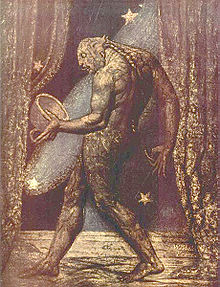


.jpg)


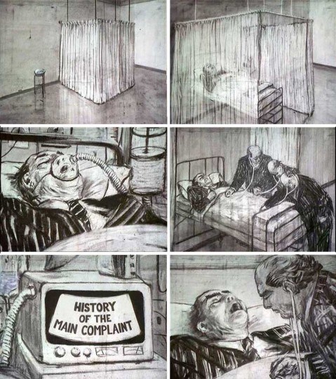


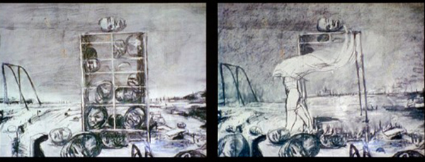


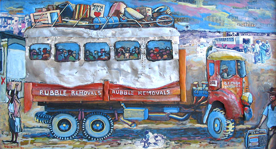
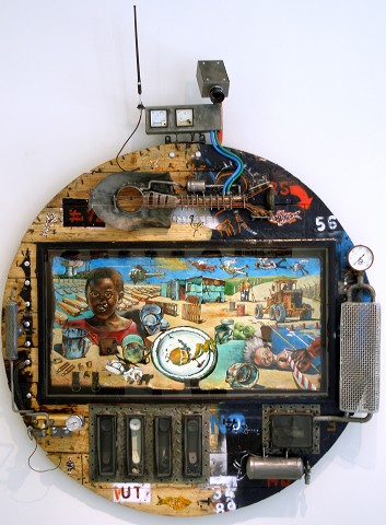

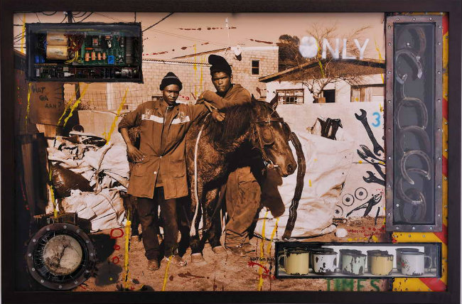


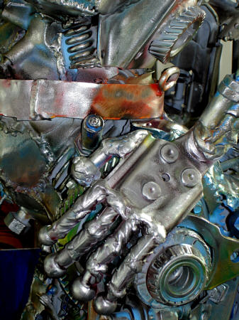


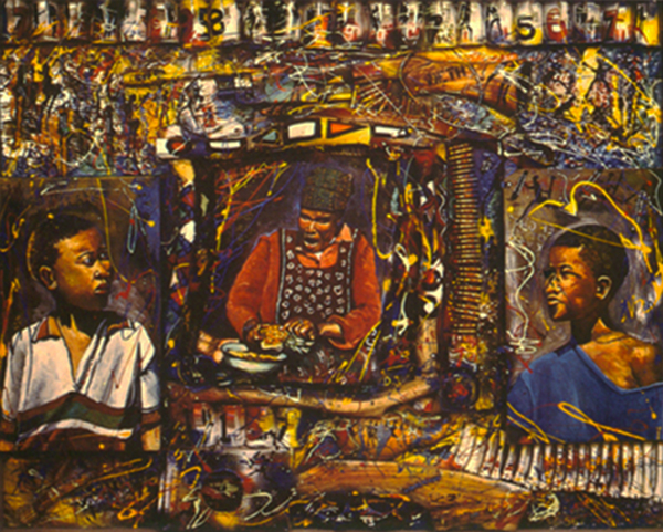
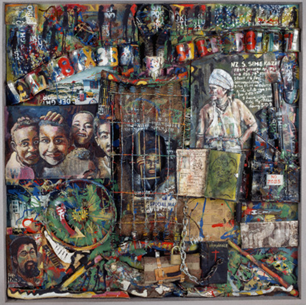


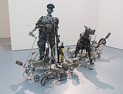


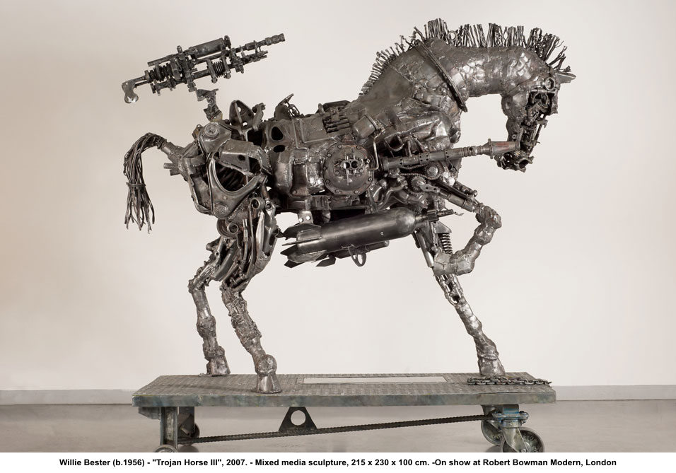
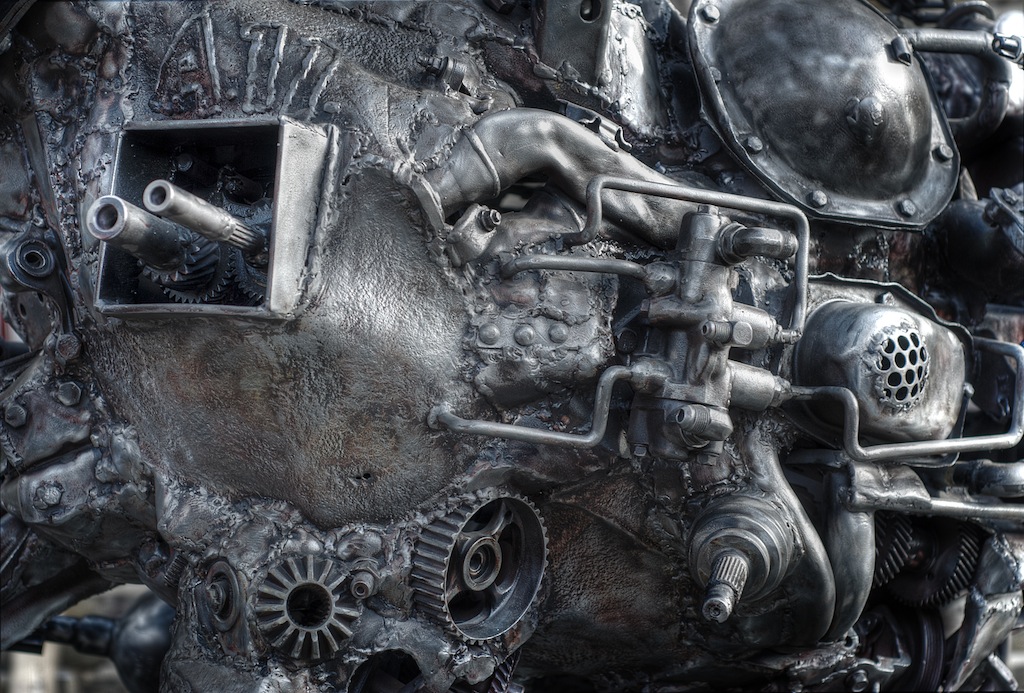


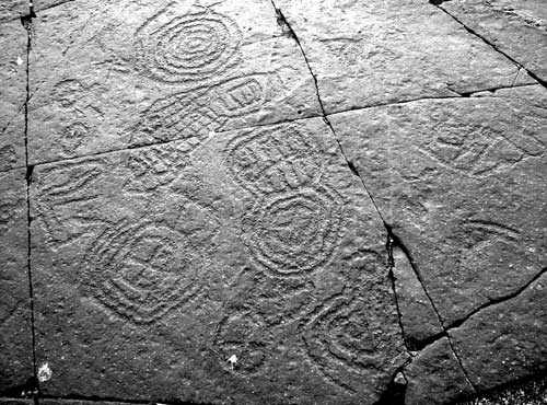


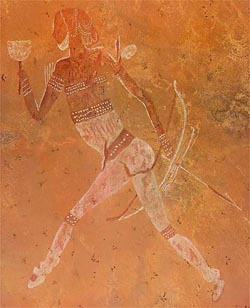


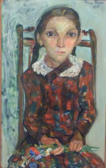


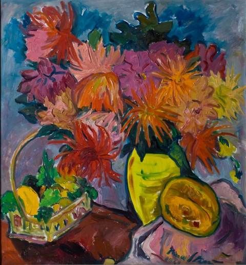


